[BRAND]: {brand name}
[PRODUCT]: {food / dish}
[HEADLINE]: {short bold word}
[INTERACTION]: {tie a knot / interlock with type / weave over and under / pierce through type}
[FOOD ELEMENT]: {pretzel rope / onion rings / bacon strips / skewer / other suitable food}
[ACCENT COLOR]: {headline color}
[DETAILS]: {ingredients / short copy / hours / address}

Create a 9:16 vertical food editorial poster combining highly realistic food photography with large, professionally designed typography.

Use a warm cream or ivory background, subtle paper texture, clean editorial composition and minimal props.

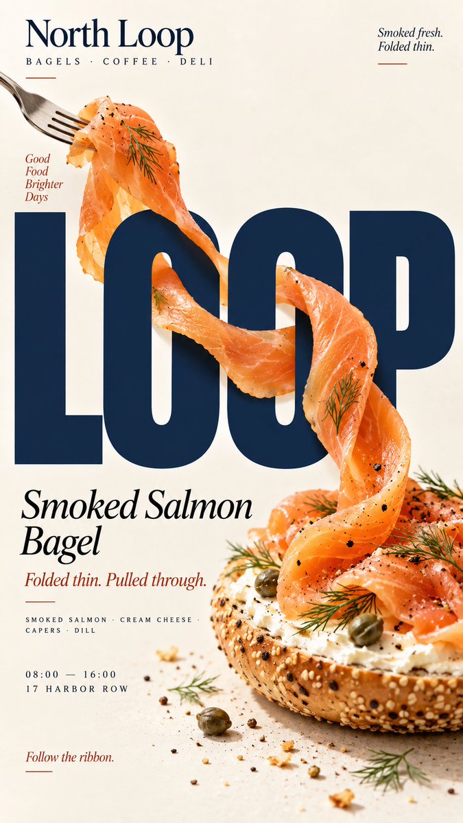
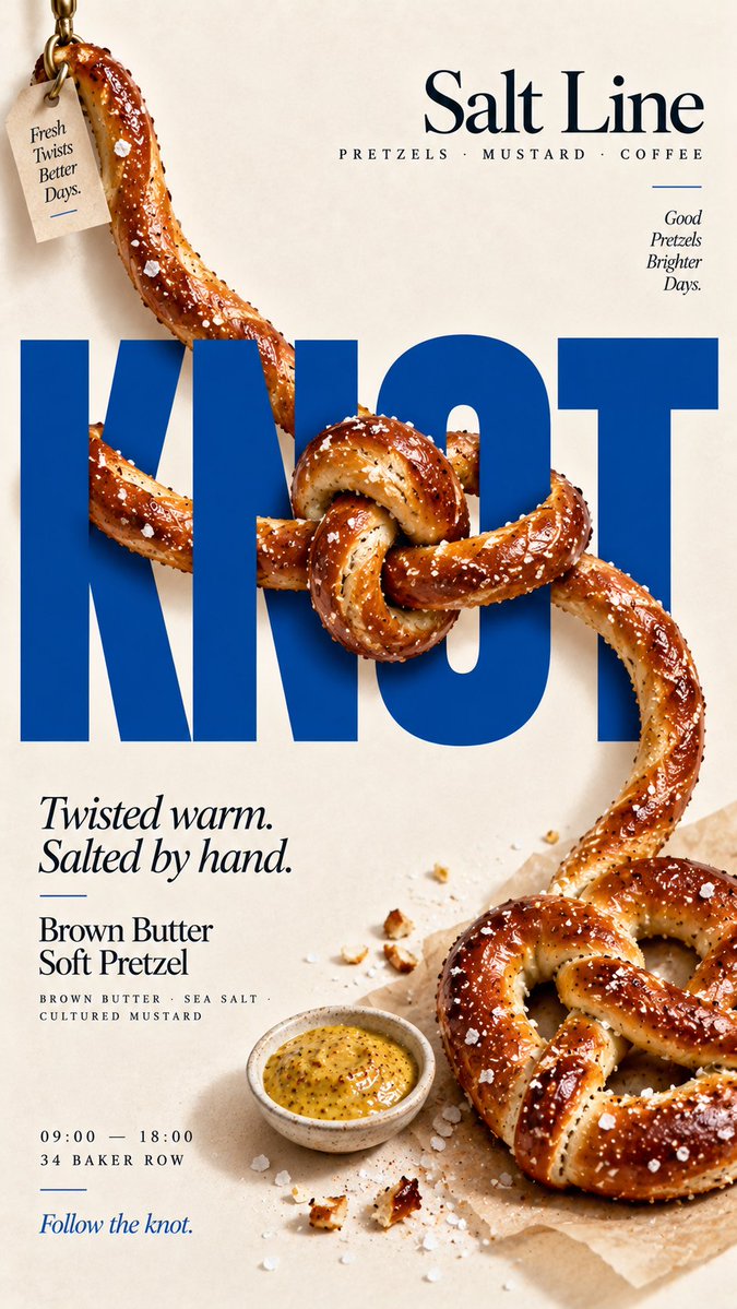
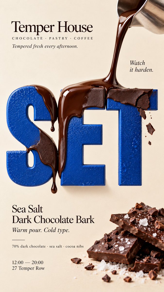
Keep [HEADLINE] large, flat, sharp and fully readable. The food must remain a real independent object and physically interact with the typography according to [INTERACTION].

For “tie a knot,” let one continuous edible strand move in front of and behind the letters, then form one clear physical knot with believable overlap, compression and contact shadows.

For “interlock with type,” use closed-loop foods such as rings. Let the food loops genuinely interlock with each other and with letter strokes, with opposite front and back relationships at different crossing points.

For “weave over and under,” use several continuous food strips. Alternate them clearly in front of and behind the typography, and allow one or two believable food-to-food crossings to create a real woven structure.

For “pierce through type,” use one rigid food element or skewer as a strong directional axis. Let it pass through letter counters and alternate between the front and back of the headline while remaining continuous from end to end.

Every interaction must have clear three-dimensional depth. Food in front should cast subtle contact shadows; food behind the letters must be genuinely hidden. Keep each food element’s thickness, texture, direction and structure continuous so the viewer can trace its full path.

Do not turn food into letters, do not damage or distort the typography, and do not use fake hole