[BRAND]: {brand name}
[PRODUCT]: {food / drink}
[HEADLINE]: {short bold word}
[INTERACTION]: {split / impact / powder flow / compression}
[ACCENT COLOR]: {headline color}
[DETAILS]: {ingredients / short copy / hours / address}

Create a 9:16 vertical food editorial poster combining highly realistic food photography with bold, professionally designed typography.

Use a warm cream or ivory background, subtle paper texture, clean editorial composition and minimal props.

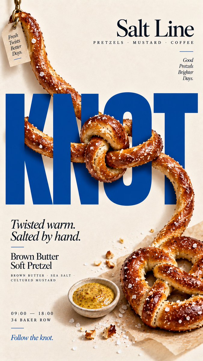
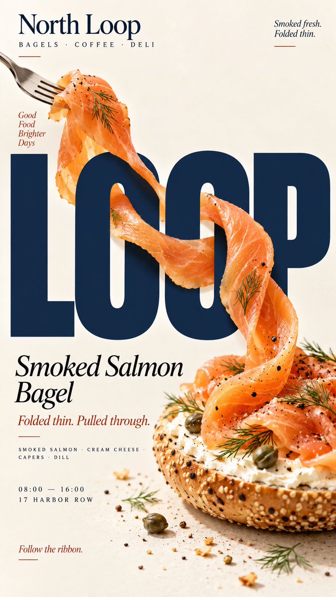
Keep [HEADLINE] large, flat, rigid and fully readable. The typography stays unchanged while the real food physically reacts to it according to [INTERACTION].

For “split,” let one continuous liquid stream hit a letter and clearly divide into two believable flows before rejoining.

For “impact,” let a brittle food collide with a hard letter edge and break only at the contact point, with a few realistic fragments following the impact direction.

For “powder flow,” let real food powder hit the typography, accumulate on exposed edges, flow around its geometry and create cleaner shadow zones behind the letters.

For “compression,” push a soft food through a narrow gap between rigid letters, showing realistic flattening, stretching and bulging while keeping the food continuous.

Use believable gravity, contact shadows, material texture and clear cause-and-effect. The viewer should immediately understand what the typography is physically doing to the food.

Do not turn food into letters, do not distort the typography, and avoid fake digital effects, CGI materials, excessive debris, numbered labels, 01/02, Vol. or sparkles.

Use [ACCENT COLOR] with natural food colors and dark neutrals. Add only a few useful details such as [BRAND], product name, ingredients, one short line of copy, opening hours and address.

The final poster should work as a stop-scroll image: one bold headline, one recognizable food element and one clear physical reaction.

Keep the type rigid. Let the food react.