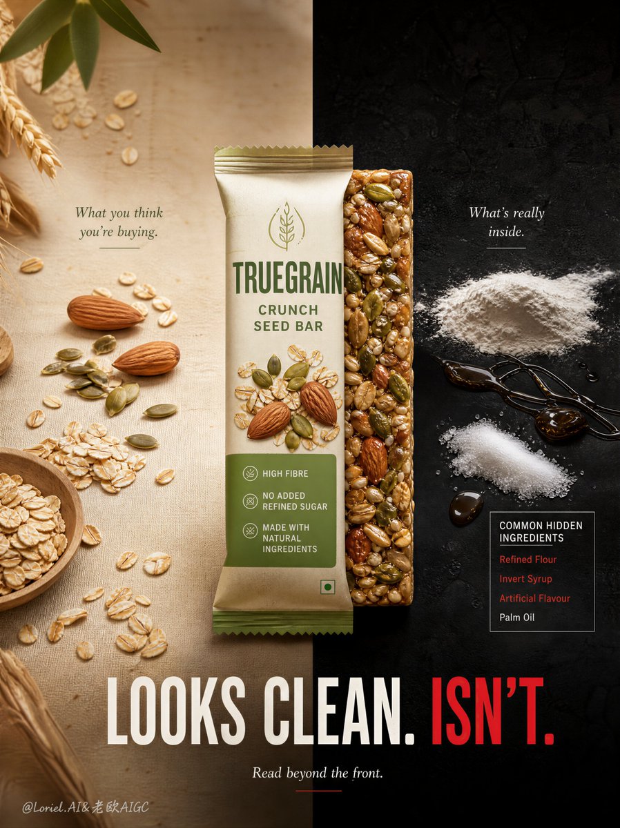
Create a Cannes-level flagship food advertising poster for an original snack brand named TRUEGRAIN, featuring a hero product called TRUEGRAIN Crunch Seed Bar. Build the image with Orbit x Transit visual logic: preserve the sharp split-truth composition with a warm natural promise world on the left and a darker ingredient-reality world on the right, while making both sides visually circulate through the central hero product and reducing all unnecessary noise so the final image feels more iconic, more premium, and more like an international issue-driven FMCG campaign.

Core composition:
Use a square or slightly vertical composition divided precisely into two halves. The left half is a soft warm beige natural-food world with oats, wheat stalks, almonds, and seeds. The right half is a dark charcoal-black studio world with refined white powders, sticky syrup traces, and a controlled ingredient-list panel. The split must be perfectly vertical and clear. The hero product stands exactly on that divide, visually bridging the two worlds and acting as the central anchor.

Orbit x Transit logic:
Design the image as a closed loop anchored by the product. The eye should begin in the left wholesome world, move through the natural grains and nuts toward the central package, cross into the exposed sticky bar texture, continue toward the darker right-side ingredient panel and powder world, and then return through the strong lower campaign line back to the center product again. The loop must feel natural and inevitable. At the same time, remove unnecessary scattered detail, trim the right-side ingredient list, and keep the composition sharp and reduced.

Hero product logic:
Design an original premium snack bar package called TRUEGRAIN Crunch Seed Bar. The front of the pack should look modern, health-forward, and trustworthy, using muted cream and green packaging with restrained claims such as HIGH FIBRE, NO ADDED REFINED SUGAR, and MADE WITH NATURAL INGREDIENTS. The package must feel realistic, shelf-ready, and highly legible. Behind or beside the pack, reveal the real bar itself with glossy sticky grains and dense compressed texture. The package and exposed bar together must remain the strongest visual focus.

Left-side "clean promise" world:
The left half should feel wholesome, airy, premium, and natural. Use oats, almonds, pumpkin seeds, wheat stalks, and clean organic food styling around the package. Keep the palette warm beige, oat cream, muted green, and natural brown. If any note appears, keep it subtle and minimal, such as:
What you think you're buying.
This side must feel attractive and commercially seductive.

Right-side "ingredient truth" world:
The right half should feel darker, sharper, and more forensic, but still elegant and premium. Use a reduced set of refined white powders, sugar dust, syrup smears, and a tightly edited ingredient-list panel. Highlight only the most important problematic terms with subtle red emphasis, such as refined flour, invert syrup, artificial flavor, or palm oil. Add a restrained small note such as:
What's really inside.
Keep the scene clean and hard-hitting rather than cluttered.

Typography system:
Do not use any real brand names or copied wording. Use original English-only typography. Keep the main campaign copy bold and minimal:
LOOKS CLEAN.
ISN'T.
Place this across the lower center spanning both halves, with LOOKS CLEAN. in off-white and ISN'T. in strong warning red. Beneath it, place one smaller line:
Read beyond the front.
Typography must feel editorial, premium, and globally campaign-ready.

Material realism:
Push exceptional realism in the wrapper texture, granola bar stickiness, seed density, powder textures, syrup gloss, oat grain detail, and surface finish. The left side should feel naturally tactile; the right side should feel dry, dusty, sticky, and processed. Every object must feel physically real and photographically premium.

Lighting:
Use soft daylight-style premium lighting on the left half and harder, more dramatic studio lighting on the right half. The center product should be lit so that it bridges both worlds seamlessly. The contrast between the two halves must be immediately readable but highly art-directed.

Color direction:
Use a tightly controlled palette of oat beige, muted sage green, almond brown, charcoal black, chalk white, sticky caramel brown, and restrained warning red accents. The image must feel premium, sharp, and globally award-worthy.