[BRAND]: {brand name}
[PRODUCT]: {food / dish}
[HEADLINE]: {short bold word}
[INTERACTION]: {through counters / grip letters / wrap around strokes / fold through type}
[FOOD ELEMENT]: {salmon ribbon / octopus tentacle / citrus peel / pasta sheet / other suitable food}
[ACCENT COLOR]: {headline color}
[DETAILS]: {ingredients / short copy / hours / address}

Create a 9:16 vertical food editorial poster combining highly realistic food photography with large, professionally designed typography.

Use a warm cream or ivory background, subtle paper texture, clean editorial composition and minimal props.

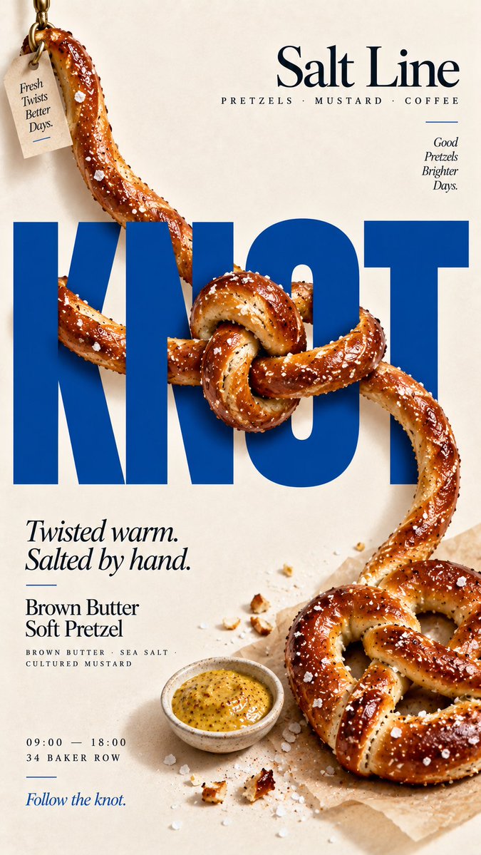
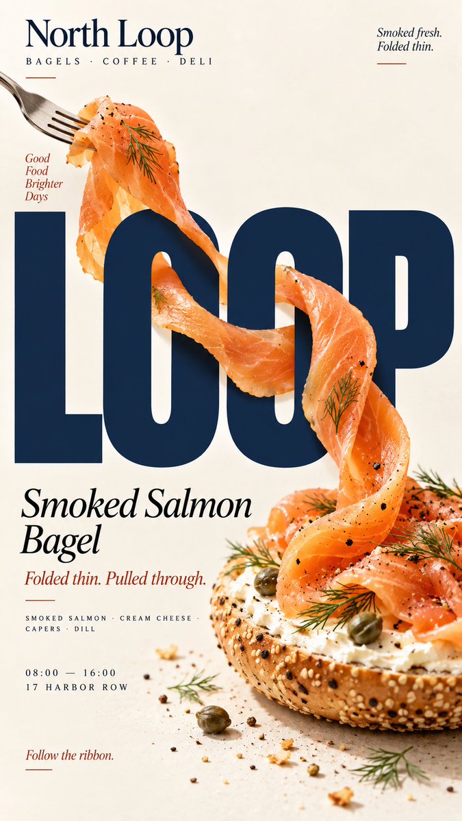
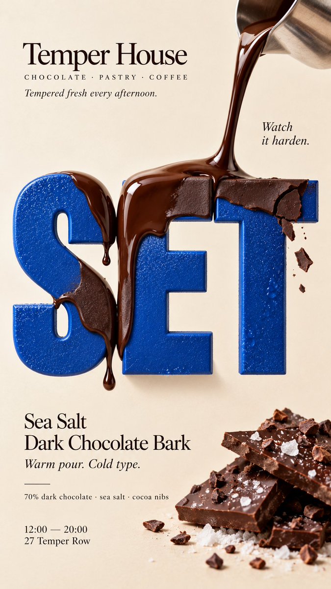
Keep [HEADLINE] large, flat, sharp and fully readable. The food must remain a real independent ingredient and physically travel through the typography according to [INTERACTION].

For “through counters,” let the food clearly enter and exit the open spaces inside letters, with believable front and back occlusion.

For “grip letters,” let a natural part of the food physically attach to or hold a letter while the typography itself remains unchanged.

For “wrap around strokes,” use one continuous edible element to move in front of, behind and around different letter strokes with a traceable path.

For “fold through type,” use a broad flexible food sheet with visible thickness and real food texture, folding between the front, back and negative spaces of the letters.

Every interaction must have clear depth. Food in front of type should cast subtle contact shadows; food behind type should be genuinely hidden. Keep the food’s texture, thickness and direction continuous so the viewer can trace the same ingredient through the composition.

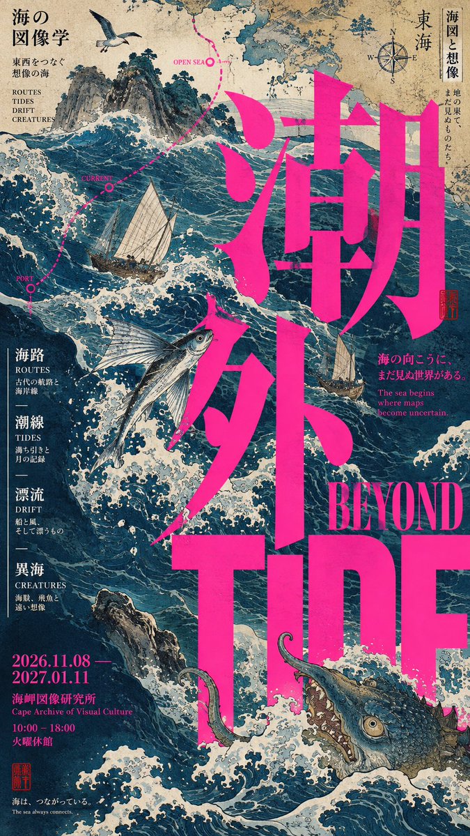
Do not turn food into letters, do not use food textures to fill typography, and do not rely on digital warp or fake 3D effects.

Use [ACCENT COLOR] with natural food colors and dark neutrals. Add only a few meaningful details such as [BRAND], product name, ingredients, one short line of copy, opening hours and address.

The final image should wor