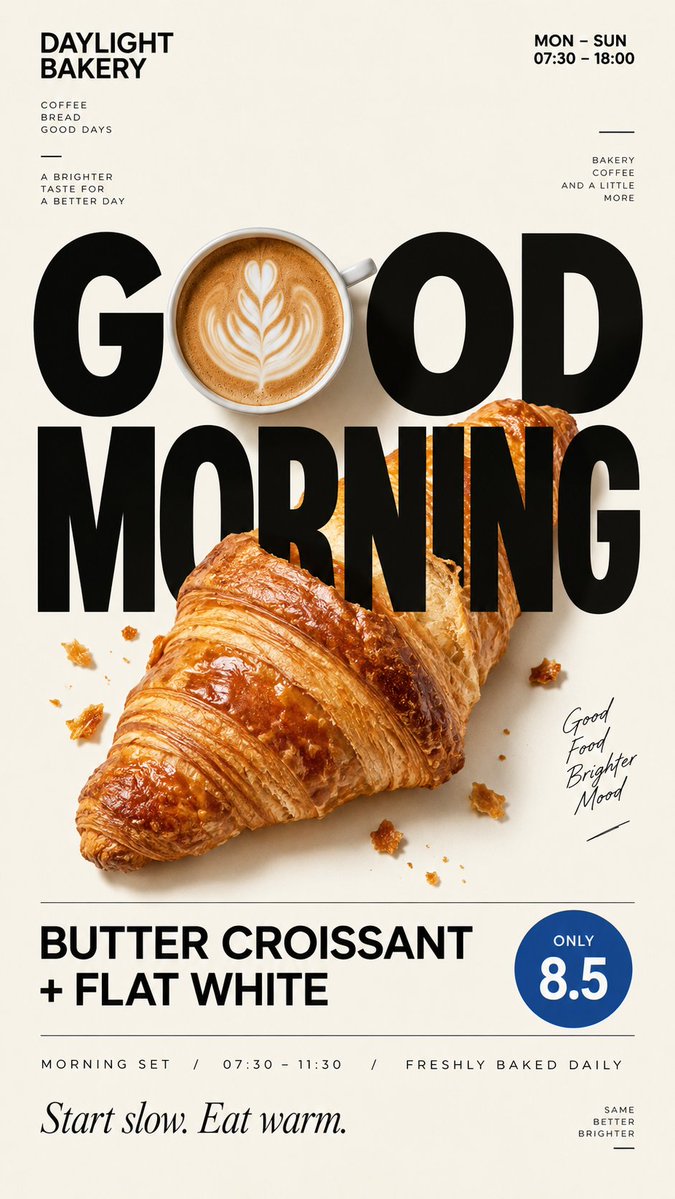
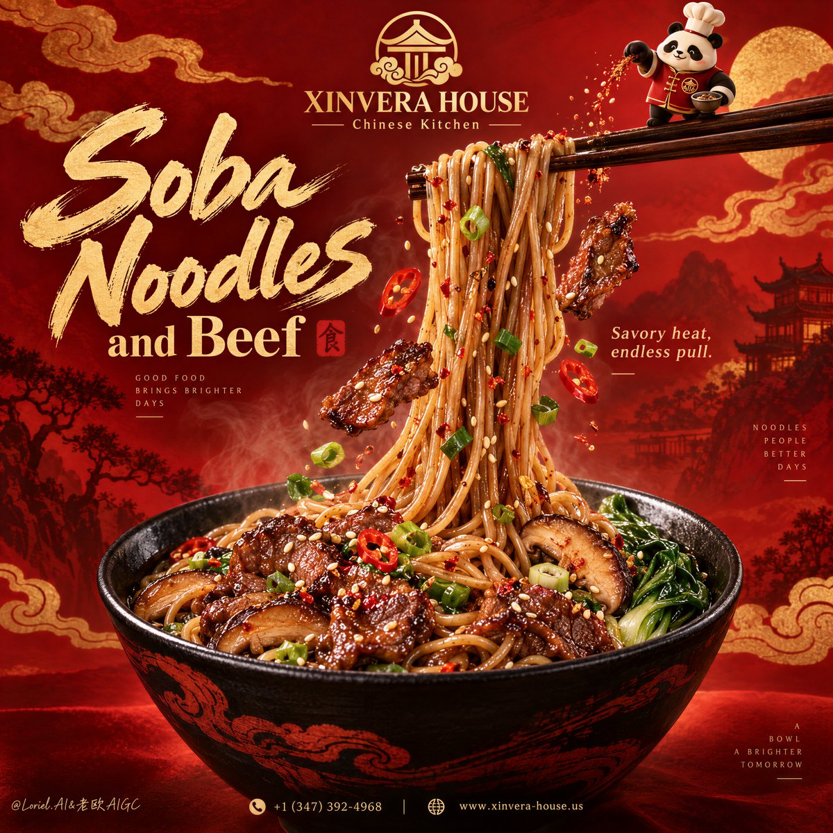
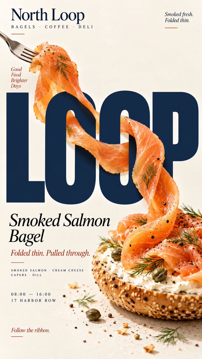
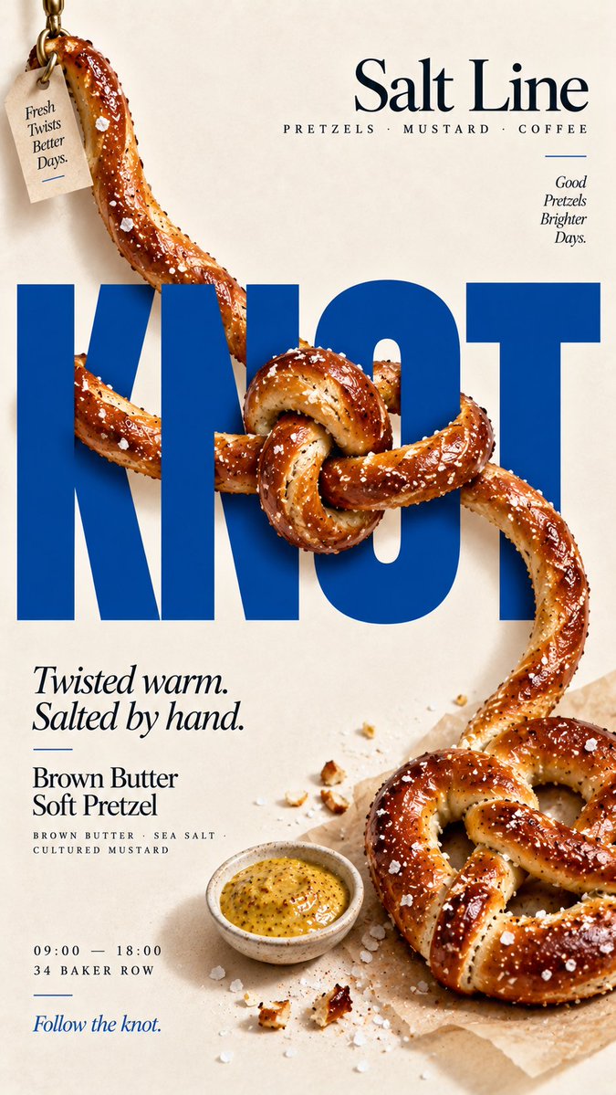
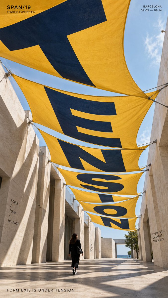
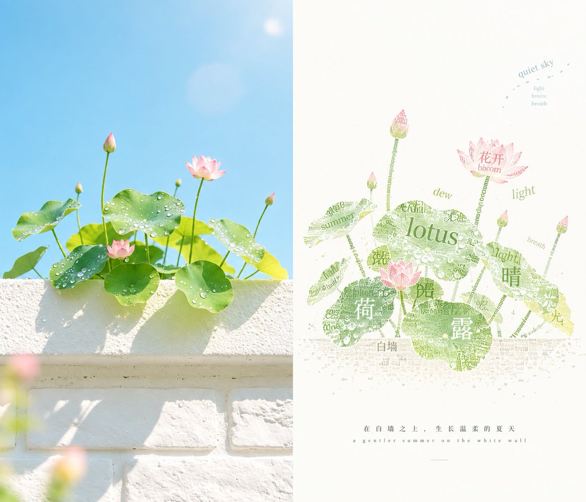
Create a 9:16 vertical food editorial poster combining highly realistic food photography with bold typography through one clear liquid or fluid interaction.

Use a warm cream or ivory background, subtle paper texture, realistic food materials, natural lighting and a clean editorial layout. The result should feel like a real café, bakery or restaurant campaign.

The food or liquid must physically interact with [HEADLINE] according to [INTERACTION], rather than simply appearing beside it.

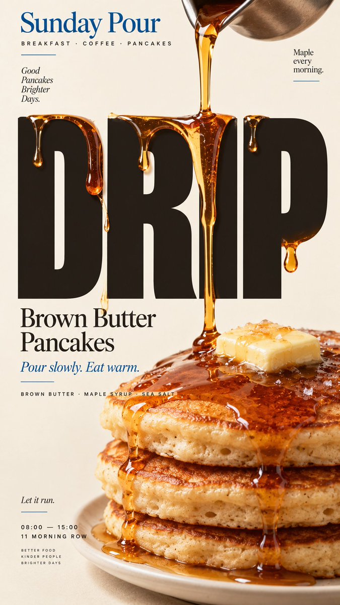
For "liquid drips over type," let one continuous syrup or sauce flow naturally over the letters with realistic gravity, thickness, surface tension and dripping.

For "type dips into liquid," place the headline into the same real liquid surface as the food, with one shared immersion line and believable contact between liquid and letters.

For "food smears across type," let a real spread, jam or sauce be physically dragged across the headline, showing true thickness, transparency, fruit pieces or texture instead of a painted brush stroke.

For "liquid motion moves type," form the headline from a movable food material such as cocoa powder, then let a real swirl or stirring motion gradually displace it according to the fluid flow.

Keep [HEADLINE] large, simple and readable at thumbnail size. The interaction should be obvious within the first second.

Use [ACCENT COLOR] sparingly with cream, natural food colors and dark neutrals. Add only a few meaningful details such as [BRAND], product name, ingredients, one short line of copy, opening hours or address.

Keep props minimal. Avoid CGI liquids, paint-like textures, digital distortion, fake drips, excessive splashes, generic 3D type, numbered labels, 01/02, Vol. or sparkles.

The final poster should work as a stop-scroll image: one bold headline, one clear liquid action, and one surprising but physically believable Food × Typography interaction.

Do not add a liquid effect to the type — let the real food physically act on it.