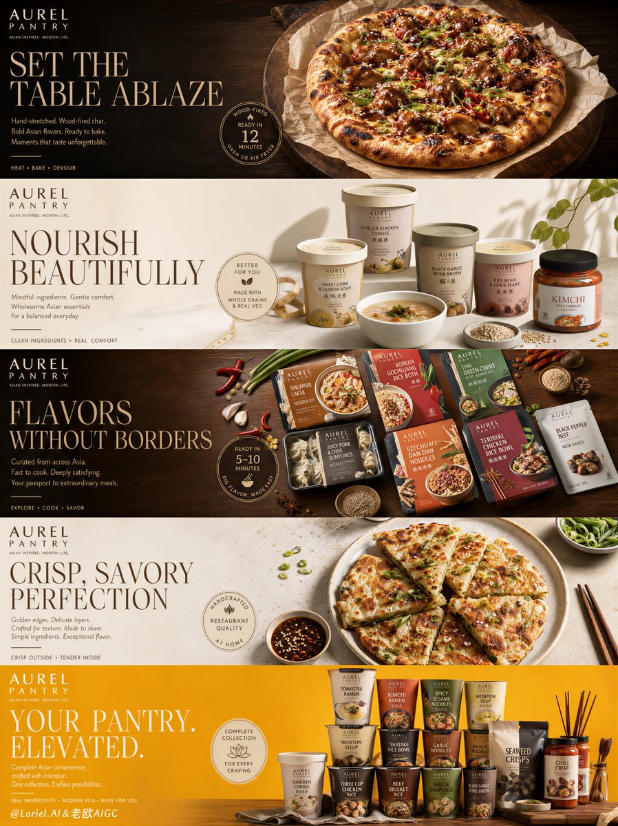
Create a Cannes-level premium integrated food campaign board for an original modern Asian pantry brand called "AUREL PANTRY", presented as one single tall vertical poster composed of five horizontally stacked advertising panels, each panel functioning like a refined sub-poster within one unified luxury retail brand system.

Global campaign structure: Use a tall mobile-first format divided into five clean horizontal sections stacked vertically. Every panel must preserve the same composition logic: the brand logo in the upper-left corner, a large elegant serif English headline on the left side, a short editorial support copy underneath, one refined circular badge or promo seal near the product zone, and a hero food item or product family occupying the right half or center-right area with clear visual dominance.

Brand system: Design a clean luxury identity for "AUREL PANTRY" that blends modern lifestyle grocery branding with premium Asian convenience-food culture. The logo should be minimal, uppercase, and confident, paired with a small secondary line beneath it. Typography throughout the campaign must feel expensive, spacious, and editorial.

Panel 1: Gourmet ready-to-bake Asian-inspired premium flatbread or fusion pizza hero, dark charcoal palette with moody warm lighting.

Panel 2: Wellness pantry featuring sculptural arrangement of premium Asian convenience products, warm oat-cream or soft ivory background.

Panel 3: Global-flavors panel with multiple branded packaged meals, cedar spice and chili-red accents.

Panel 4: Plated savory hero dish, mineral ivory or pale stone background.

Panel 5: Hero product-family finale with stacked tower of branded pantry containers, vibrant saffron-gold background.

Lighting and realism: Use world-class commercial food-photography lighting across all five sections. Every panel must feature softly sculpted directional light, precise highlight control, premium shadow falloff, and realistic material separation.

Color system: Use a controlled premium palette moving through the five panels: charcoal ember and deep wood for indulgence, oat cream and warm ivory for health-forward products, cedar spice and chili-red accents for global Asian pantry meals, mineral neutral tones for plated savory elegance, and saffron-gold for the final hero lineup.

Rendering style: ultra-realistic premium food campaign system, luxury Asian pantry branding, editorial FMCG advertising board, high-end packaging visualization, hyper-detailed commercial food photography, clean modular layout, elegant serif typography, international retail campaign polish, cinematic product lighting, 8k, world-class image quality.