[DESTINATION] = [CITY NAME]
[LANDMARK] = [PRIMARY LANDMARK]

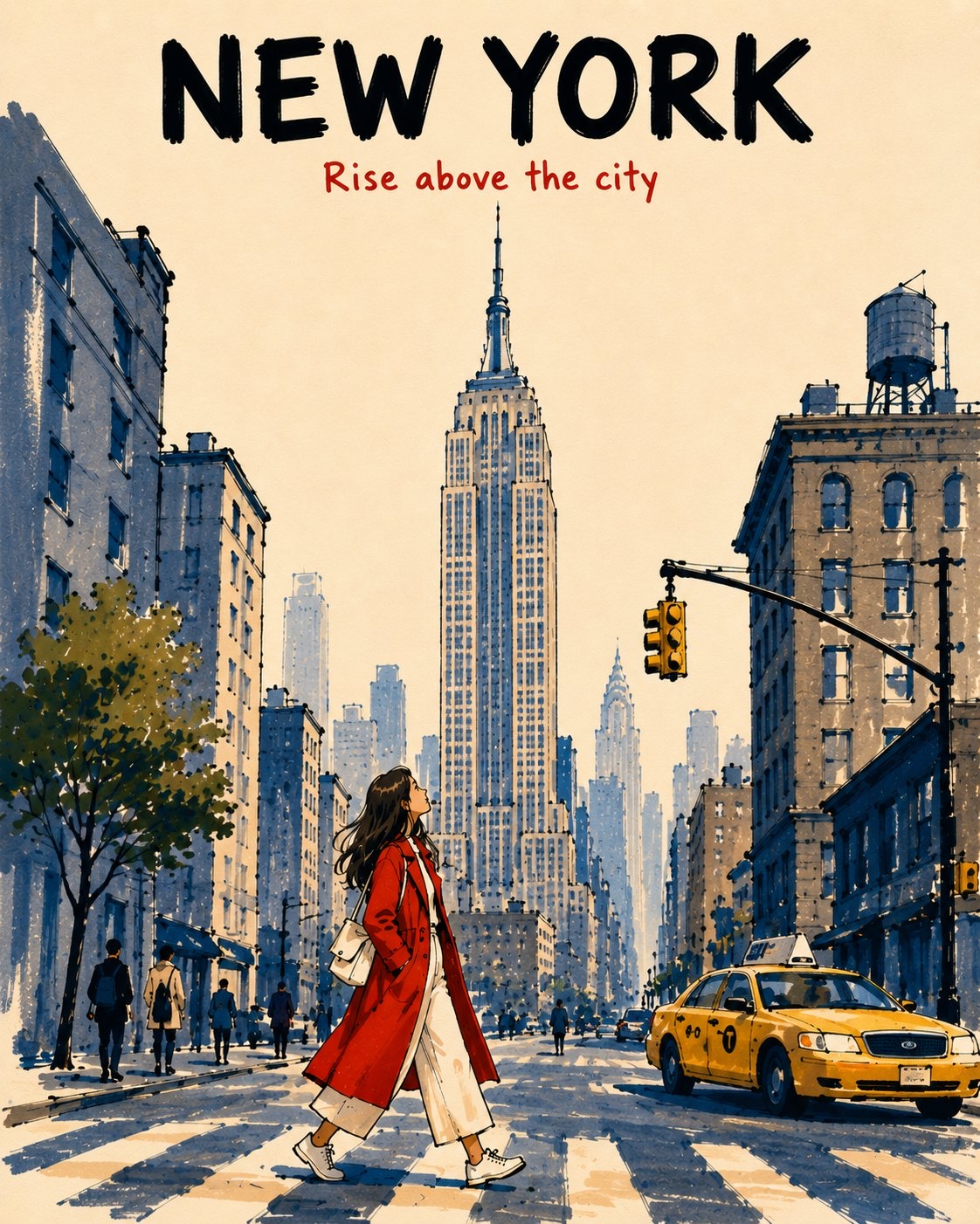
Create a vertical 4:5 alcohol-marker travel poster of [LANDMARK] in [DESTINATION], viewed from a low pedestrian viewpoint. Make it feel like an affectionate, imperfect travel memory, not a photorealistic rendering, postcard, map, landmark collage, or cinematic panorama.

Keep the top 14–16% open warm ivory paper.

At the top center, write exactly:

“[CITY NAME]” — large, bold black marker capitals.

Below it:

“[SHORT TRAVEL PHRASE]” — smaller vermilion-red handwritten marker lettering.

Keep both lines highly legible and separate from the landmark. No additional text.

Place [LANDMARK] prominently in the upper-center, preserving its most recognizable silhouette and defining features while simplifying unnecessary detail.

Reduce surrounding architecture to 2–3 broad building masses. Add one simple local vehicle, a few tiny pedestrians, and a young female traveler walking across the lower-center foreground while looking upward.

Dress her in a vivid vermilion-red coat over cream clothing, with natural warm-peach skin tones. Make her warm colors contrast against the cool slate-blue and pale blue-gray architecture.

DEPTH & MARKER STYLE

Foreground: saturated colors, 2–3 overlapping marker passes, visible chisel-tip strokes, darker shadow overlaps, and thick broken black contours.

Midground: medium-density slate-blue / blue-gray marker strokes, 1–2 passes, moderately thick broken outlines.

Background: progressively reduce saturation, density, contrast, detail, and contour weight. Use pale blue-gray single-pass strokes with thin, incomplete outlines that gently merge into the ivory sky.

Use broad vertical strokes for buildings and short directional strokes for streets. Leave approximately 40% of the warm ivory paper exposed.

STYLE CONSTRAINTS

Keep the illustration simplified, tactile, graphic, airy, nostalgic, and slightly imperfect, with only major architectural forms and a few window suggestions.

Avoid: photorealism, repetitive window grids, dense skyline detail, realistic reflections, uniform outlines, digital gradients, watercolor effects, black-filled shadows, excessive detail, clutter, or extra typography.

Overall: sophisticated mid-century-inspired travel-book illustration recreated with expressive alcohol markers, with strong foreground-to-background atmospheric perspective and an unmistakable sense of place.
Saul Goodman
13h
Mid-century travel picture-book illustrations of American cities

GPT Image 2

Prompt:
[DESTINATION] = [CITY NAME]

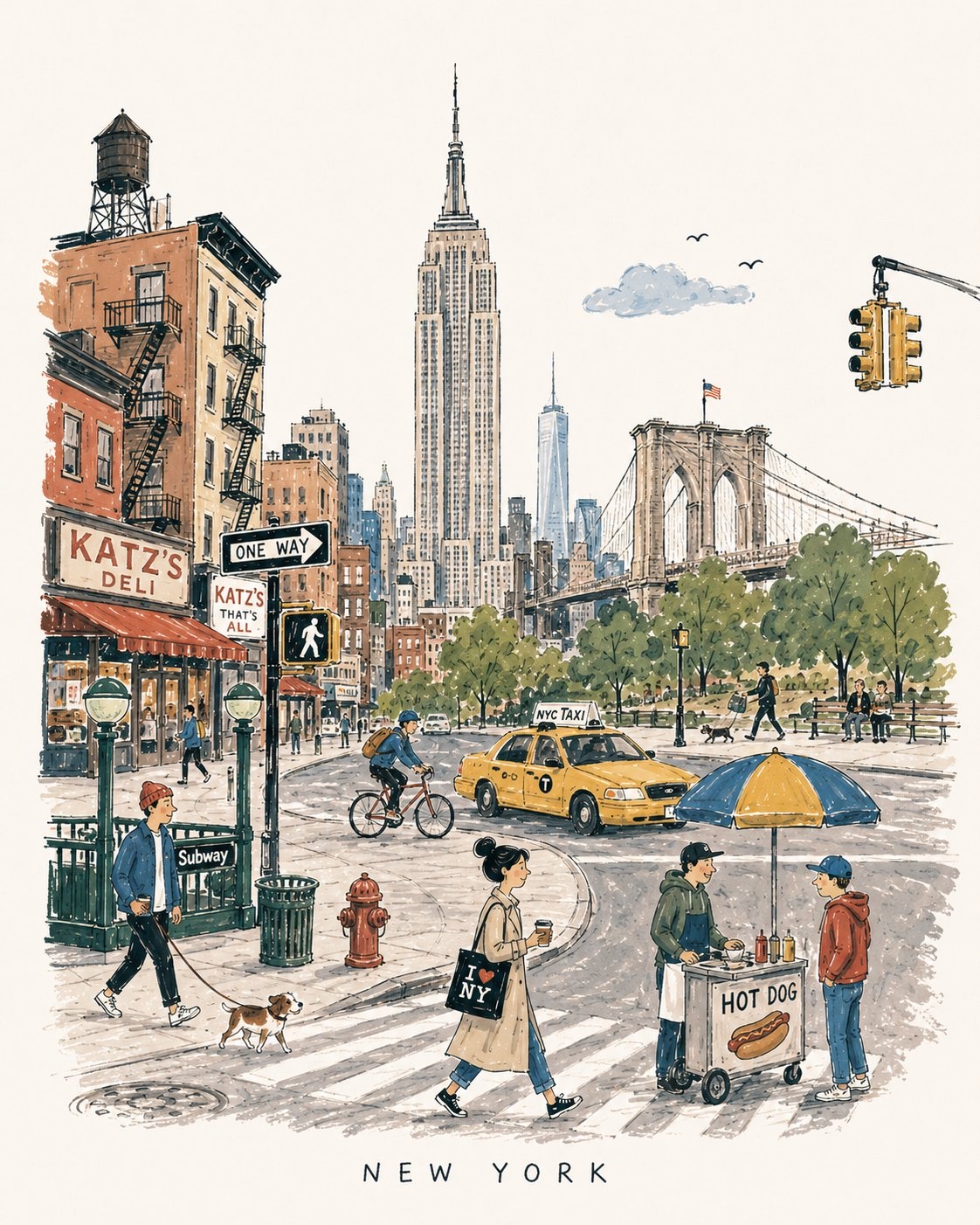
Create a charming vertical 4:5 mid-century travel picture-book illustration of [DESTINATION], inspired by playful 1950s–60s European city books.

Depict the city as an affectionate, imperfect travel memory—not a map, postcard, architectural rendering, landmark collage, or cinematic panorama.

Include:
  • 1 distinctive primary landmark
  • 1 smaller secondary landmark
  • 1 distant/partially hidden local feature
  • 1 recognizable local vehicle
  • 3–5 subtle everyday city details
  • 5–6 ordinary people doing simple local activities

Compress these naturally into one imaginary street, plaza, park, or waterfront. Keep the primary landmark slightly off-center, with open foreground, shallow theatrical depth, gentle curves, and generous museum-white negative space. The city should be recognizable without feeling geographically accurate.

STYLE:
Hand-drawn picture-book illustration with loose charcoal/navy ink, trembling contours, crooked architecture, uneven proportions, sparse windows, simplified silhouettes, occasional double strokes, and minimal detail. Use the fewest lines necessary. Slightly awkward, intelligent, warm, humorous, and handmade.

PEOPLE:
Simple expressive figures with oversized heads, thin legs, narrow bodies, tiny faces, tilted accessories, and awkward but readable gestures. Show ordinary local life, not celebrities, models, stereotypes, or tourist clichés.

COLOR:
Use a restrained 6–7 color destination-specific palette with flat matte gouache shapes, uneven brush edges, white gaps, slight misregistration, and occasional color spilling beyond ink. Mostly unpainted sky/paper. No gradients or realistic shading.

MEMORY DISTORTION:
Gently compress geography and distort scale: distant landmarks may appear nearby, roads may curve strangely, buildings may overlap, and people/vehicles may be slightly oversized or undersized. Keep it balanced, affectionate, and culturally respectful.

OPTIONAL TEXT:
“[DESTINATION]” in small uneven hand-drawn capitals near the bottom. No slogans, dates, labels, logos, or promotional text.

AVOID:
Photorealism, map-like accuracy, landmark checklists, aerial views, cinematic lighting, technical perspective, dense crowds, detailed ornament, polished vector art, CGI, 3D rendering, gradients, sepia/beige paper, artificial aging, distressed textures, and hyper-detailed watercolor.

Overall feeling: [DESTINATION] remembered lovingly-recognizable, spacious, human, humorous, slightly improbable, and beautifully imperfect.