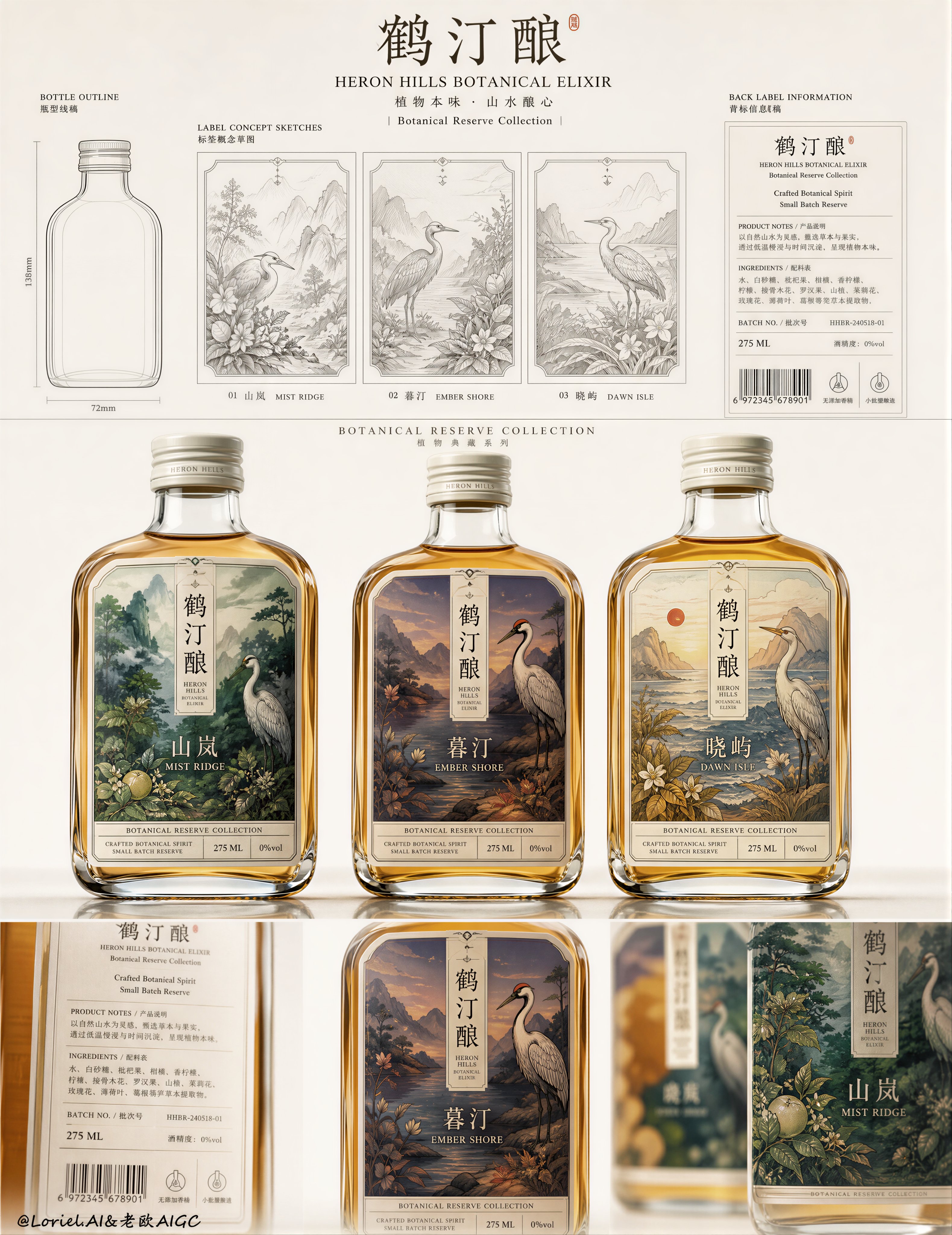
Create an ultra-premium packaging concept poster for a fictional Chinese botanical cordial brand called “鹤汀酿”, with the English subtitle “HERON HILLS BOTANICAL ELIXIR”. The final image must feel like a Cannes-level packaging presentation board with stronger first-glance impact: highly art-directed, product-led, collectible, and impeccably structured. Use a pale warm-white studio background, soft refined lighting, elegant negative space, and a disciplined three-tier layout that combines monochrome concept sketches, enlarged hyper-realistic final bottles, and close-up presentation details. No copied text from the reference image. All typography must be newly created, artistic, premium, and layout-driven.

Core board structure:
Use a tall vertical design-board composition divided into three clean horizontal sections.

Top section:
On the far left, place one simple bottle-outline technical silhouette. To its right, place three refined black-and-white label concept sketches in a row, each framed like a premium archival design card. On the far right, place one elegant back-label information panel with clean typography blocks, barcode area, ingredient text rows, and tiny certification icons. This top row must feel like a restrained luxury packaging development sheet.

Middle section:
This is the visual center and must deliver the strongest impact. Place three final hyper-realistic glass bottles side by side in the center, evenly spaced, front-facing, and slightly enlarged so they behave like a hero trio. Their visual weight must be stronger than in a normal design board, making the viewer notice the three-bottle family instantly. Keep them perfectly aligned on a soft reflective studio surface with crisp silhouette clarity, elegant spacing, and premium monument-like presence.

Bottom section:
Create a close-up detail strip with stronger editorial drama: left side shows a cropped bottle back-label macro, center shows one hero bottle front-facing with the label fully visible, right side shows a shallow-depth blurred close-up of another bottle edge and label for luxury depth. This lower band should feel like a refined print-fidelity showcase, not just repetition.

Brand system:
Brand name: “鹤汀酿”
English subtitle: “HERON HILLS BOTANICAL ELIXIR”
Series line: “Botanical Reserve Collection”

Flavor variants:
1. “山岚” / “MIST RIDGE”
2. “暮汀” / “EMBER SHORE”
3. “晓屿” / “DAWN ISLE”

Typography:
Use elegant Chinese main naming with small refined English subtitles beneath or beside each flavor name. The type must feel custom-designed, delicate, premium, and modern with an East-Asian editorial sensibility. Avoid crude bold fonts. Use restrained microcopy in the back-label panel such as:
“Crafted Botanical Spirit”
“Small Batch Reserve”
“275 ML”
“Product Notes / Ingredients / Batch No.”
All text must feel like luxury packaging typography and belong to one strict brand grid system.

Bottle design:
Render the bottles with extreme realism: compact rounded-rectangular glass bottles, softly flattened shoulders, white metal screw caps, thick clear glass edges, subtle meniscus, warm amber-gold liquid, gentle studio reflections, premium label print texture, and precise shadow grounding. The bottles should feel collectible, tactile, and expensive. The central trio must have especially sharp print fidelity and luminous liquid presence.

Label illustration system:
Each front label should feature a highly art-directed illustrated world built around one elegant bird motif fused with poetic landscape storytelling. The illustration style should feel like premium contemporary print design: detailed, decorative, color-rich, and collectible, but still clean and controlled.
- “山岚” label: misty mountain greens, botanical density, pale fruit forms, layered forest rhythm
- “暮汀” label: dusk-toned riverbank scene, red-crowned bird, twilight landscape, elegant warm-cool contrast
- “晓屿” label: sunrise shoreline palette, pale cliffs, red orb sun, rhythmic field or coast textures
The three labels must feel like one unified brand family with identical layout skeleton, border logic, information zones, and illustration discipline.

Transit-style system discipline:
Keep the whole poster standardized under one mature packaging identity system. The three labels must share the same border thickness, title placement, English subtitle position, bottom information strip, print margins, and visual rhythm. The top sketch cards, bottle silhouette, back-label panel, center hero trio, and bottom close-up strip must all feel governed by one clean international presentation grid. The image should read as a professional luxury SKU system, not a loose mood board.

Port-style elevation:
Without changing the three-tier board structure, elevate the image into a more collectible brand-poster presentation. Let the top monochrome sketch cards feel more archival and gallery-like, with finer linework, cleaner margins, and quieter white space. Let the middle trio feel more iconic and poster-worthy. Let the bottom strip feel more cinematic and tactile. The final result should feel like a framed premium proposal board worthy of exhibition.

Impact enhancement:
Increase first-glance impact by tightening the spacing between the top title elements and the middle hero trio, enlarging the center bottles slightly, sharpening the label readability, and giving the three bottles a stronger collective presence. The board should immediately communicate “award-level packaging family” in one glance, while still remaining clean and highly controlled.

Lighting and material:
Use ultra-soft refined studio lighting with smooth transitions and no harsh highlights. The glass should show premium subtle reflections, the liquid should glow naturally, and the labels should feel crisp and textured. The background must stay clean and airy, with soft reflection beneath the bottles. The middle row should receive the clearest product light emphasis.

Color direction:
Use a restrained premium palette overall: warm white, soft gray, amber-gold liquid, muted ivory caps, and richly curated label colors. Each label can introduce its own poetic palette, but the board as a whole must remain elegant, minimal, and balanced.

Mood and quality:
luxury packaging concept board, high-impact product family poster, premium botanical cordial, collectible label design, enlarged hero bottle trio, hyper-realistic glass bottles, refined East-Asian editorial branding, clean exhibition-grade presentation sheet, soft studio lighting, museum-grade commercial design, 8k, world-class packaging advertisement

Negative

prompt:
cheap packaging, messy layout, random label styles, generic typography, oversaturated colors, plastic-looking bottles, low-detail labels, cluttered design board, cartoon illustration, harsh highlights, hard shadows, noisy background, weak middle-section impact, low resolution
2:45 AM · Aug 9, 2026
635
Views
1
2
17
10

===ARTICLE 1===
Shara I Ai Video Creator
@itsshara_ai
15h
An emblem that works at cap size and poster size, correct.
10