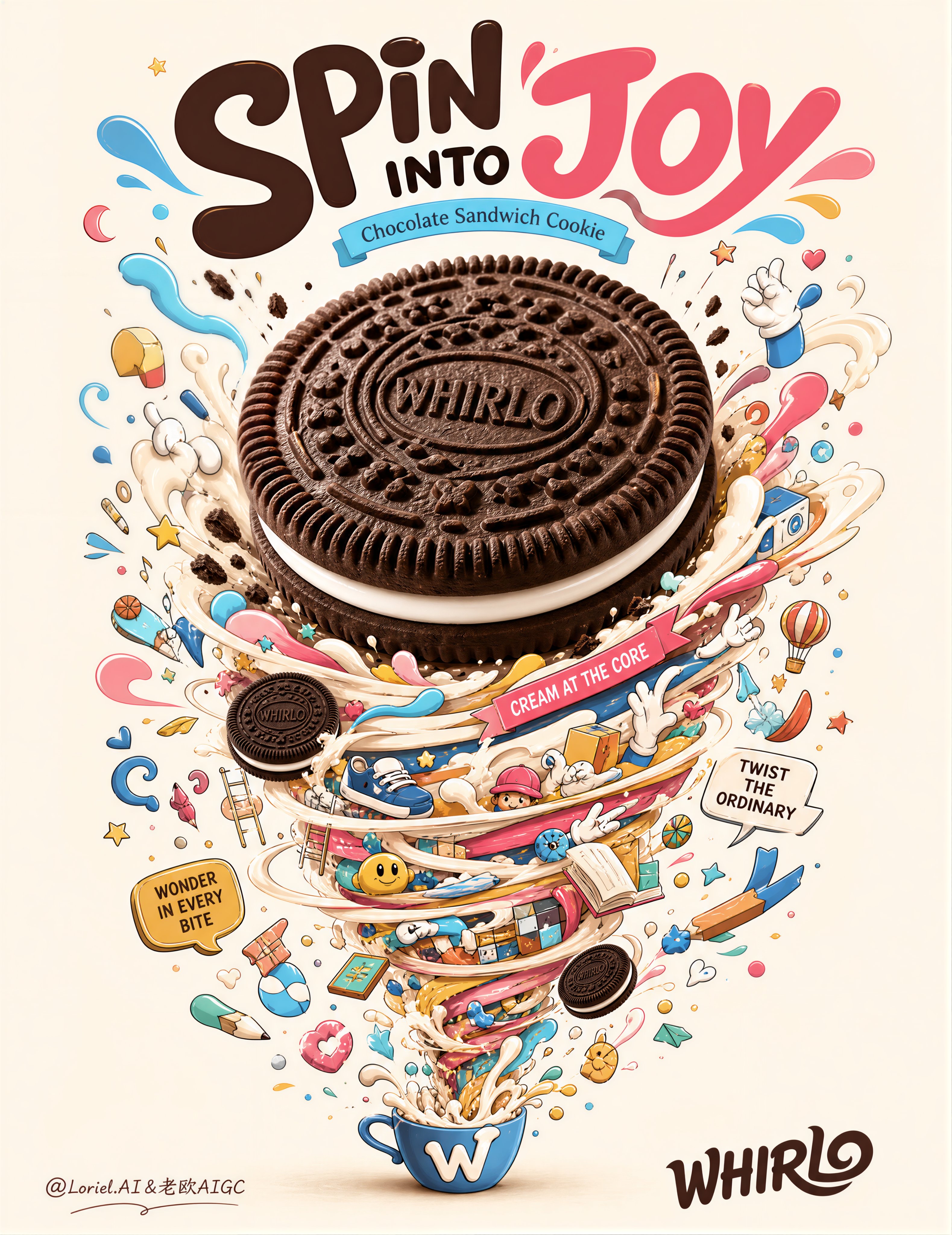
Create an ultra-premium advertising poster for a fictional chocolate sandwich cookie brand called “WHIRLO”, designed as a Cannes-level commercial print ad that combines one hyper-realistic hero cookie with a whimsical vertical tornado of illustrated snack-world energy. The final image must preserve the same iconic composition logic: large title at the top, one oversized central cookie as the visual anchor, and a swirling upward-downward universe of playful doodle objects wrapped around an invisible spiral column. The image should feel joyful, clever, collectible, and product-led, while remaining extremely clean, highly controlled, and internationally polished.

Core composition:
Use a tall vertical poster with one giant realistic chocolate sandwich cookie centered in the upper-middle area as the main focal point, enlarged slightly so it dominates the layout more powerfully at first glance. Beneath and around the cookie, build a tall tornado-like spiral made of playful doodle objects, cream swirls, tiny illustrated snack icons, abstract shapes, hands, ribbons, and whimsical everyday fragments, all spiraling around a clear vertical axis. The composition must feel like a controlled vortex of imagination exploding from the cookie’s center. Keep the structure visually strong and iconic, not loose or chaotic.

Brand creation:
Brand name: “WHIRLO”
Main headline: “SPIN INTO JOY”
Support line: “Chocolate Sandwich Cookie”
Optional micro copy:
“Cream at the Core”
“Twist the Ordinary”
“Wonder in Every Bite”
All copy must be original, premium, and beautifully art-directed. Do not copy the sample wording. Typography should feel playful, elegant, and graphic, with a mature international poster hierarchy.

Product realism:
Render the main cookie with extreme photorealistic precision: embossed dark cocoa biscuit texture, crisp edge ridges, creamy white filling layer, realistic crumbs, subtle shadow grounding, and tactile surface relief. Add one or two smaller realistic cookies floating within the swirl for support, but keep the central hero cookie as the strongest anchor. The main cookie should feel slightly more dominant, like the gravity source of the whole poster.

Orbit-style impact:
Increase the first-glance force by enlarging the central cookie slightly and tightening the relationship between the hero cookie and the surrounding cream-and-object tornado. The viewer should first register the cookie, then the spiral energy, then the playful micro-world around it. The cookie must feel like the central engine of the whole composition.

Transit-style system discipline:
Keep the entire poster standardized under one mature visual system. All small doodle objects, cream ribbons, geometric fragments, floating hands, shoes, stars, ladders, books, and mini cookies must follow one coherent outline thickness, one controlled color hierarchy, and one repeatable visual rhythm. The image should feel like part of a polished international snack-brand campaign rather than a random doodle collage.

Illustration tornado:
Build a dense but elegant spiral world of miniature illustrated objects and snack-surreal symbols, such as:
- cream ribbons and splash loops
- candy bits and geometric confetti
- tiny toy-like objects and doodle props
- playful hands, shoes, ladders, books, and sweets
- floating stars, droplets, smiley shapes, and abstract loops
- one or two tiny cookie companions
Everything must feel highly designed, witty, and collectible, not random clutter. The spiral should feel like a fantasy ecosystem born from the cookie’s cream center.

Graphic style:
Use refined contemporary doodle-pop illustration with thin clean outlines, bright candy colors, and smooth graphic filling. The illustrated elements must feel light, playful, and premium. Keep them secondary to the cookie, but rich enough to reward close viewing.

Typography layout:
Place the main title at the top in large bold playful typography. Add one smaller support line beneath it. Optionally place a minimal brand signature or small logo-style mark near the bottom. Keep the poster text sparse and beautifully spaced. Do not add unnecessary copy blocks.

Color direction:
Use a pale warm cream background, deep cocoa brown for the cookie, soft milk-white cream filling, and a bright but tasteful accent palette of pink, sky blue, yellow, mint, orange, and red for the doodle objects. The overall image must feel cheerful, premium, and graphically clean.

Lighting:
Use soft refined studio lighting on the realistic cookie with subtle depth and no harsh glare. The illustrated tornado remains graphic and crisp, but the cookie itself must feel dimensional, tactile, and delicious. The overall poster must feel luminous and polished.

Mood and quality:
premium cookie advertising, enlarged hero sandwich cookie, whimsical doodle tornado, collectible snack poster, playful editorial typography, cream-filled fantasy world, highly systemized commercial illustration, clean high-end advertising image, 8k, world-class visual quality

Negative

prompt:
copied Oreo text, real brand logo, weak cookie focus, cluttered layout, random doodles, muddy colors, low-detail biscuit texture, plastic-looking cream, unreadable typography, harsh shadows, dirty background, low resolution
9:58 AM · Aug 9, 2026
276
Views
1
1
7
5

===ARTICLE 1===
Jemimah Yohanna Pilau
@JemimahYoh
8h
I love this so much that I had to try it
1
1
13