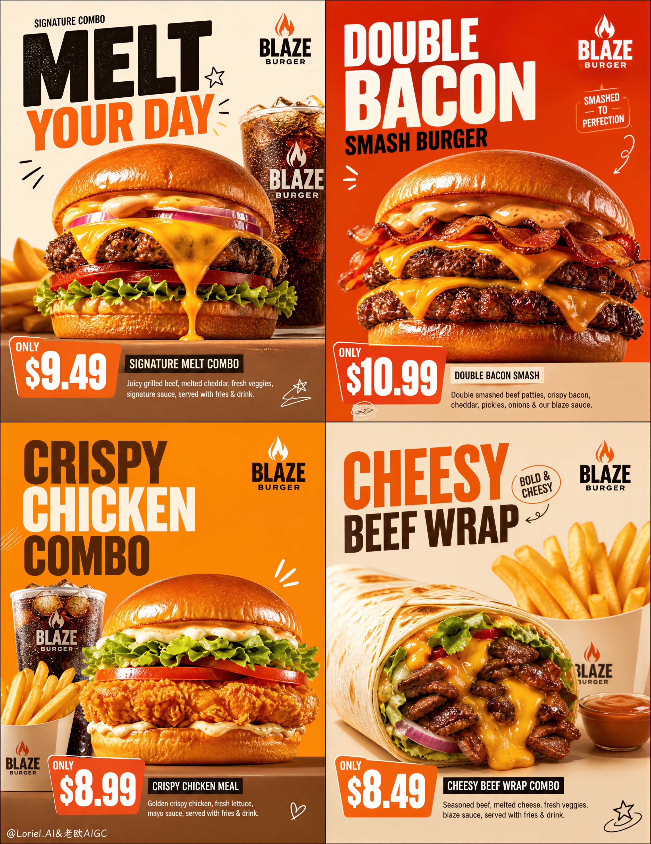
Create an ultra-premium western fast-food campaign poster system for a self-created brand called "BLAZE BURGER". The final artwork must feel like a world-class commercial fast-food key visual with strong poster energy, highly structured promotional layout, bold typography, clear pricing, saturated minimal backgrounds, restrained playful doodle graphics, and extremely realistic flagship food photography. Build the composition as a 2x2 four-panel campaign board, with each panel functioning like an individual premium promo poster while still belonging to one unified brand system.

Creative direction:
Combine Milk Cloud Orbit and Cream Halo Transit. Keep the exact 2x2 campaign skeleton, but intensify the most craveable premium food-light details while tightening the graphic system: purer melted-cheese highlights, cleaner seared-patty edge shine, colder cola condensation realism, stronger fried-surface sparkle, tighter title-and-price composition, and fewer doodle accents. The final image must feel more expensive, more controlled, more appetizing, and more internationally polished.

Core layout:
Use a strict 2x2 grid with four square poster panels. Each panel must have a strong, clean commercial hierarchy:
1. a bold English headline area,
2. a dominant hero food product or combo,
3. a clear price block,
4. a short English product description,
5. a small official brand logo area,
6. only a few minimal playful doodle accents integrated into typography and negative space.
All four panels must feel organized, modern, youthful, highly appetizing, and brand-consistent.

Brand identity:
Create a self-invented premium western fast-food brand named "BLAZE BURGER". The brand language should feel youthful, bold, urban, energetic, and internationally polished. Use English as the primary headline language. Typography must feel graphic, modern, and commercial-premium, never cheap, never generic.

Product lineup:
Create four highly recognizable western fast-food hero panels:
Panel 1: Signature Melt Burger combo
Panel 2: Double Bacon Smash Burger promo
Panel 3: Crispy Chicken Burger meal with fries and cola
Panel 4: Cheesy Beef Wrap combo with fries
Each panel must feature a different flagship product or combo, with visually distinct construction and supporting items.

Food realism:
Render every food item with extreme realism and irresistible detail: glossy toasted buns, melted cheese flow, juicy beef patties, crispy fried chicken texture, bacon sheen, fresh lettuce moisture, tomato freshness, red onion translucency, creamy sauce gloss, golden fries with salt crystals, fizzy iced cola condensation, tortilla wrap texture, grill marks, crumbs, and appetizing oil highlights. The food must feel hot, crunchy, juicy, fresh, and physically believable.

Milk Cloud Orbit food-light logic:
This is critical. Increase the purity of highlights on flowing cheese, patty sear edges, crispy coating, fry salt crystals, sauce gloss, bun reflections, and cola condensation. The cheese must look hotter and more luminous, the patty edges more caramelized and premium, and the cola colder and more tactile, with believable condensation droplets and ice-chill surface reflections. Every hero product should feel like a flagship icon under precision commercial lighting.

Cream Halo Transit graphic-tightening logic:
Keep the same structure, but pull the title blocks and price blocks into a tighter, more deliberate graphic relationship. The price should feel more locked into the typography system, as if both are part of the same poster architecture. Reduce doodle graphics by 15%-20% so the decorative layer becomes cleaner, more selective, and more premium. The result should feel bolder and more controlled, with stronger product dominance.

Product dominance:
The hero food must dominate each panel. Typography, price tags, doodles, and graphic blocks must support the product, never overpower it. The burgers and combos should feel large, close, vivid, and commercially irresistible, like flagship menu icons.

Visual structure by panel:
Panel 1:
A huge signature cheeseburger with dramatic melted cheddar dripping down, crisp lettuce, tomato, onion, thick grilled beef patty, glossy bun, bold headline such as "MELT YOUR DAY", clear premium combo price, small English descriptor, and only a few doodle accents.
Panel 2:
A focused Double Bacon Smash Burger promo emphasizing stacked layers, double patty structure, bacon strips, cheddar, and bold pricing, with strong orange-red poster energy and highly graphic arrangement.
Panel 3:
A premium combo set with crispy chicken burger as hero, supported by golden fries and iced cola, using a strong value-promo composition that still feels clean and premium.
Panel 4:
A cheesy beef wrap combo with visible filling cross-section, fries, and a tighter modern promo layout, with a lifestyle-premium feel but clear product-first hierarchy.

Typography and price logic:
Use large bold English headlines, smaller English subtext, and clean price blocks that are easy to read. Price markers must be visually strong and commercial, but also premium and beautifully integrated into the layout. The title and price block should feel compositionally connected, sharing rhythm, alignment, and graphic mass.

Background and color system:
Use saturated but controlled fast-food campaign colors: orange, red-orange, warm cream, toasted beige, amber, and deep burger-brown accents. Each panel can have a slightly different color emphasis, but all four must feel unified under one brand system. Backgrounds should be clean, minimal, smooth, and spacious.

Doodle graphic logic:
Add only a few minimal playful hand-drawn doodles such as stars, swirls, burger icons, motion marks, hearts, sauce strokes, or small abstract shapes. These doodles must feel clean, witty, youthful, and intentional, never cluttered or childish. Keep them fewer and more precise than a typical fast-food poster.

Lighting:
Use extremely delicate soft commercial food lighting with rich highlight control. Let cheese, buns, patties, fries, sauces, and cola condensation glow with premium appetizing realism. The light must feel warm, polished, and high-end, never greasy or harsh.

Surface and finish:
Use subtle reflective tabletops or graphic product pedestals depending on the panel. Keep the finish polished, clean, and premium, like a collector-grade design annual fast-food ad campaign.

Mood:
bold, youthful, appetizing, premium, graphic, commercial, urban, saturated, modern, craveable, flagship, high-impact

Rendering style:
ultra-realistic premium western fast-food campaign poster, self-created brand, 2x2 four-panel promo system, tighter title-price composition, restrained doodles, saturated clean backgrounds, flagship burger and combo visuals, purer cheese highlights, sharper patty edge lighting, colder cola condensation realism, refined commercial lighting, design-annual quality, 8k, world-class image quality

Negative

prompt:
cheap flyer layout, messy composition, weak food presence, low-detail burger, plastic-looking cheese, limp fries, flat cola, cluttered doodles, weak title-price hierarchy, generic black font, muddy lighting, cartoon food, crowded background, low-resolution commercial look, greasy blur, cheap takeaway poster aesthetic