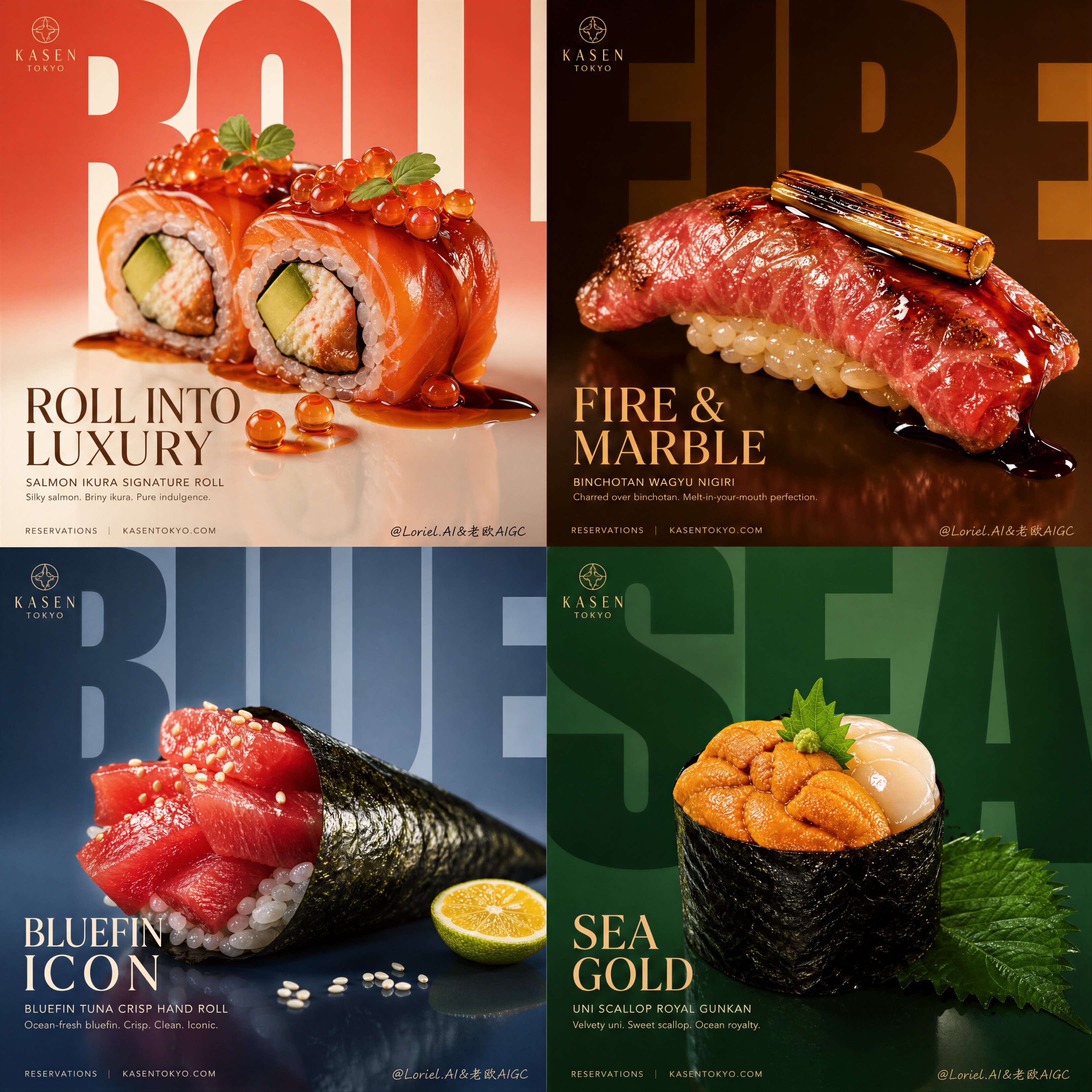
Create an ultra-premium horizontal 2x2 four-panel Western fine-dining campaign poster for a self-created luxury restaurant brand. The final artwork must feel like a world-class design-annual food advertisement: bold, minimal, product-dominant, collector-grade, and unmistakably high-end. Use a strict four-panel system with absolute visual unity, but make each panel feature a more distinctive signature Western dish with stronger personality, stronger plating identity, and more memorable premium ingredients.

Core composition:
Use a strict 2x2 grid. Each panel must follow the same hierarchy:
1. one massively oversized bold background word fragment or giant cropped letterform,
2. one hero Western dish placed prominently in the lower-middle to center area,
3. one refined English dish headline,
4. one short supporting descriptor beneath,
5. minimal lower information line or brand footer styling.
All four panels must feel structurally identical in rhythm and spacing, like one unified luxury campaign.

Brand direction:
Create a self-invented international fine-dining brand with a refined Western luxury identity, for example "MAISON FLAME". Use elegant English-only branding with restrained premium logo treatment. The brand system must feel modern, exclusive, clean, and highly designed.

Signature dish lineup:
Create four highly characteristic premium Western dishes, each with a stronger fine-dining identity than ordinary steak-or-salmon menu items:
Panel 1: butter-poached blue lobster tail with saffron beurre monte and charred lemon
Panel 2: dry-aged wagyu rossini with foie gras, black truffle jus, and glazed shallot
Panel 3: herb-crusted Dover sole medallion with citrus beurre blanc and fennel pollen
Panel 4: parmesan-aged truffle risotto with wild porcini, roasted hazelnut, and shaved black truffle
Each dish must feel like a true signature plate from a world-class Western restaurant: highly recognizable, visually special, luxurious, and impossible to confuse with generic food photography.

Color worlds:
Give each panel its own refined color atmosphere while preserving campaign unity:
Panel 1: coral red, shell ivory, saffron gold
Panel 2: deep burgundy, charcoal brown, toasted bronze
Panel 3: pale silver-blue, citrus cream, muted herb green
Panel 4: olive cream, truffle brown, dark moss, hazelnut beige
Each panel must feel distinct yet perfectly synchronized inside one premium brand universe.

Food realism:
Render every dish with extreme realism and premium tactile detail: blue-lobster shell gloss, saffron butter sheen, rich wagyu marbling, foie gras caramelization, black truffle surface texture, Dover sole flesh layers, beurre blanc gloss, creamy risotto flow, porcini texture, shaved parmesan translucency, and refined plate-edge reflections. Every hero dish must feel jewel-like, luxurious, and immediately edible.

Milk Cloud Orbit food-light logic:
This is critical. Increase the purity of highlights on sauces, butter glaze, jus reflections, meat juices, fish moisture, creamy rice sheen, and plate-edge lighting. The food must feel brighter in the right places, richer, cleaner, and more expensive without becoming greasy. Let each dish glow like a luxury object under precision commercial lighting.

Cream Halo Transit ingredient logic:
Keep the same four-panel skeleton, but reduce each panel to only 2-3 essential supporting elements so the dish becomes more iconic and less busy:
Panel 1: charred lemon, saffron butter gloss, micro herb
Panel 2: foie gras, black truffle slice, glazed shallot
Panel 3: citrus segment, fennel pollen, beurre blanc reflection
Panel 4: shaved black truffle, porcini, roasted hazelnut
No clutter, no garnish overload, no buffet feeling. Supporting ingredients must amplify the hero dish, never compete with it.

Oversized typography logic:
Make the giant background typography much larger than before, so large that each word fragment fills most of the panel and gets cropped by the panel edges. The typography must feel monumental, graphic, and architectural.

Typography-background fusion:
The oversized letterforms must be deeply fused into the background color field through tonal blending, subtle texture continuity, soft depth layering, glow falloff, shadow overlap, and atmospheric integration. The letters should feel embedded into the panel rather than pasted on top. Let the food sit in front of the giant typography while the type melts into the background world behind it. Some steam haze, sauce shine, plate reflections, or ingredient highlights may lightly cross in front of the giant letters, strengthening the integration.

Headline system:
Each panel should include a refined smaller headline such as:
"SAFFRON TIDE"
"ROSSINI FIRE"
"CITRUS VEIL"
"TRUFFLE CROWN"
These smaller headlines remain elegant and readable, while the giant background type acts as the main graphic force.

Lighting:
Use extremely delicate, soft, high-end commercial lighting. Let the food surfaces glow with refined highlight rolloff, subtle shadow grounding, and elegant dimensional separation. The light must feel luxurious, velvety, and world-class, while also helping the giant typography fuse naturally into the background.

Background:
Use minimal, clean, saturated backgrounds with subtle premium smoothness. The background must feel spacious and controlled, but structurally bonded to the giant type. No restaurant interior, no scenery, no unnecessary props.

Surface and finish:
Let each dish sit on a clean reflective or semi-reflective base with controlled reflections. Keep the finish sharp, polished, and premium, like a collector-grade dining campaign printed for a design annual.

Mood:
luxury, refined, bold, modern, Western fine dining, product-dominant, editorial, appetizing, premium, graphic, clean, collector-grade

Rendering style:
ultra-realistic luxury Western fine-dining campaign poster, 2x2 four-panel layout, self-created premium restaurant brand, massively oversized fused typography, stronger type-background integration, four refined color worlds, more distinctive signature Western dishes, compressed essential ingredients, jewel-like food highlights, sharp food realism, elegant commercial lighting, high-end editorial design, 8k, world-class image quality

Negative

prompt:
cheap fast-food look, cluttered garnish, buffet composition, generic steak plate, ordinary salmon fillet, weak dish identity, messy sauce splash, low-detail food texture, fake meat surface, distorted plating, weak typography, small background text, pasted text effect, generic black font, crowded background, low-end menu design, cartoon rendering, muddy lighting, plastic-looking food, low resolution