Create a premium, photorealistic 3D mockup of a beautifully designed hardcover travel book about [COUNTRY / CITY / DESTINATION], styled like a real, finished book ready to be picked up and opened.

1. Physical book presentation

Show the book standing upright at a slight three-quarter angle against a warm, neutral beige studio background. Clearly display the front cover, visible spine, thick hardcover binding, subtly textured linen or matte paper finish, realistic page edges, gentle studio lighting, and a soft natural shadow. The book must look physically real, professionally published, and ready for a bookstore shelf — not like a flat poster.

2. Cover design

Use a minimalist, elegant vintage-illustrated aesthetic with a warm ivory or cream background, refined serif typography, generous negative space, and a sophisticated editorial layout.

At the top, display the name of a famous, real author associated with the destination, chosen appropriately for the book’s subject. Add a small, delicate ornamental emblem inspired by local culture.

Place the destination name “[DESTINATION NAME]” prominently in large, elegant serif lettering. Use a tasteful color inspired by the destination, such as deep red, navy blue, forest green, or earthy terracotta.

Below the main title, include the subtitle:

“A JOURNEY THROUGH HISTORY, CULTURE AND TIMELESS PLACES”

Keep the typography perfectly aligned, balanced, legible, and beautifully spaced.

3. Destination illustration

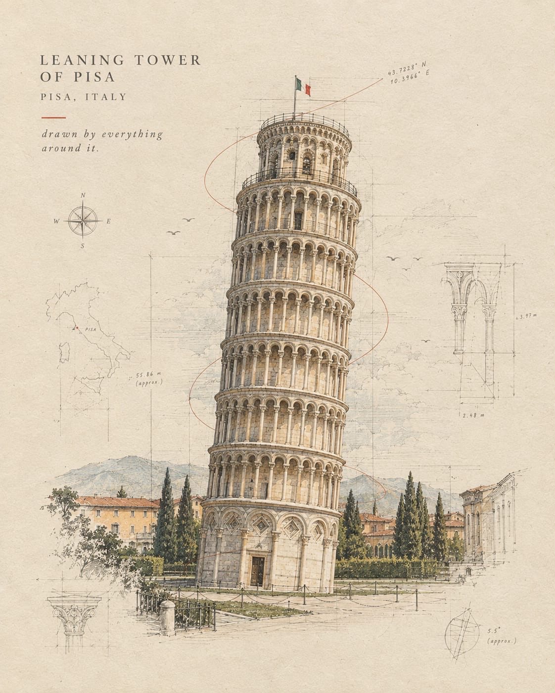
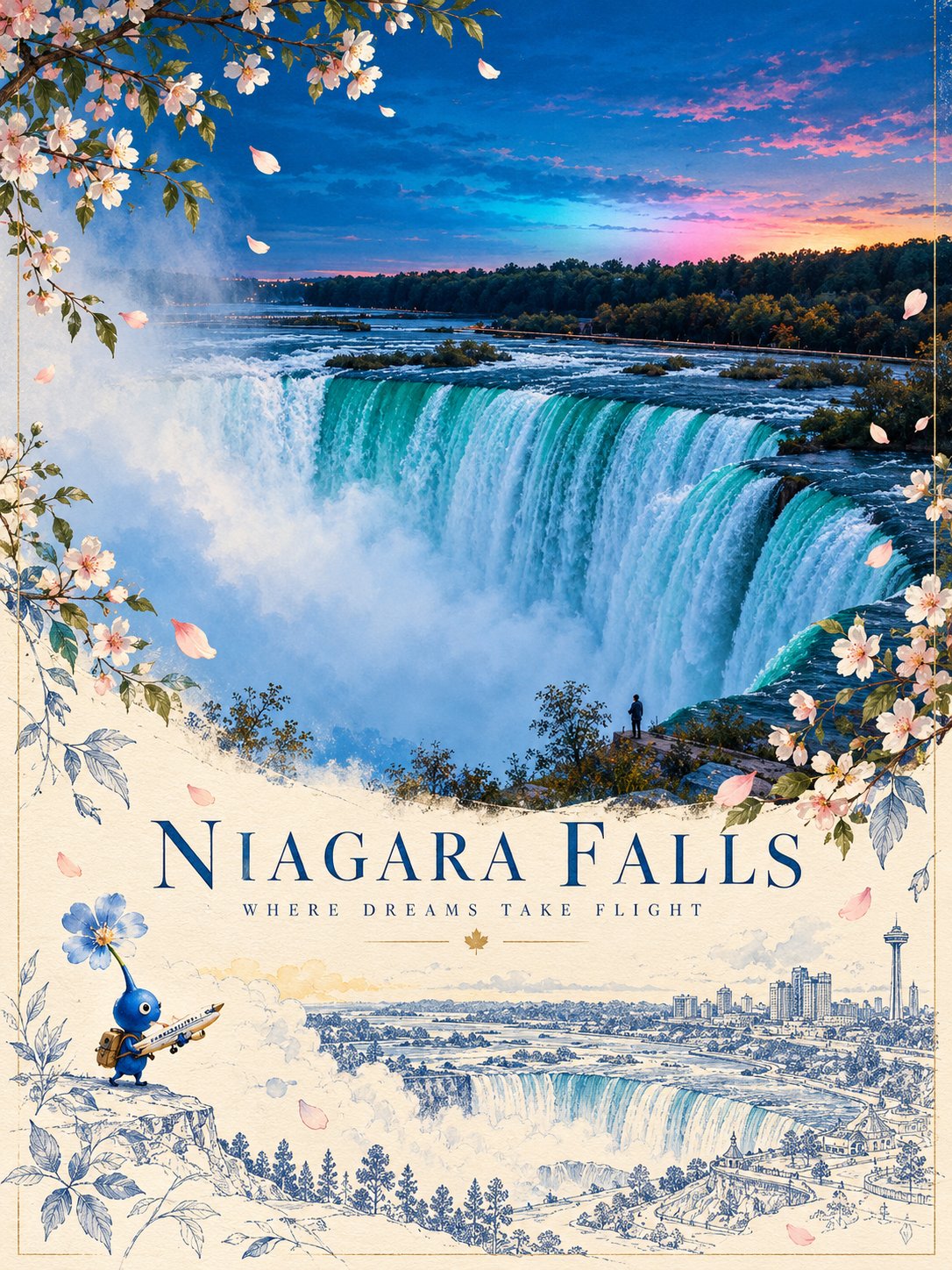
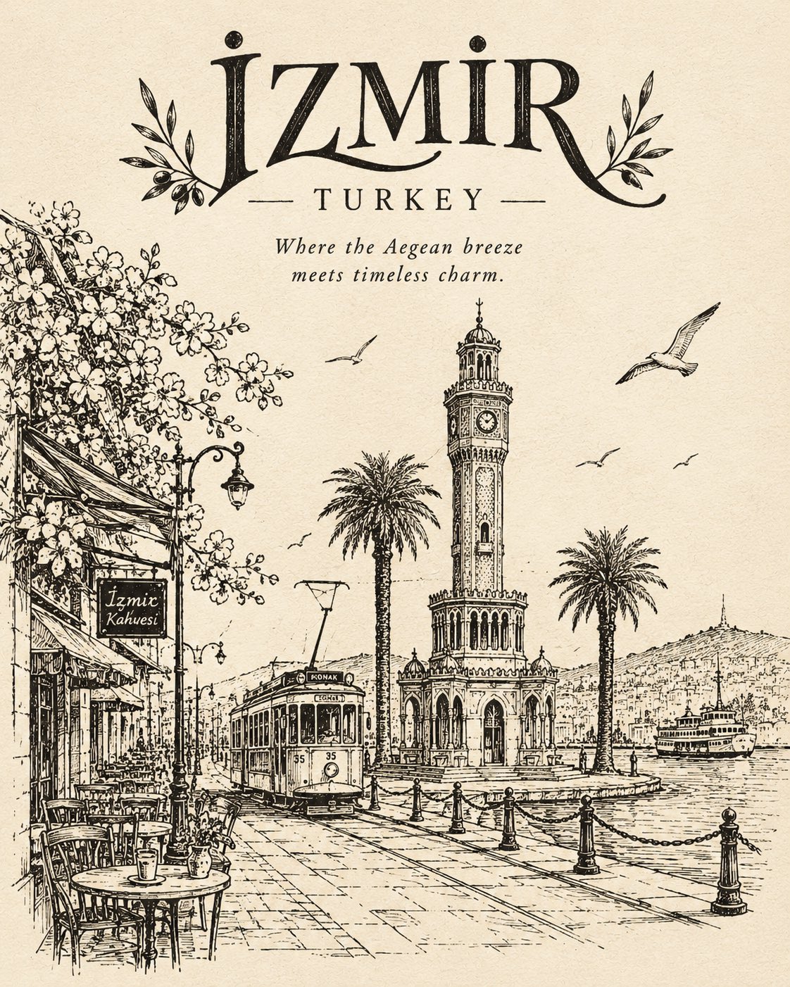
Illustrate the lower portion of the front cover with a sophisticated, painterly vintage scene featuring the destination’s most recognizable landmarks, distinctive architecture, natural scenery, and subtle cultural details.

Include only a carefully curated selection of iconic visual elements that immediately communicate the destination’s identity. Use delicate watercolor textures, muted natural colors, atmospheric depth, fine details, and the nostalgic charm of an illustrated travel book.

The illustration should complement the typography rather than overwhelm it. Maintain ample clean space around the title and subtitle.

4. Spine design

Make the spine clearly visible, with the destination name and author name arranged elegantly in readable serif typography. Add a small matching decorative emblem for a cohesive, professionally designed book series.

5. Art direction and quality

Premium independent-publisher aesthetic, understated luxury, vintage travel illustration, textured cream book cloth, timeless typography, balanced composition, realistic hardcover proportions, subtle paper grain, warm editorial studio photography, soft shadows, crisp details, sophisticated color harmony.

Important constraints: Maintain the same physical book angle, composition, typography hierarchy, background, and lighting across the entire collection. Change only the destination name, appropriate author, accent color, cultural emblem, and destination-specific illustration.

The result must unmistakably look like a real, elegant hardcover book photographed in a studio, not a flat graphic, magazine cover, travel poster, or floating digital artwork.

, 2026
·
1,