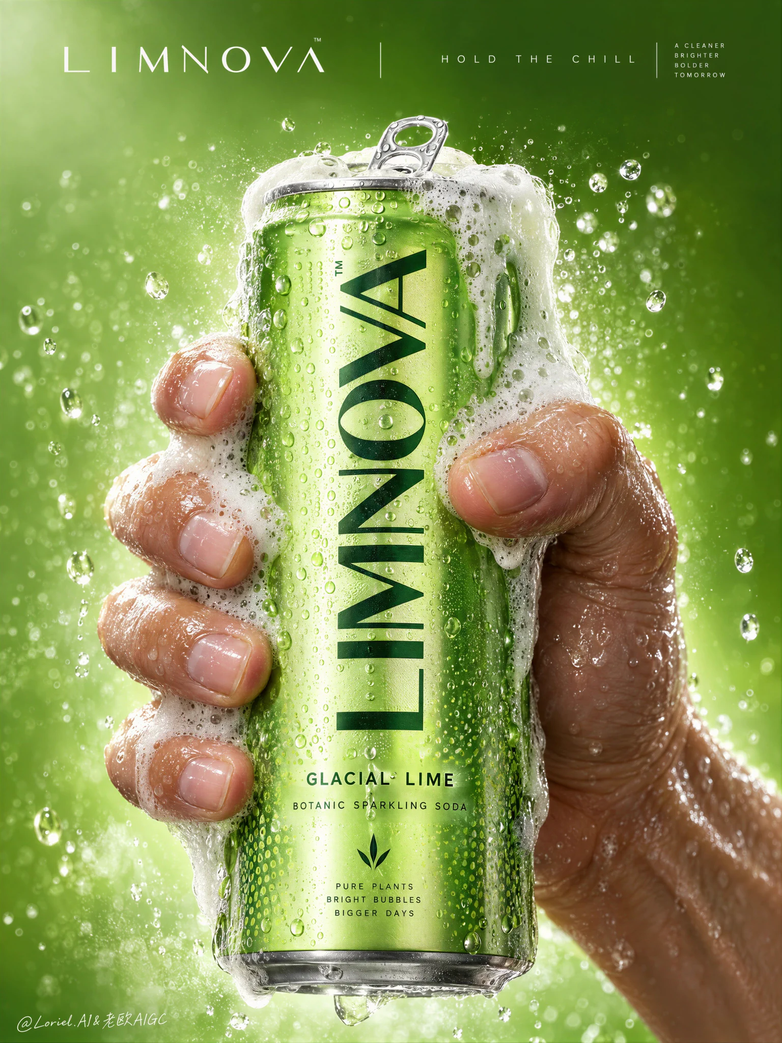
The pressure feels real because the foam follows the hand’s grip instead of hiding the product.
🫧 dense foam cresting at the rim, then spilling down the can’s side edges and across selected fingers while leaving the main logo and flavor line clear
This gives you a true release moment without sacrificing pack recognition. The foam looks active, but the brand still reads instantly.
🧊 one wet hand wrapping from the right and lower rear, with visible knuckle tension, natural finger spacing, and slight skin compression against the can
The grip adds force without crushing the can or making the anatomy feel artificial. Product, hand, and foam become one tightly controlled central mass.

GPT- image 2.5

prompt
👇
Create a Cannes-level commercial poster for fictional premium sparkling soda brand LIMNOVA, merging tactile product realism, pressure-driven human interaction, and ultra-clean gallery-grade graphic design into one unified hero image. The core concept is controlled release: a cold lime soda can gripped at peak tension, overflowing with foam and condensation, turning an ordinary beverage moment into a sculptural event of freshness, pressure, and desire.

Use a vertical full-bleed poster in extreme close-up, rule-of-thirds disciplined but visually centralized. Preserve the exact structure: a single slim can dominates the center, held tightly by one wet human hand wrapping from the right and lower rear; dense foam crowns the top and spills down the can; broad negative space remains above for elegant brand typography. The hand, can, and foam should read as one compressed central mass, surrounded by a luminous citrus atmosphere with no extra props. The can must remain the undisputed focal point and fully legible.

The subject is a hyperreal slim aluminum soda can in radiant glacial lime green, with crisp pull-tab geometry, subtle printed microtexture, dense condensation droplets, and refined premium branding. Use the fictional text “LIMNOVA” as the main vertical logo, “GLACIAL LIME” as the flavor line, and “BOTANIC SPARKLING SODA” as the descriptor. The identity should feel bold, contemporary, and luxury-clean, with strong custom letterforms and exact print clarity. The can should look manufacturable, collectible, and ice-cold.

One realistic human hand grips the can firmly with correct five-finger anatomy, natural finger spacing, believable knuckle tension, realistic nail beds, subtle skin compression, and wet highlights. The grip communicates force and freshness, not aggression. Foam surges over the top rim and flows across the fingers and can in airy dense clusters, while suspended micro-droplets and faint carbonation mist activate the space. The can remains undeformed except for natural optical tension created by the grip and liquid pressure. No extra hands, no anatomy drift.

Build a minimal studio field rather than a literal location. The background is a luminous acid-lime to chilled-chartreuse gradient with suspended droplets, vapor-like fizz haze, and a soft freshness halo around the product. Keep the space clean and abstract, letting the product, hand, and foam generate all depth. No fruit slices, no ice cubes, no bar setup, no clutter. The world should feel like a distilled atmosphere of citrus pressure and cold carbonation.

Lighting is a premium studio setup with a bright frontal key, cool upper-left freshness lift, and narrow specular edge highlights on wet aluminum and skin. Palette hierarchy: 60% glacial lime and electric citrus green, 30% white foam and bright condensation highlights, 10% natural warm skin tone as tactile counterpoint. Contrast should be crisp yet soft-edged, with no dead blacks, dirty grey mud, or cartoon oversaturation. The emotional tone is icy, alive, compressed, clean, and addictive.

Materials must feel extremely photoreal: sharp reflective aluminum edges, chilled metallic bloom, droplets merging into trails, subtle ink adhesion texture; foam that feels light, wet, aerated, and creamy with translucent bubble variation and convincing thickness at the rim and fingers; and a real, de-AI hand with accurate anatomy, realistic skin texture, natural moisture sheen, crease detail, true finger joints, and no swollen or fused forms. Apply restrained high-end commercial polish, keeping hero detail sharp and print-ready.

Integrate a minimalist top header as a refined brand system, not ad clutter. Place “LIMNOVA” on one side of the top band and a secondary studio-style signature or edition mark on the other, separated by a thin elegant divider. If an extra micro-headline is used, keep it very restrained, such as “HOLD THE CHILL” or “PRESS THE FIZZ”, set small outside the can recognition zone. Typography must feel architected into the negative space, aligned with the product axis, and never heavy or crude.

Output: a premium beverage poster with product-first hierarchy, hyper-clean execution, strong tactile realism, elegant negative space, and exact brand readability. No extra cans, no fruit garnish, no ice props, no chaotic splash overload, no warped can geometry, no broken tab, no malformed hand, no extra or merged fingers, no unreadable text, no muddy shadows, no large dead black blocks, no low-quality AI artifacts, no clutter, no style drift, and no resemblance to existing real soda branding.
·