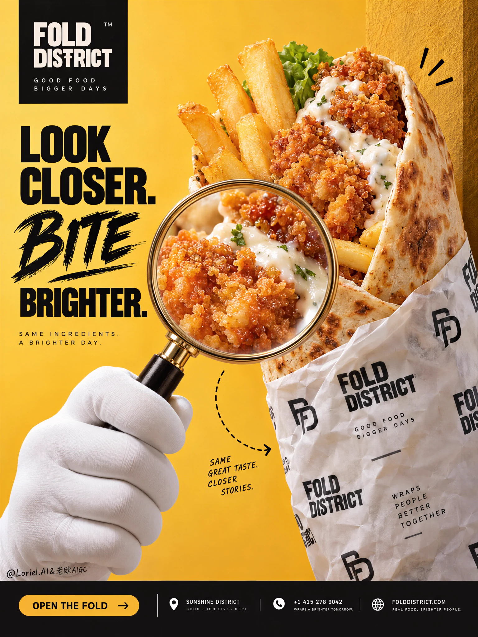
The magnifying glass works when it enlarges appetite—not when it becomes a gimmick.
🔍 large magnifying glass entering from the lower left, enlarging one tight section of crispy chicken and glossy sauce with true optical magnification
You get a clear reason to look closer: sharper crumb, richer sauce, more texture. The food feels more tangible without being distorted.
🌯 upright wrap anchored along the right third, with the branded paper sleeve covering only the lower half and the open filling kept fully visible
The packaging builds brand presence while the exposed top still does the selling. Product, paper, and headline each keep their own territory.

GPT- image 2.5

prompt
👇
Create a Cannes-level commercial food poster for fictional premium wrap brand FOLD DISTRICT, merging tactile real food photography, bold graphic advertising, and subtle gallery-like art direction into one unified hero image. The core idea is discovery through appetite: an oversized loaded wrap as the dominant edible object, inspected through a magnifying glass, with every element reinforcing curiosity, craving, and brand precision. The result must feel witty, premium, contemporary, and highly publishable.

Use a vertical full-bleed poster with a front-facing studio setup and slightly close hero framing. Preserve the exact structure: the wrap emerges from the right side as the main visual pillar, partially overlapping a tall warm-toned vertical panel at the far right edge; a large magnifying glass enters from the lower middle-left and enlarges the most seductive food detail; broad controlled negative space fills the left side for headline typography; a clean bottom information strip spans the full width. Add one restrained curved dashed motion line in the lower half to connect the rhythm. The wrap must remain the clear primary subject.

Design an oversized open-top chicken wrap with highly realistic toasted flatbread, visible golden fries, crisp fried chicken fillets, creamy white garlic-style sauce, and a small fresh green accent near the top opening. The tortilla should show soft blistering, gentle browning, believable thickness, natural fold stress, and subtle elasticity. The fried chicken must look extremely appetizing, with irregular crunchy crumb texture, rich amber-gold tones, fine oil sheen, and believable density. Fries should feel freshly fried, lightly salted, and firm. Sauce should read as thick, glossy, and freshly layered. The food must feel edible, premium, and physically present, never plastic.

The lower half of the wrap is enclosed in premium branded white paper with repeated black FOLD DISTRICT typography and a minimalist emblem system. The wrapper should feel like a custom fast-casual identity: graphic, modern, urban, and elegant. Show realistic paper crumpling, fold memory, slight translucency in compressed zones, printed ink variation, and shadowed wrinkles where hand and food mass create pressure. The repeated graphics should support the poster rhythm without overwhelming the hero read.

A smooth white mascot-like gloved hand rises from the lower center-left, holding the magnifying glass with correct finger anatomy, natural grip tension, elegant wrist angle, and believable object weight. The magnifying glass should enlarge one delicious section of crispy chicken and sauce with convincing optical magnification, not surreal distortion. The wrap remains upright, slightly angled toward camera, with the filling clearly visible. Keep one or two very small playful accent marks near the upper right of the wrap to suggest surprise and delight.

The background is a luminous saffron-yellow studio field with soft tonal modulation, paired with a slightly darker textured golden vertical panel on the right for depth and framing. No restaurant interior, furniture, or clutter. Depth comes from overlap, scale hierarchy, the foreground magnifying glass, wrapper folds, and the right structural plane. The space must stay bold, minimal, and graphically disciplined.

Lighting is bright premium studio light with a soft frontal key, subtle upper-left lift, and delicate shadows preserving dimensionality without heaviness. Palette hierarchy: 60% saturated saffron and warm golden yellow, 30% black and creamy white for graphic contrast, 10% toasted beige, fried amber, and small fresh green accents. The image should feel energetic and appetizing, but also clean, expensive, and globally contemporary. Keep blacks rich but not dead, highlights creamy but not blown, and shadows clean rather than greasy.

Materials must feel hyperreal and tactile: tortilla blister texture, crisp crumb structure, slight salt crystals on fries, moist sauce sheen, subtle wrapper paper grain, a polished warm metallic magnifying-glass rim, and a matte soft-touch glove surface. Keep hero zones highly sharp and readable, with controlled micro-contrast and restrained premium poster polish. The finish should sit between bold mass-market food advertising and a more elevated design-forward campaign.

Integrate original English typography as part of the composition. Main headline on the left: “LOOK CLOSER. BITE BRIGHTER.” Use a mixed system where one word receives expressive brush-script emphasis and the supporting lines are set in a sharp heavy sans-serif with elegant spacing. Place the FOLD DISTRICT logo inside a black brand block near the upper left. In the bottom full-width bar, include a refined CTA capsule reading “OPEN THE FOLD”, followed by minimalist brand metadata such as district location, contact line, and website in clean editorial alignment. Typography must feel sculpted into the poster flow, avoid the food recognition zone, and remain visually premium.

Output: a premium food poster with product-first hierarchy, strong graphic rhythm, minimal clutter, highly readable food detail, clean commercial realism, a witty but controlled concept, and elegant brand unity. Avoid extra limbs, malformed fingers, duplicated fries, warped tortilla geometry, broken magnifying glass, unreadable text, random props, greasy mess, muddy lighting, cheap stock-poster styling, chaotic backgrounds, floating ingredients, distorted packaging, low-grade AI texture, or off-brand visual noise.
·