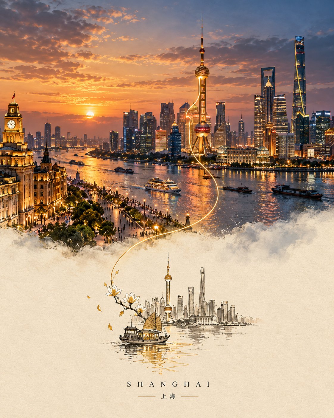
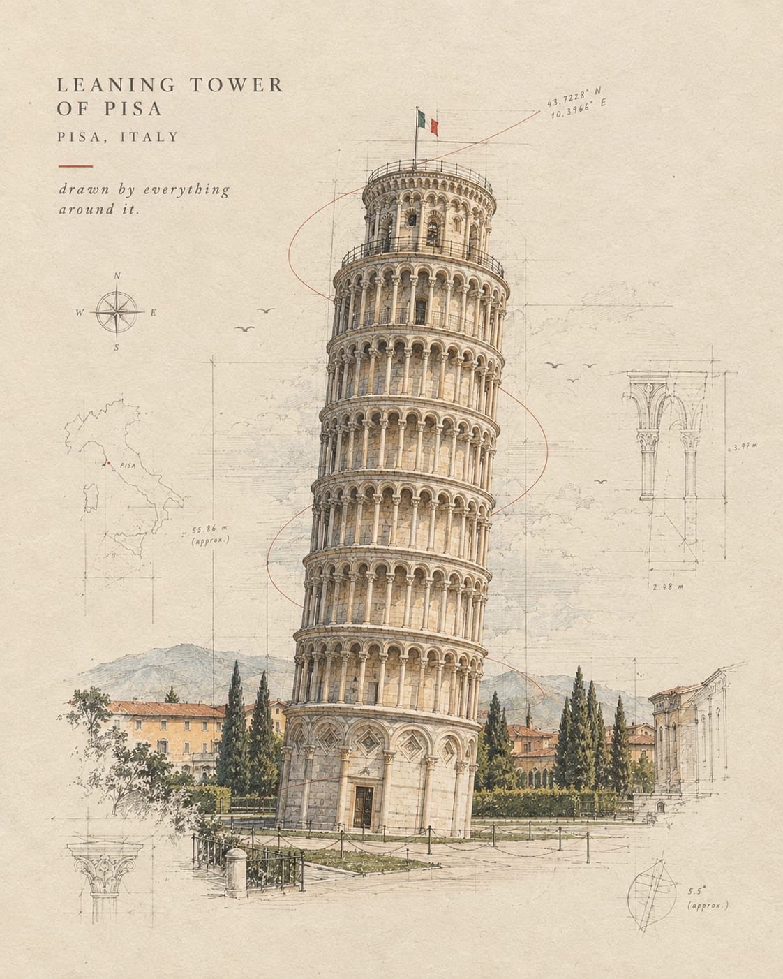
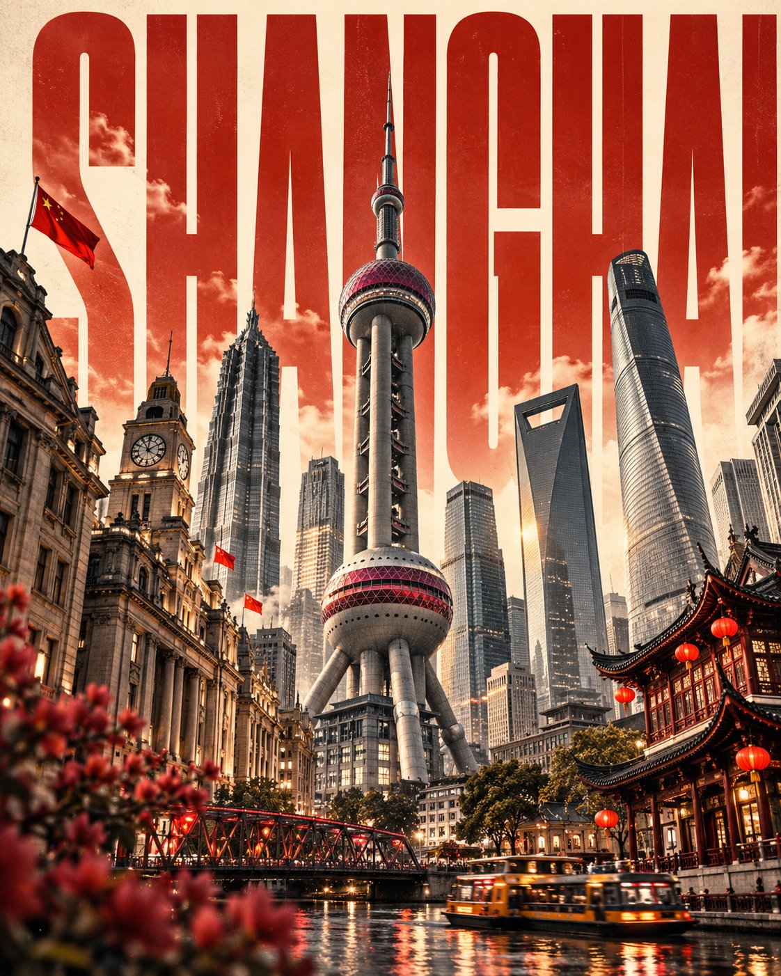
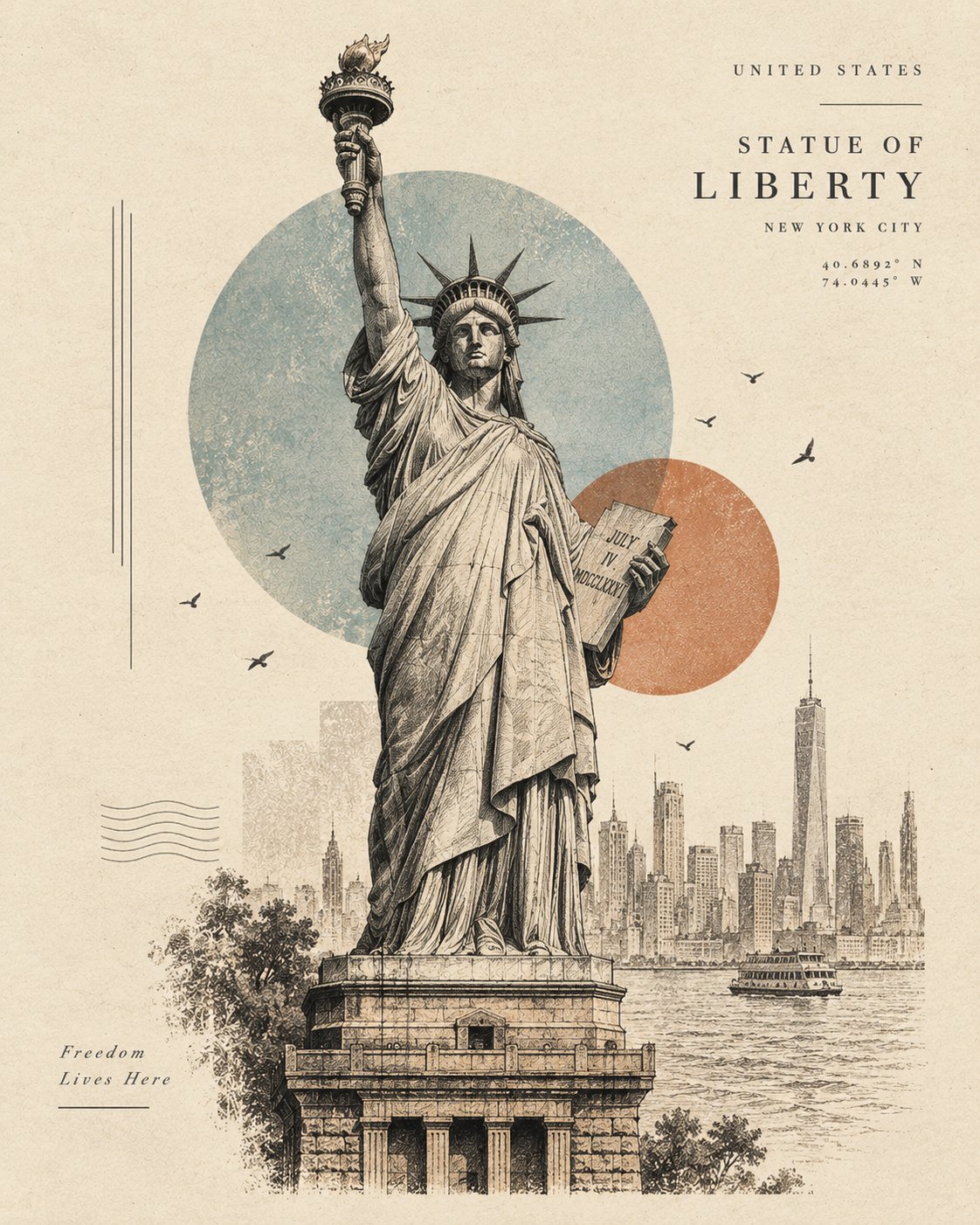
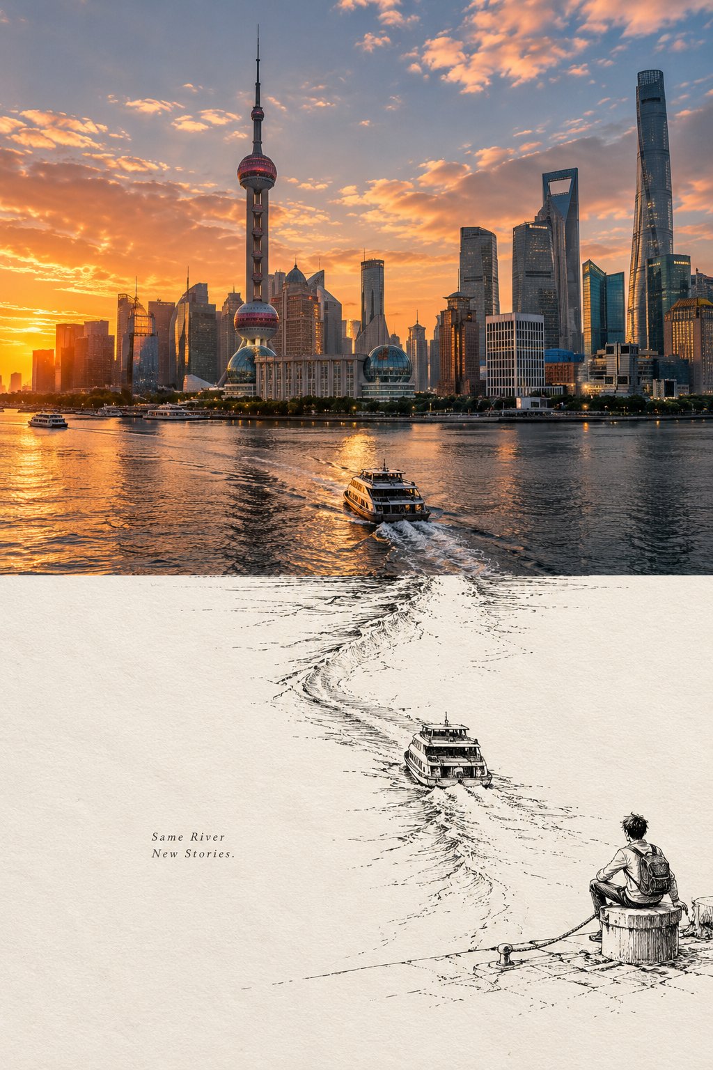
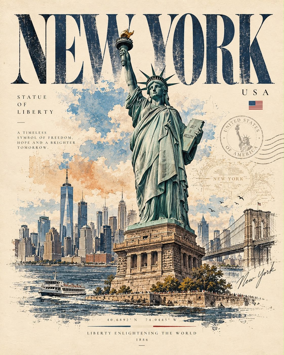
Create a premium 3:4 vertical editorial memory poster for [COUNTRY / CITY / LOCATION / SUBJECT].

TEXT-TO-IMAGE ONLY — generate the entire artwork creatively from [COUNTRY / CITY / LOCATION / SUBJECT] alone. No reference image required.

CORE CONCEPT
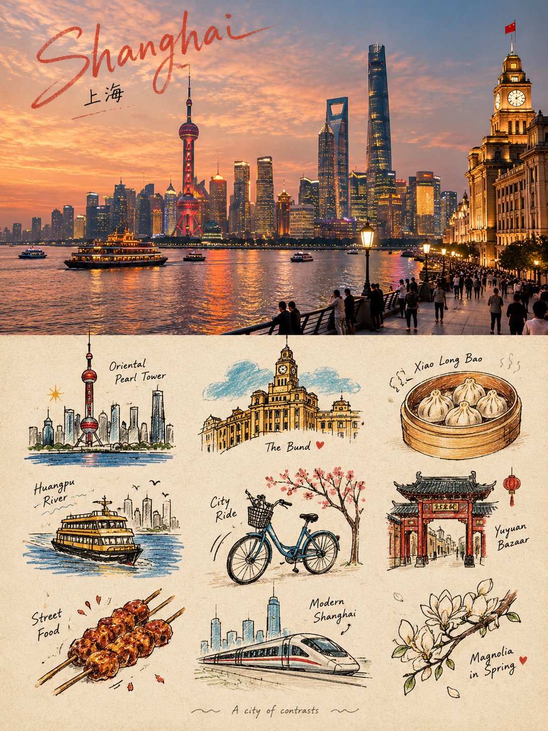
Create a sophisticated visual diary that combines one realistic destination scene with a playful 3×3 collection of illustrated memory fragments. The artwork should feel like a private travel handbook, independent art publication, or collectible visual diary.

UPPER HALF
Fill the entire upper 50% with a cinematic, highly realistic scene representing [COUNTRY / CITY / LOCATION / SUBJECT]. Automatically select the most recognizable subject, environment, architecture, landscape, people, objects, lighting, and atmosphere associated with the location.

Keep the scene natural and authentic, with refined editorial color grading, realistic textures, natural light, subtle film character, and strong photographic composition.

LOWER HALF
Use the lower 50% as a warm paper-based illustrated memory board. Extract the most recognizable visual ideas associated with the upper scene and reinterpret them as 9 simplified graphic memory units.

Include a mixture of:
  • the main subject or silhouette
  • local landmarks or architectural details
  • transportation
  • food or objects
  • plants or nature
  • gestures or human actions
  • cultural details
  • small environmental elements
  • emotional or symbolic details

3×3 MEMORY GRID
Arrange the nine elements using a loose hidden 3×3 grid. The grid should guide the composition without appearing as a rigid table.

Allow each illustration to vary slightly in size, position, angle, and spacing. Keep the arrangement organic, playful, balanced, and intentionally imperfect.

ILLUSTRATION STYLE
Use Naïve Hand-drawn Doodle Illustration with simple slightly awkward forms, trembling outlines, uneven line weight, partially open contours, rough edges, and visible handmade imperfections.

Combine thin black ink lines with colored pencil and crayon textures, small flat color blocks, scattered pigment particles, visible paper grain, white gaps, and unfinished coloring.

Do not realistically redraw the upper scene. Compress its visual information into simple memorable symbols.

TYPOGRAPHY
Add one small handwritten title inspired by [COUNTRY / CITY / LOCATION / SUBJECT] near the top of the composition. Add a tiny handwritten caption near the bottom.

Small decorative elements such as loose wave lines, stars, dots, arrows, or tiny symbols may appear sparingly around the illustrations.

PAPER & COMPOSITION
Use a warm off-white paper background with subtle physical grain and generous negative space. If any grid indication is visible, make it extremely faint and pencil-like, as though lightly sketched during the design process.

FINAL AESTHETIC
Realistic travel photography × naïve doodle illustration × 3×3 memory collection × colored-pencil texture × private travel journal × contemporary independent editorial design.

Keep the result loose, cute, restrained, tactile, and highly curated rather than crowded.

Avoid rigid grids, realistic lower-half illustrations, photo duplication, excessive detail, polished vector graphics, glossy digital art, heavy shadows, gradients, clutter, excessive typography, logos, watermarks, or UI elements.

FORMAT: 3:4 vertical, exact 50/50 upper photographic scene and lower illustrated memory collection.

, 2026
·
1,