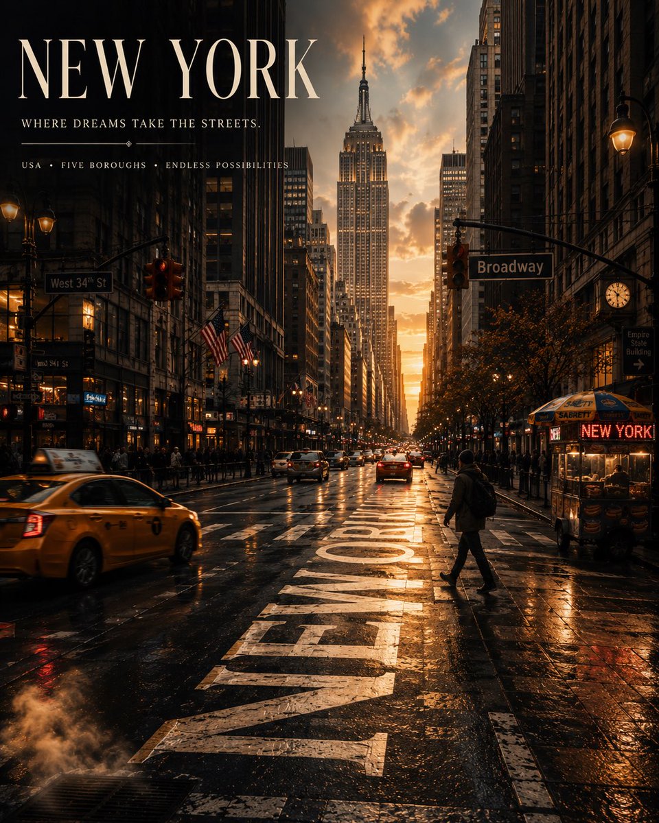
GPT-Image 2
高级
电影感城市:编辑视角的目的地旅行海报
Create a premium 4:5 vertical cinematic travel poster for [CITY], [COUNTRY], using a completely original editorial…
#旅行海报#电影感#GPT-Image2
simeon-sanai
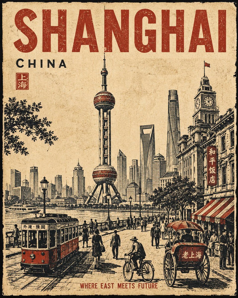
Create a premium 4:5 vertical cinematic travel poster for [CITY], [COUNTRY], using a completely original editorial…
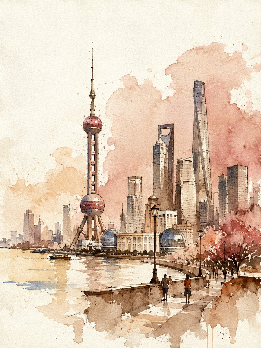
Watercolor and ink travel poster of {CITY}, {COUNTRY}. Vertical 3:4. …

3:4,粗颗粒低解析复古数码闪光人像(本版唯一成像机制),低分辨率质感、明显细碎颗粒、轻微高光溢出、柔和雾感。 成年高颜值韩系女性,窄椭圆冷感脸,新中式玉兰妆粉白变体,奶油氧气底妆,极淡眼尾晕染,淡粉唇,水润只集中在唇部…
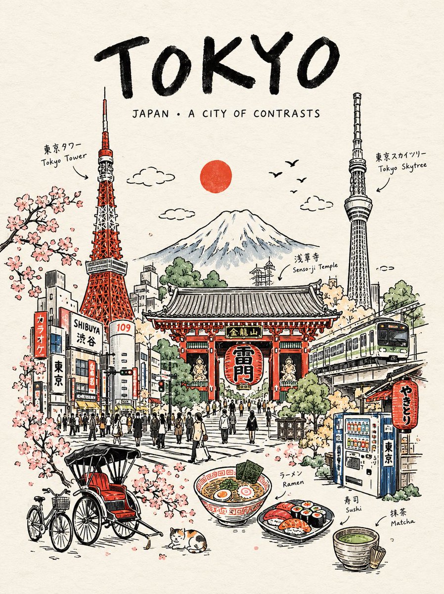
Create a premium vertical 4:5 travel poster for [COUNTRY], illustrated as one elegant continuous hand-drawn line-art…
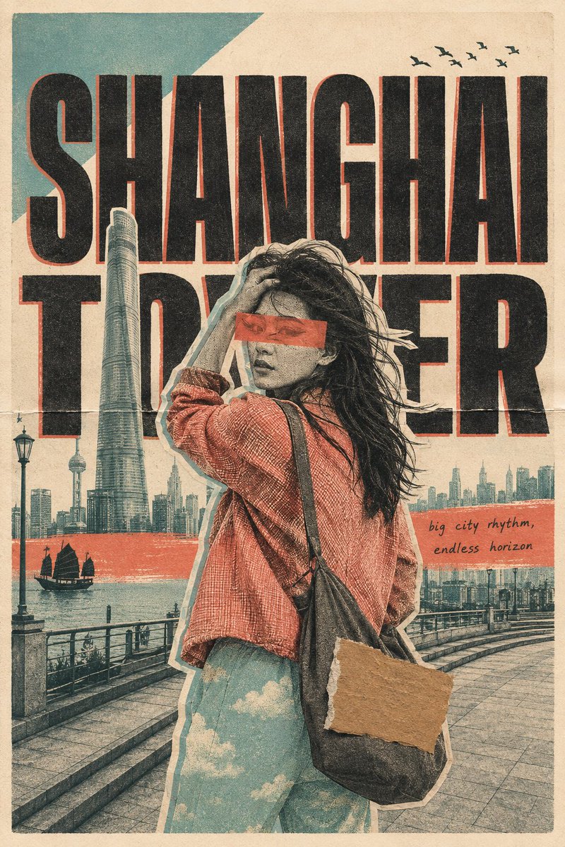
FORMAT. 3:4 vertical travel poster - handmade risograph screenprint and cut-paper collage, scanned from physical paper. …
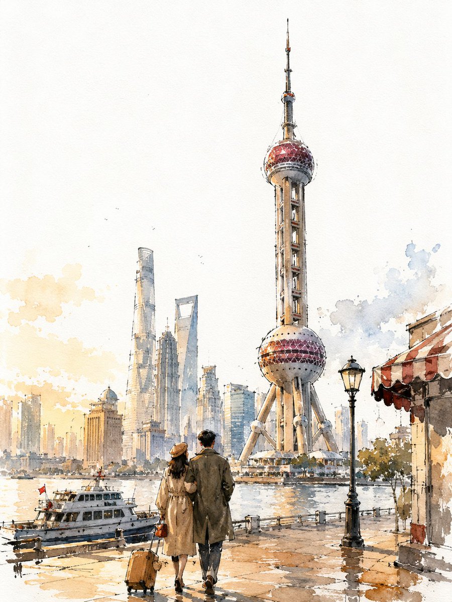
VINTAGE CITY TRAVEL POSTER - [CITY, COUNTRY] (3:4) A loose, hand-painted watercolor-and-ink travel sketch of [CITY],…
下载精美的 Prompt 分享卡片,分享到社交媒体
Create a premium 4:5 vertical vintage travel poster for [CITY], [COUNTRY]. Follow the same visual structure, composition, proportions, and artistic tr...