
GPT-image2
进阶
水彩漫游:墨水笔触下的城市地标速写
cheap grocery ad look, cluttered kitchen, unreadable packaging, generic typography, low-detail pasta, dry noodles,…
#旅行海报#水彩#GPT-Image2
Loriel.AI
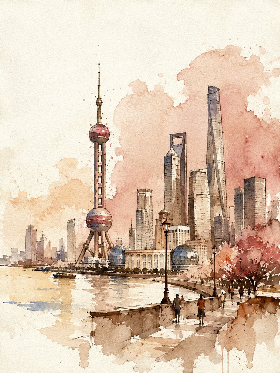
cheap grocery ad look, cluttered kitchen, unreadable packaging, generic typography, low-detail pasta, dry noodles,…
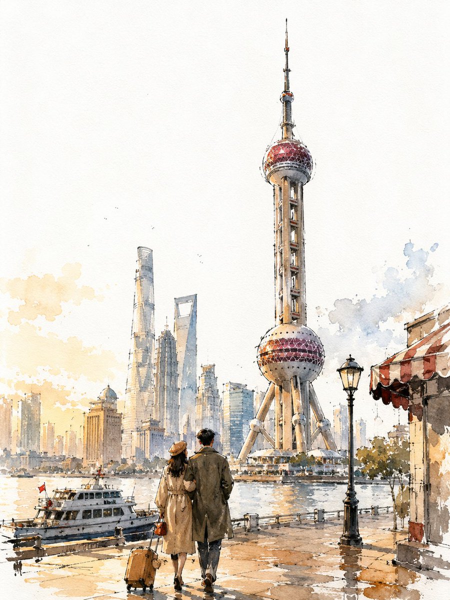
VINTAGE CITY TRAVEL POSTER - [CITY, COUNTRY] (3:4) A loose, hand-painted watercolor-and-ink travel sketch of [CITY],…
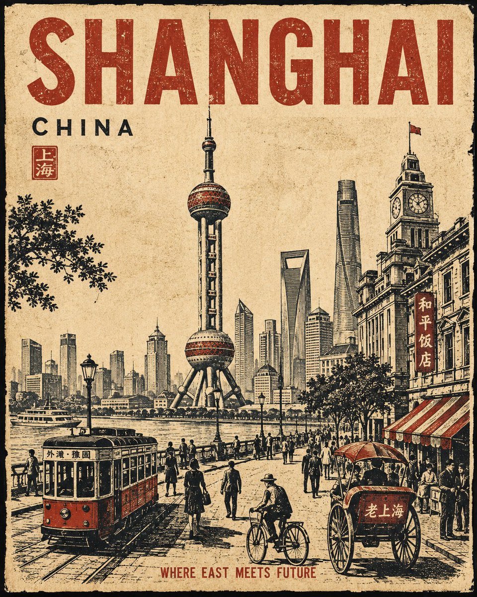
Create a premium 4:5 vertical vintage travel poster for [CITY], [COUNTRY].…

Create a full-body 9:16 realistic fashion editorial featuring an adult young East Asian woman with a refined…
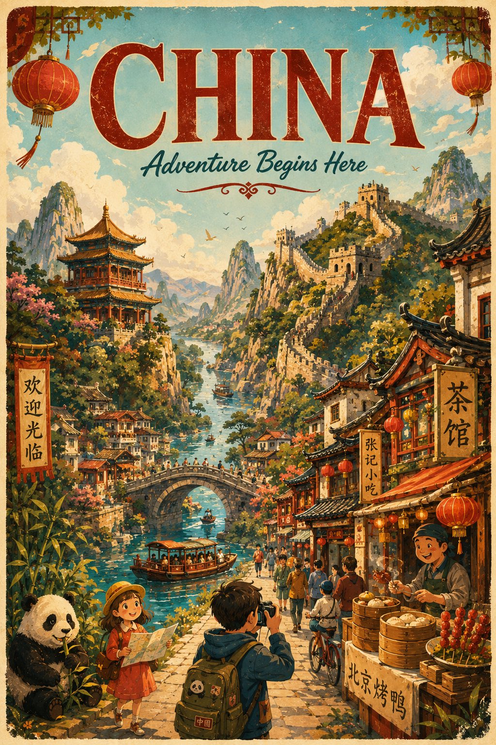
``` simeon-sanai GPT image 2 prompt: Create a beautiful vertical 4:5 cartoon-style illustrated travel poster for…
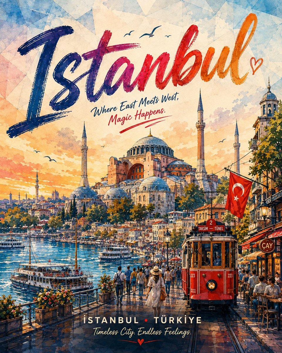
Create a premium vertical travel-poster illustration for [CITY], [COUNTRY], designed for maximum Instagram engagement.…
下载精美的 Prompt 分享卡片,分享到社交媒体
Watercolor and ink travel poster of {CITY}, {COUNTRY}. Vertical 3:4. Loose hand-painted poster, finished — not an abandoned sketch. IDENTITY LOCK — ...