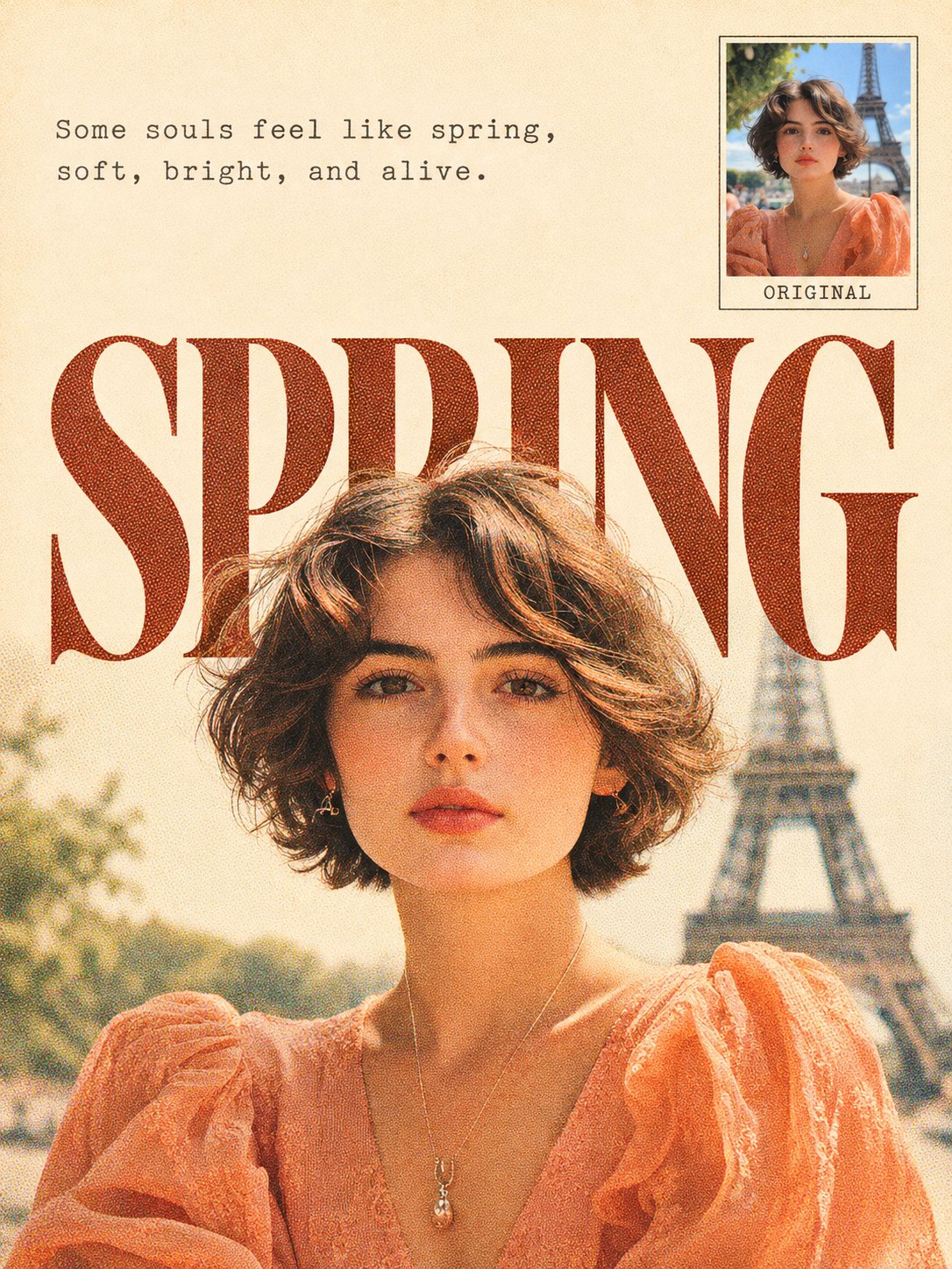
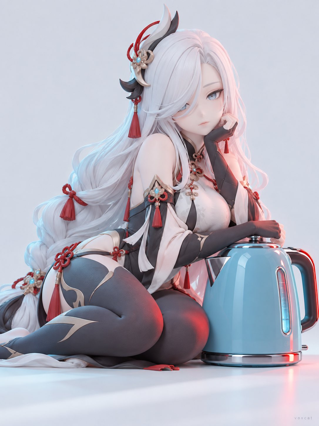
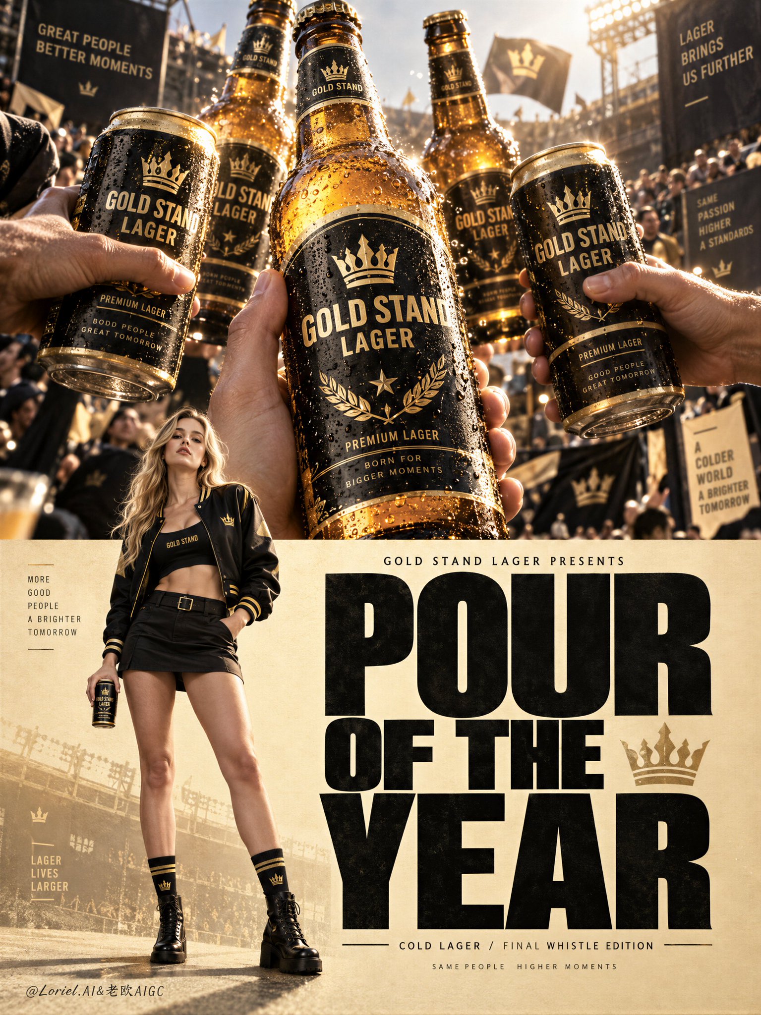
Create a 3:4 vertical poetic vintage editorial poster using the uploaded photograph as the sole reference. Maintain a clean, minimalist composition with retro magazine typography and authentic multicolour halftone print texture.

Study the original photograph and identify the most distinctive subject suitable for an upward-extending composition. Preserve its defining features, original perspective, proportions, pose, and relationship with other subjects. Do not introduce unnecessary objects.

BACKGROUND & COLOUR: Simplify the original environment while retaining essential scene details. Reduce distracting elements into a few harmonious, softly blended colour areas. Extract muted, low-saturation vintage colours from the original photograph rather than replacing the entire background with a solid colour.

TOP SECTION: Reserve approximately one-third of the upper canvas as clean, warm ivory-white space. Add two short English poetic lines that complement the photograph's mood, using subtle, small typewriter-style typography with generous spacing.

MAIN TYPOGRAPHY: Select one meaningful English word that reflects the photograph's subject. Display it across the middle in oversized, high-contrast uppercase serif lettering, leaving balanced side margins. Extract its colour from the photograph's most representative tones, ensuring strong contrast.

SUBJECT INTEGRATION: Extend the original photographic subject naturally upward from the lower scene, passing through and slightly obscuring selected letter strokes. The subject should visibly rise above the typography into the upper ivory space. Preserve realistic anatomy, proportions, perspective, and photographic detail. Never stretch, distort, or make the subject appear to float. Keep the word clearly readable.

SEAMLESS TRANSITION: Maintain one continuous composition. Use the subject's natural silhouette, original lighting, simplified background colours, and gradually fading halftone dots to transition organically into the warm ivory upper space. Avoid rectangular divisions, straight horizontal cuts, cutout edges, harsh gradients, or excessive haze.

HALFTONE PRINT EFFECT: Apply fine, clearly visible circular CMYK-style halftone dots to the large typography and main photographic colour areas. Use denser dots in shadows and lighter spacing in highlights, with subtle cyan, magenta, and yellow misregistration for authentic vintage printing. Keep background dots softer and sparser. Preserve the upper ivory paper area relatively clean, without heavy aged-paper textures. Avoid ordinary digital noise, stains, or scratches.

ORIGINAL PHOTO INSET: Place a small thumbnail of the complete original photograph in the upper-right corner, occupying approximately 15–18% of the canvas width. Preserve its original proportions, colours, and full framing without cropping or editing. Add a fine border and the exact label “ORIGINAL”, ensuring clear spacing from the poetry and main subject.

FINAL AESTHETIC: Maintain a refined visual hierarchy: the photographic subject and oversized typography should dominate, the poetry should remain secondary, and the background should be understated. Enhance the lighting mood to complement the original photograph while preserving realistic photographic textures.

Ensure all English text is correctly spelled. No additional titles, watermarks, unnecessary decorations, or extra labels. Output exactly one complete, polished 3:4 vertical poster, not a collage or mockup.

, 2026
·
1,