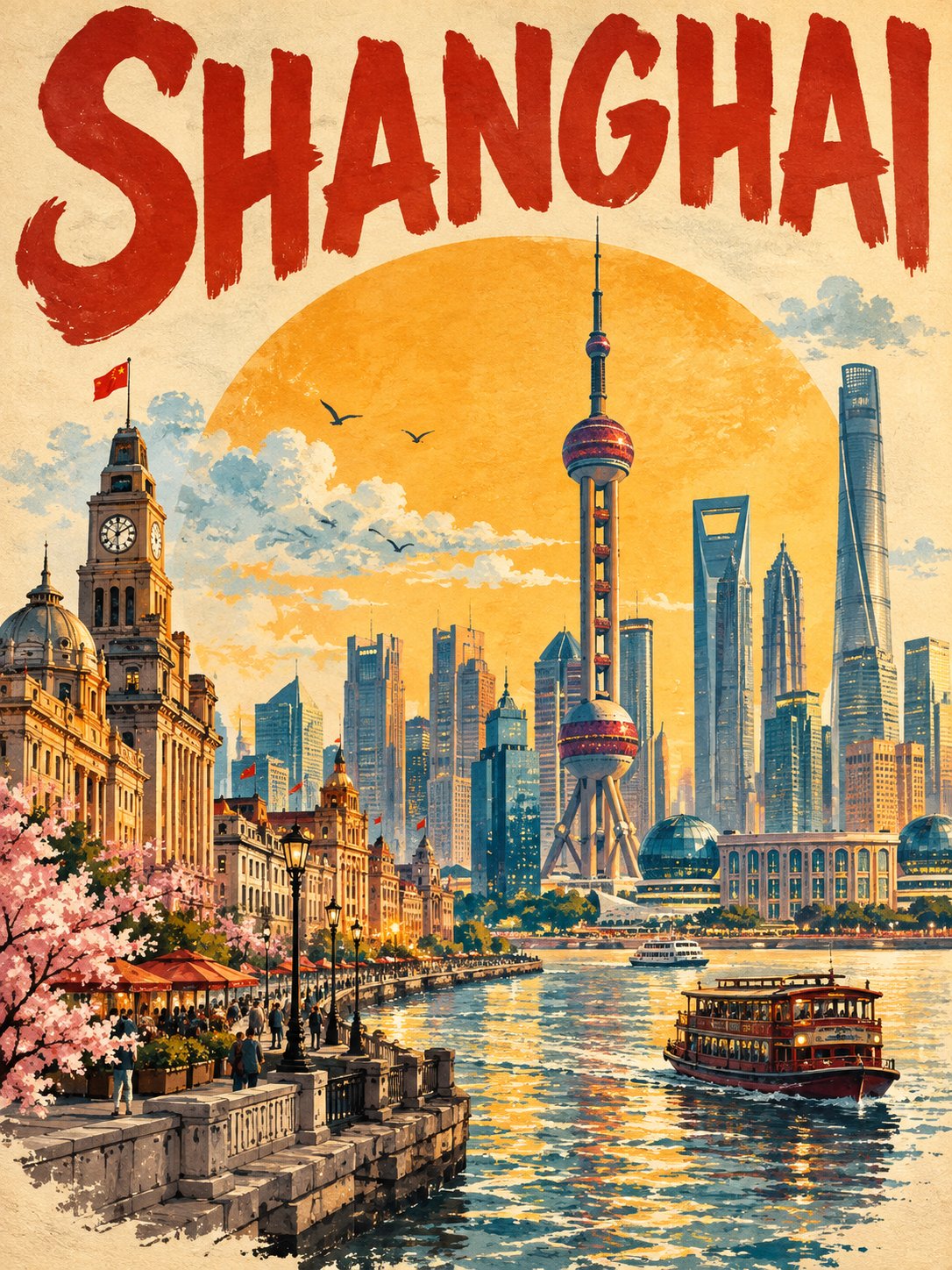
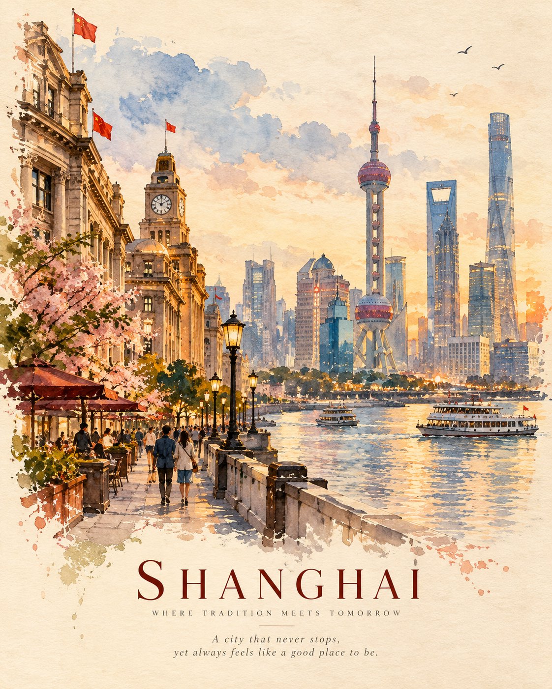
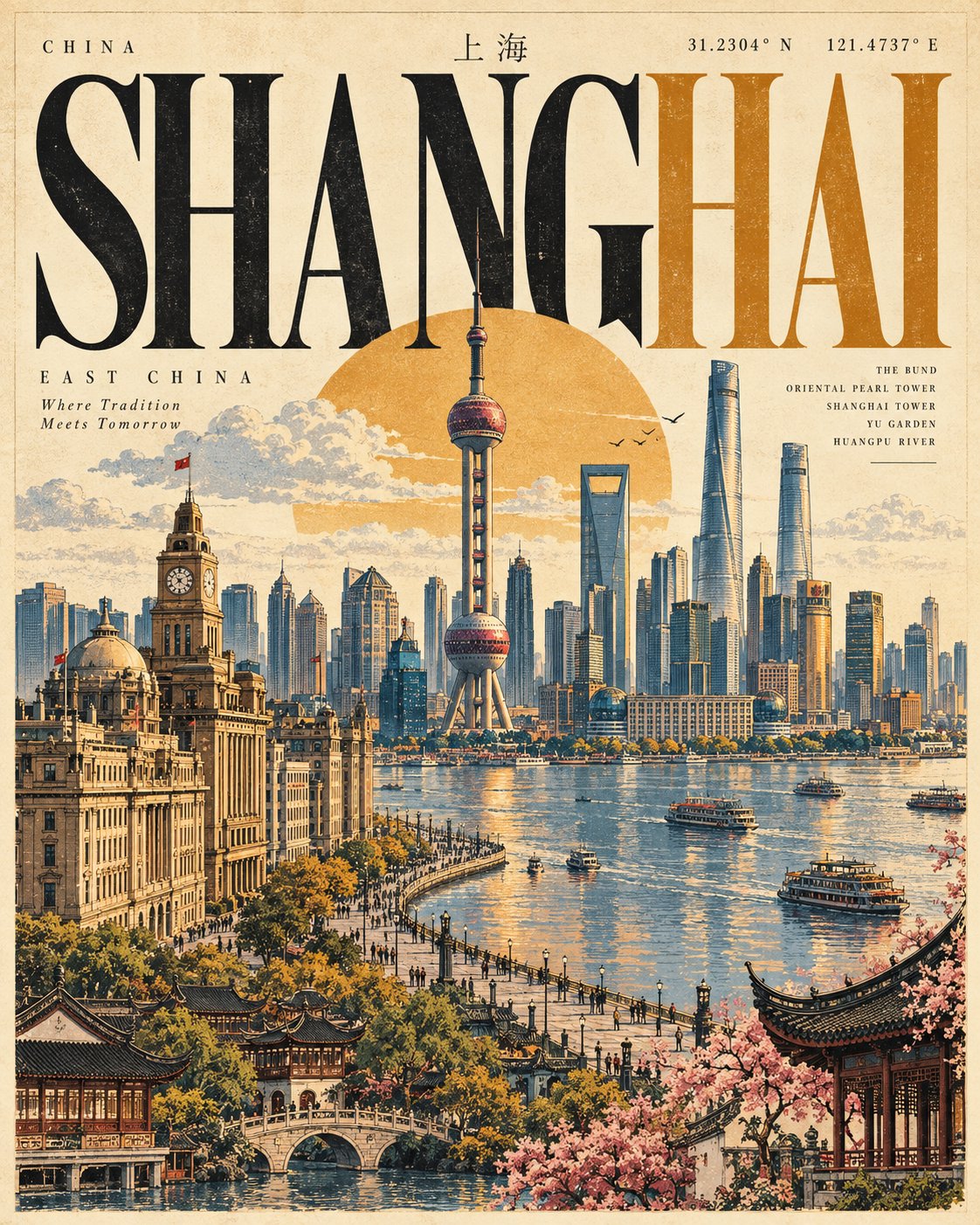
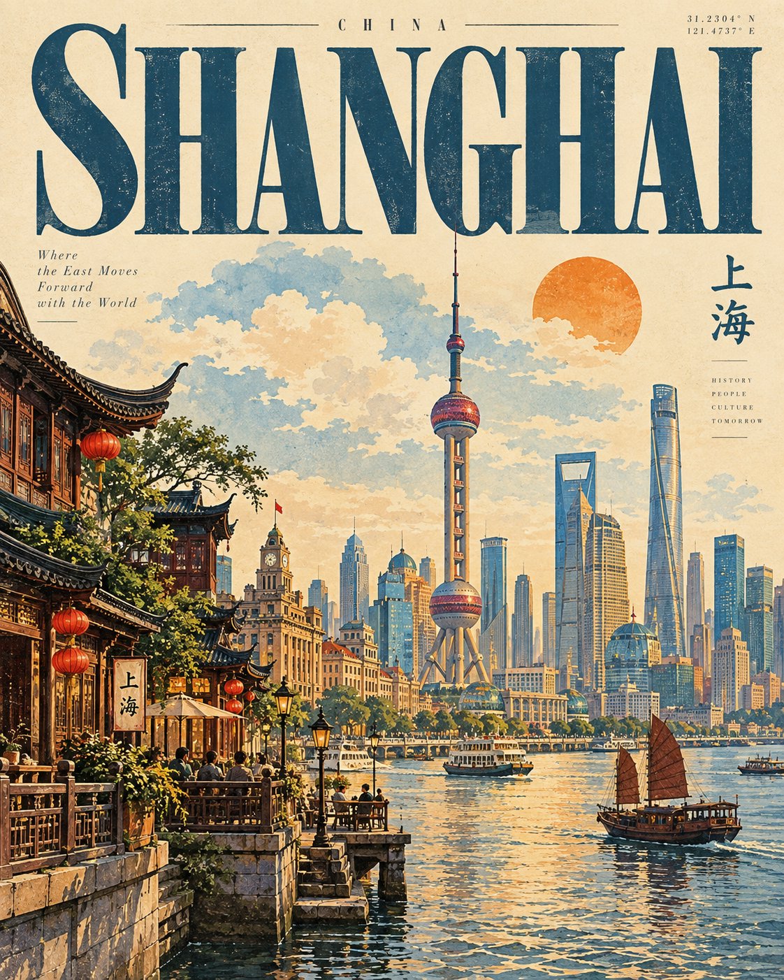
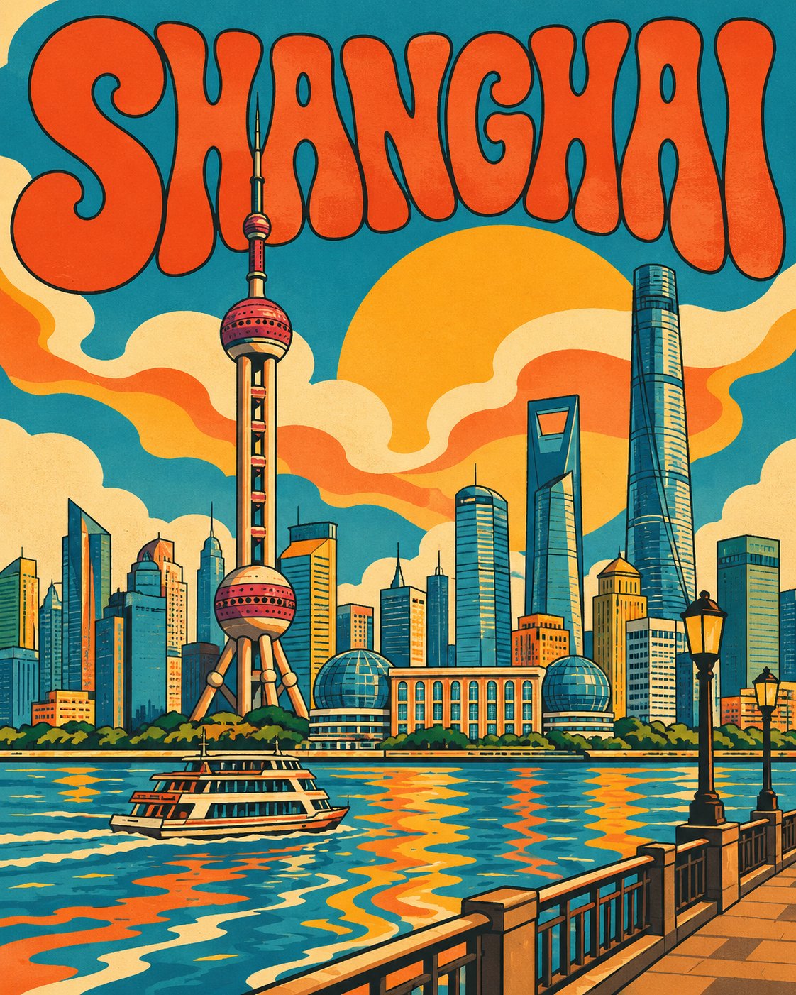
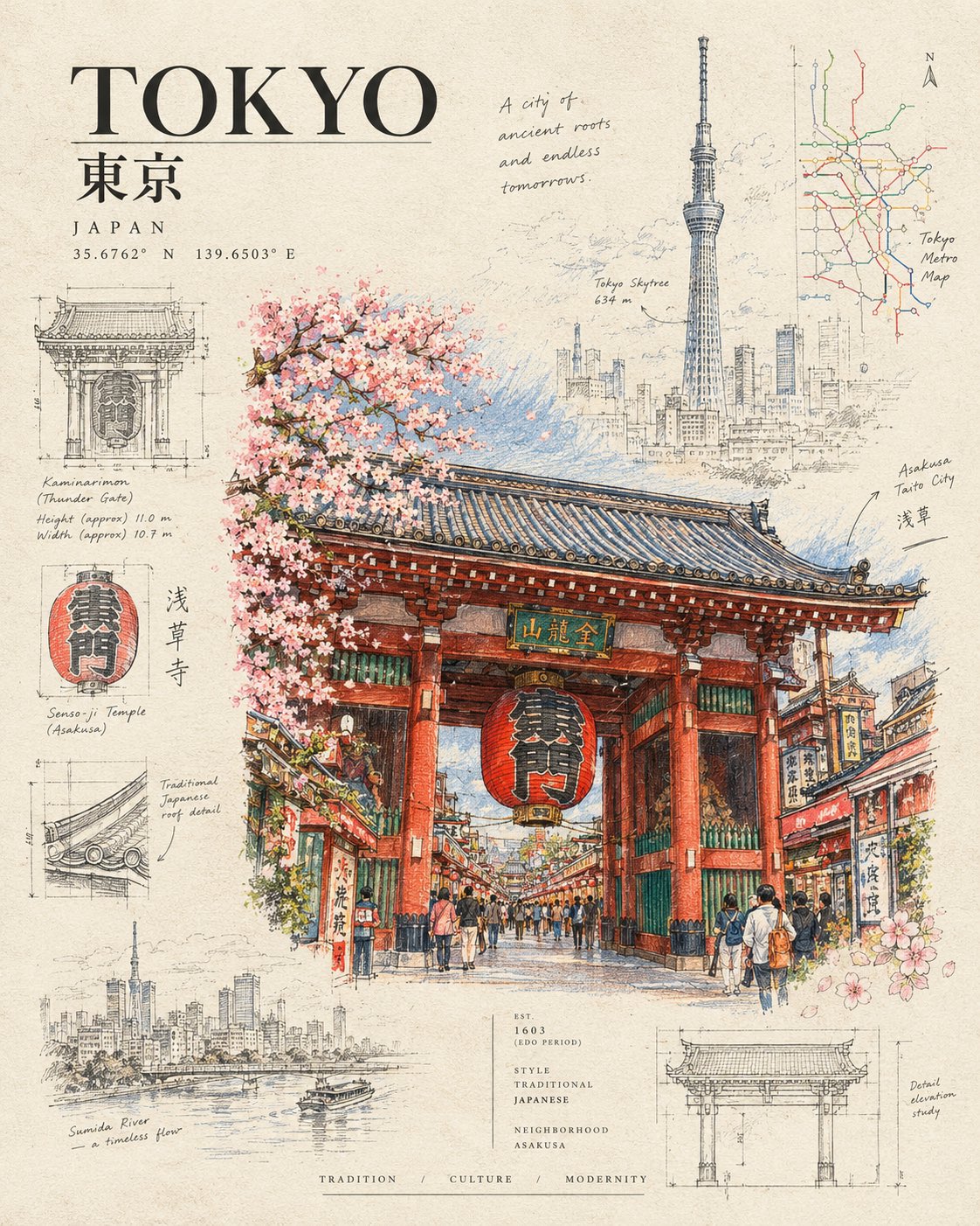
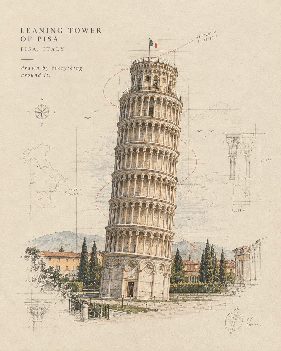
Create a premium 4:5 vertical travel-editorial artwork for [COUNTRY / CITY / LOCATION / SUBJECT].

PURE GENERATION.
Invent the complete artwork from the written destination or subject alone. The written destination is the only input. Create every visual element from your own knowledge and imagination.

MASTER STYLE LOCK:
Hand-painted watercolor on warm cream textured paper. Minimalist travel-editorial poster. Transparent watercolor blended with soft gouache. Soft imperfect brushwork, visible paper grain, organic painted edges, muted natural colors, generous negative space, quiet nostalgic atmosphere, sophisticated handcrafted art-book quality. Flat illustrated artwork with painterly depth. No 3D rendering, no glossy finish, no cartoon style, no digital photorealism.

DESTINATION INTERPRETATION:
Automatically identify the strongest visual identity of [COUNTRY / CITY / LOCATION / SUBJECT]. Select the most recognizable landmark, architecture, landscape, street character, transportation, vegetation, local objects, or cultural details that naturally belong to the destination.

Create ONE unified scene rather than a collection of separate elements.

COMPOSITION:
Use an elegant vertical editorial composition with one dominant focal point and several smaller supporting details. Establish clear foreground, middle ground, and background layers using watercolor washes and simplified shapes.

Leave generous warm cream space around important forms. Keep the silhouette clean and immediately recognizable. Avoid overcrowding.

LOCAL STORY:
Show an authentic everyday moment connected to the destination. Include subtle human activity only when it strengthens the story: walking, cycling, sitting, shopping, traveling, eating, working, or simply enjoying the surroundings.

Favor ordinary local atmosphere over generic tourism imagery.

LIGHT & ATMOSPHERE:
Automatically choose lighting that suits the destination and scene: soft morning light, warm afternoon glow, misty weather, gentle sunset, or quiet evening illumination.

Use atmospheric watercolor washes to create depth while maintaining a calm, delicate feeling.

COLOR LANGUAGE:
Build the palette naturally from [COUNTRY / CITY / LOCATION / SUBJECT]. Use warm cream, muted ochre, terracotta, dusty blue, soft green, faded red, warm grey, and subtle golden tones where appropriate.

Keep the colors slightly desaturated, harmonious, and naturally layered.

TYPOGRAPHY:
At the bottom of the artwork, add three restrained editorial text elements:

[LOCATION NAME]
[SHORT DESTINATION-INSPIRED SUBTITLE]
[SHORT WARM POETIC SENTENCE]

Use elegant minimal typography with generous spacing. Keep it secondary to the artwork and ensure all wording is clean and correctly spelled.

FINAL AESTHETIC:
Premium handmade watercolor travel poster × contemporary editorial illustration × nostalgic travel memory × quiet everyday life × sophisticated art-book design.

The finished artwork should feel like a beautifully remembered place painted by hand: atmospheric, personal, refined, understated, and unmistakably connected to [COUNTRY / CITY / LOCATION / SUBJECT].

AVOID:
Any editing workflow, source material, references, existing compositions, copied imagery, collage construction, unrelated landmarks, generic scenery, excessive detail, oversaturated colors, harsh outlines, glossy digital effects, CGI, 3D objects, cartoon characters, clutter, excessive typography, logos, watermarks, interface elements.

FORMAT:
4:5 vertical portrait composition, warm cream paper, handcrafted watercolor texture, generous negative space, premium print-quality finish.

, 2026
·
1,