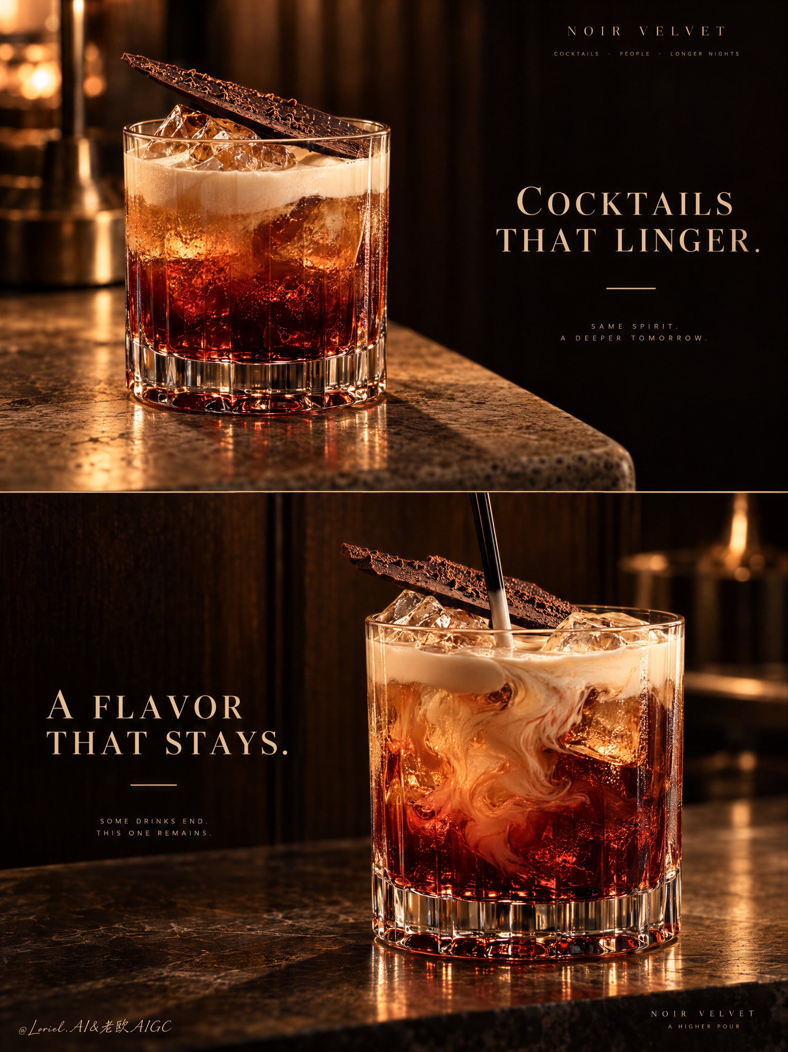
A premium cocktail campaign poster for fictional bar brand NOIR VELVET, merging emotional atmosphere, material precision, and curatorial restraint into one unified two-panel vertical advertising image. Preserve the exact luxury-drinks structure: two stacked horizontal panels, warm low-key bar atmosphere, dark wood and amber light language, one hero cocktail per panel, elegant text zones in negative space, and a strict campaign-wide product identity. Both cocktails must feel like the same brand family, bar program, and visual universe.

Top panel: a close three-quarter beauty shot of a short crystal rocks glass on a softly lit stone or travertine bar edge. The cocktail is the hero: deep garnet-red at the base, glowing amber through the middle, topped with soft pale cream foam, with clear ice catching warm highlights. A thin crisp chocolate shard or cocoa tuile rests diagonally on top as the unmistakable signature garnish. The glass is heavy, premium, and hyperreal, with thick base refraction, subtle condensation, and rich liquid glow. On the right side, keep a calm dark negative-space zone for elegant English typography such as “COCKTAILS THAT LINGER.” in refined serif capitals, with one thin accent line beneath. This panel should feel quieter, stiller, and more seductive.

Bottom panel: a second hero variation from the same drink family, larger and more front-facing, placed slightly right of center on a polished bar or stone surface against a deep dark wood backdrop. Keep the same short crystal glass, same red-to-amber body, same pale cream top note, and same chocolate garnish language. The liquid is shown in a fresh stirring moment, with cream folding into the amber-red body, visible ice, and a black stirrer descending from above. The motion should feel hypnotic but controlled, never messy. On the left side, preserve a clean text zone for a secondary English line such as “A FLAVOR THAT STAYS.” in the same typography system, with the same minimal accent.