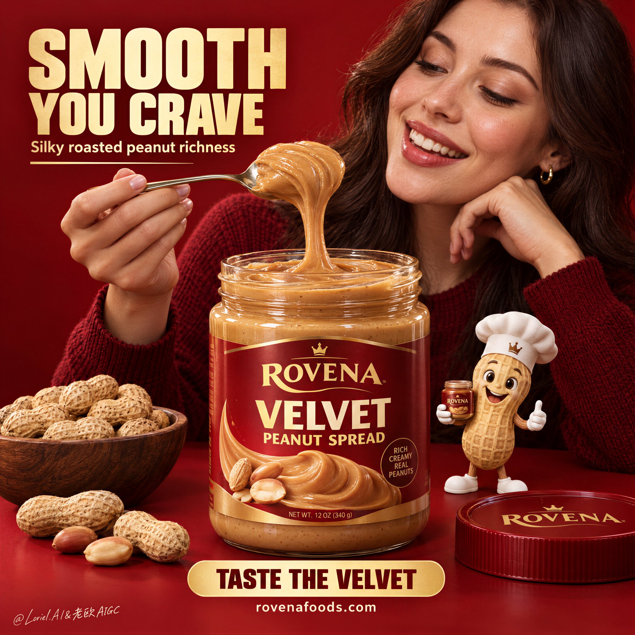
A bold FMCG food poster for fictional premium peanut spread brand ROVENA, with the product as the absolute visual leader. Keep the same structure: a saturated deep-red monochrome studio background and tabletop, one large open jar of silky peanut spread centered in the foreground, an adult woman in a dark red knit sweater behind and slightly right of the jar, smiling warmly at a spoonful she lifts above it, a small premium peanut mascot at the lower right, a bowl of whole peanuts at the lower left, the lid nearby, and a few loose peanuts along the front edge.
Use a medium close-up frontal advertising shot with strong central weighting, shallow depth separation, negative space in the upper left for the headline and lower center for the CTA. The jar must dominate the hierarchy and feel large, tactile, and desirable. The woman is adult, photoreal, naturally proportioned, anatomically correct, with realistic skin texture, subtle pores, natural lips, soft hair density, correct head-neck-shoulder structure, and elegant hands with five normal fingers, clear joints, natural nails, no deformation. Her expression shows genuine delight and appetite, eyes on the lifted spoonful. Her torso stays secondary and never overpowers the jar.
The spread is the key material event: smoother, softer, silkier, and more refined than ordinary chunky peanut butter, with creamy satin body, rounded folds, velvety gloss, slow elastic pull, softened micro-granular texture, gentle roasted-peanut color variation, and thick luxurious viscosity. The lifted spoonful stretches in a smooth continuous ribbon with plush curved edges, glossy highlights, and realistic gravity drag, while keeping a subtle nut-rich identity, never melted-candy-like. The transparent jar has believable thickness and reflections, filled with dense silky spread. Redesign the packaging fully in English with an original premium system: brand mark “ROVENA”, product name “VELVET PEANUT SPREAD”, and only a few small clean support details, with no excessive claims. The peanut mascot is polished, charming, cleanly modeled, wearing a chef hat and holding a tiny jar, playful but clearly secondary.
Lighting is soft and layered: a large diffused key from upper front-left, controlled fill from the opposite side, smooth highlights on the spoon and jar rim, refined contour light on the woman’s face and hair, and strong material clarity on the spread, with rich volume and no dead black shadows. Color hierarchy: deep campaign red dominant, silky caramel-gold and roasted nut tones secondary, with small cream and metallic accents for text and spoon highlights. The finish is hyperreal, clean, appetizing, poster-ready, and fully coherent as one commercial brand world.
Typography follows the same logic: a large bold English headline block in the upper left, one short supporting line beneath, a strong bottom-center CTA banner, and a small social or website line below. Use original copy only, not source wording. Suggested system: “SMOOTH YOU CRAVE”, “Silky roasted peanut richness”, “TASTE THE VELVET”, “rovenafoods.com”. Use bold condensed sans serif for the headline, smaller support text, and a clean rounded CTA bar. Keep text aligned, graphic, warm cream or golden, integrated into the composition, and always outside the product’s core recognition area.