```
🤠🤠🤠
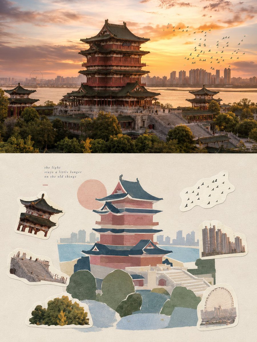
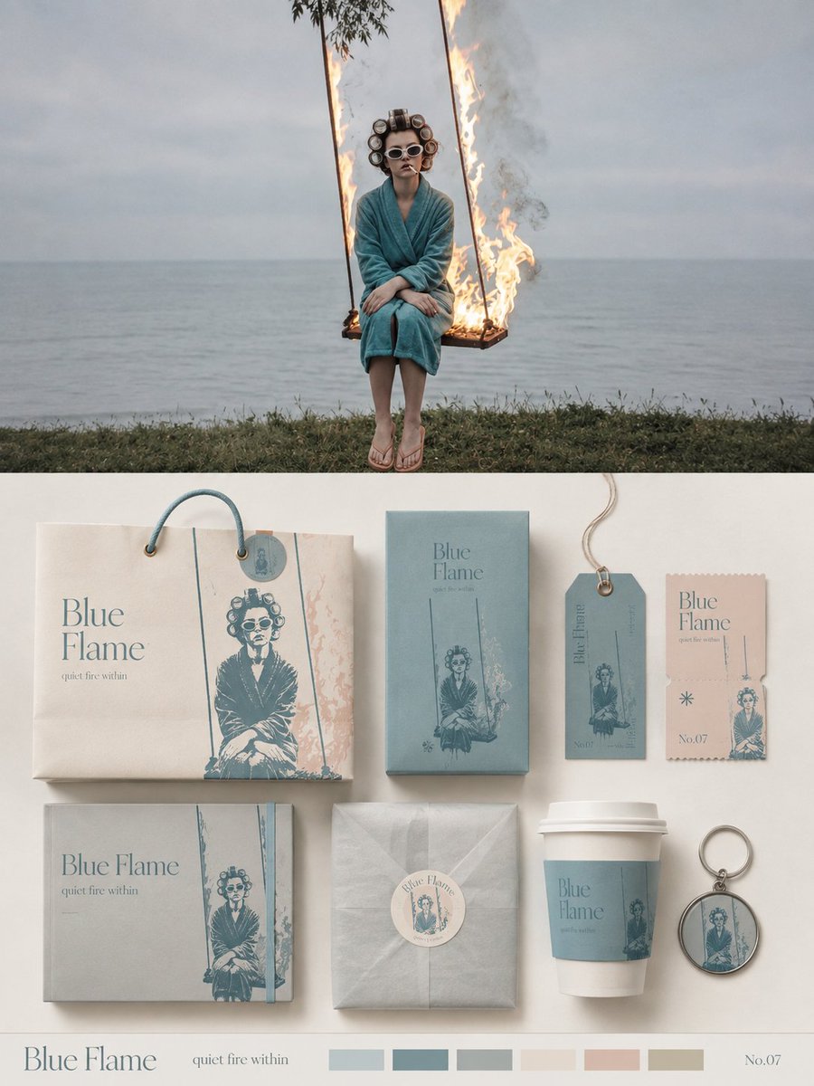
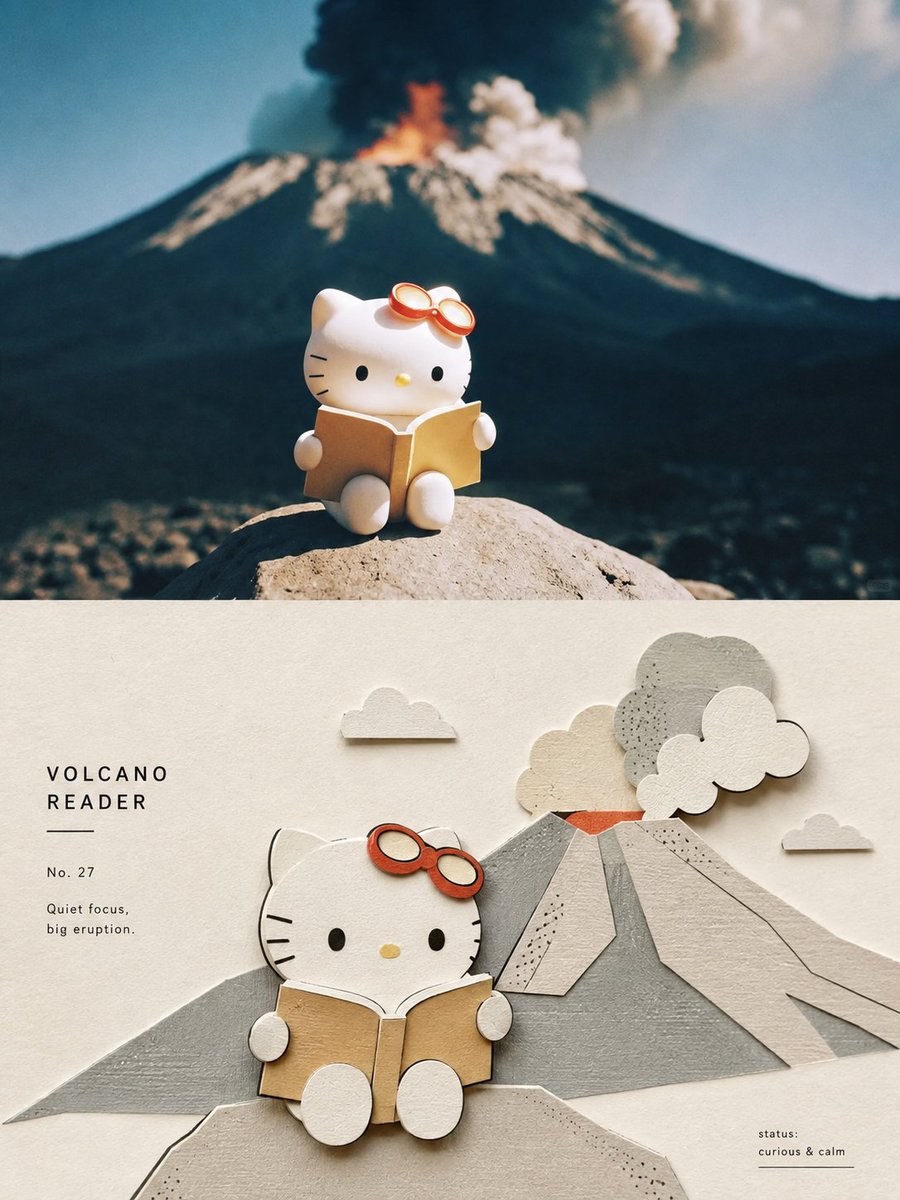
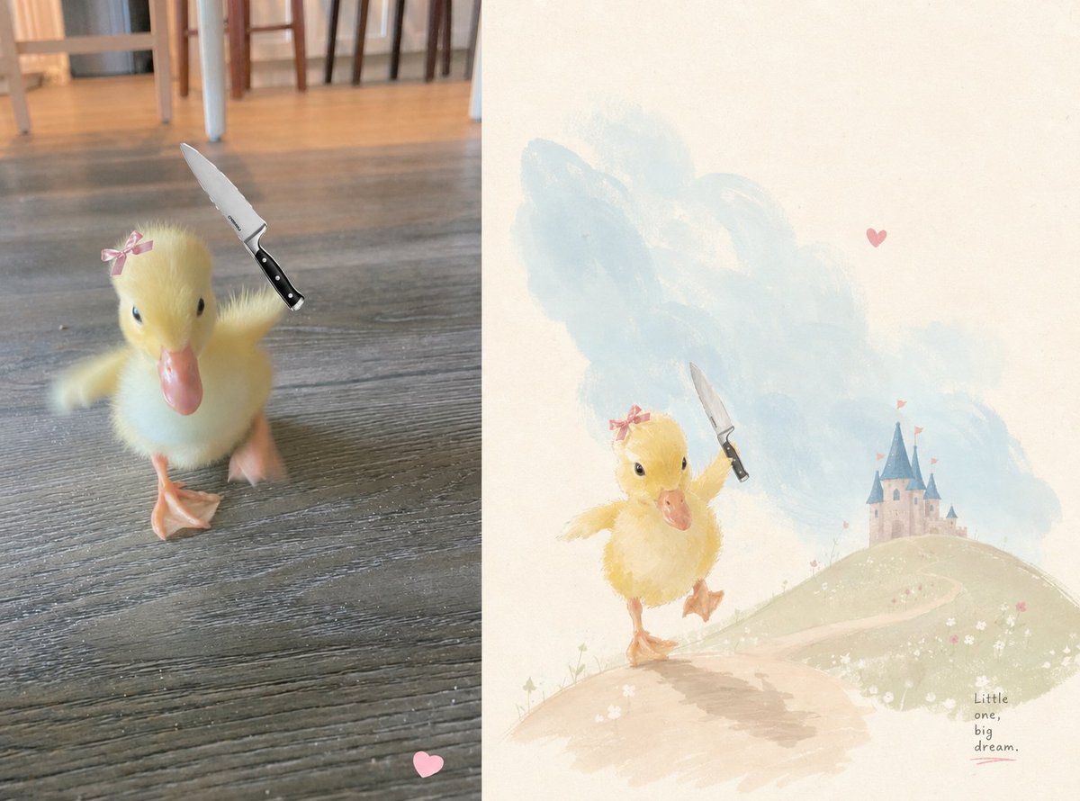
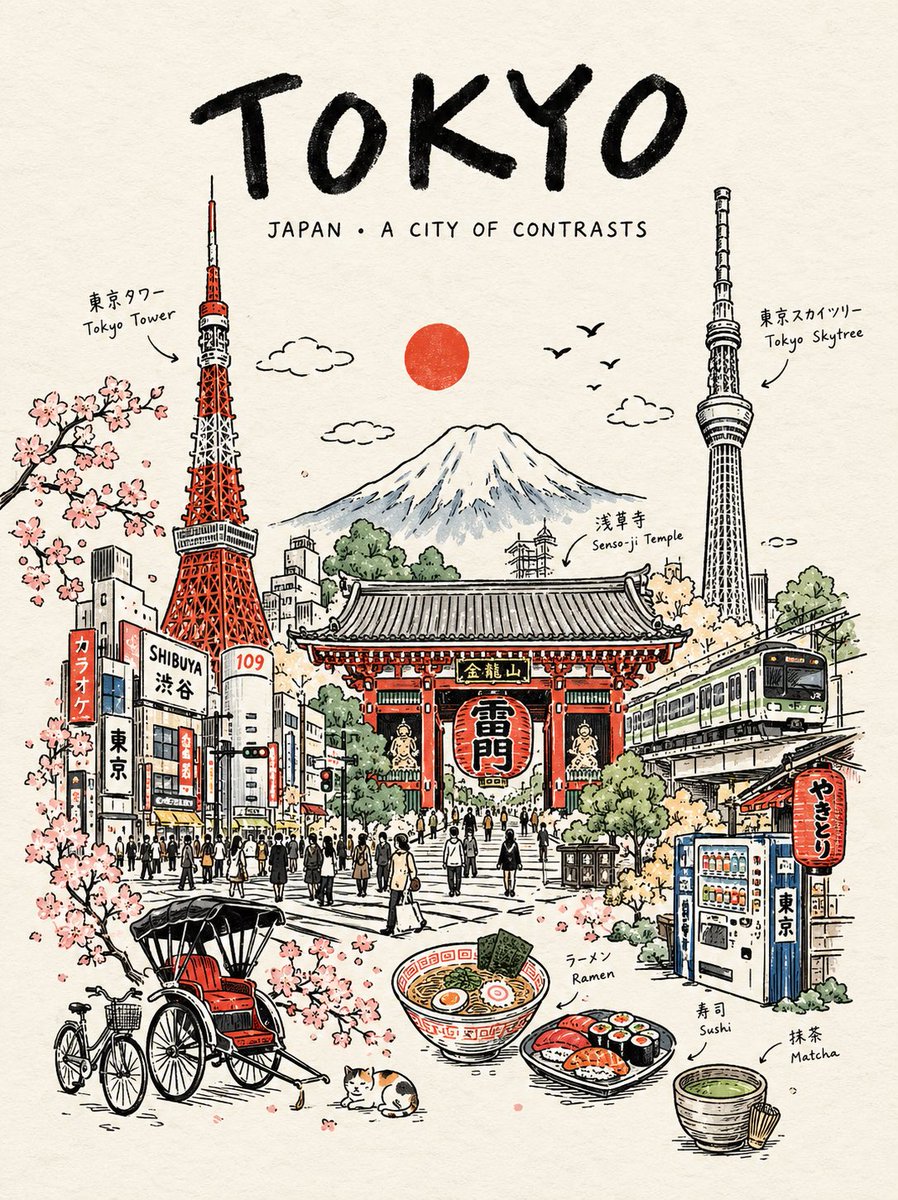
请将我上传的每一张照片分别制作成一张独立的高级设计海报,不多图拼接,每张照片单独输出。整体采用3:4竖版构图,上下两个区域高度严格1:1,各占画面50%。

上半部分保留原始照片,保持主体身份、结构、姿态、真实质感、自然光影和原有色彩氛围,仅进行轻微高级摄影调色,使其具有艺术杂志、独立出版物与展览摄影质感。为适配画幅,可自然扩展天空、地面或环境背景,但不得拉伸、扭曲或改变主体。

下半部分提取照片中最具识别性的主体、轮廓、姿态与叙事关系,将其转化为一套完整的品牌包装与物料视觉系统。不要简单复制照片,而是把主体特征提炼成可重复使用的核心图形、插画符号、纹样、色块或识别元素,再分别应用到不同尺寸和用途的包装载体中,使所有物料一眼属于同一个视觉家族。

根据原图主题自动选择最合适的 5–8 种载体,例如纸袋、包装盒、套盒、标签、吊牌、票券、卡片、贴纸、封套、杯具包装、钥匙挂件、包装纸或其他相关物料,不强行使用固定品类。以 1–2 个主包装作为视觉重心,其余物料按大小、横竖比例和功能形成模块化组合;使用清晰网格、边缘对齐、尺度反差、间距节奏和大面积留白组织画面,像专业品牌设计工作室的 packaging identity presentation board,而不是商品陈列或杂乱 mockup 拼贴。

配色保持柔和、通透、略微去饱和的高级色系,以浅粉蓝、雾蓝、天空蓝、空气感冷调蓝为主,搭配象牙白、奶油白、浅米色、柔和灰绿和建筑中性色,仅用少量 dusty rose 或 muted blush 作为视觉跳点。不同包装可以改变颜色面积和组合方式,但必须保持同一套色彩系统,形成丰富而统一的系列感。

材质强调真实而精致的纸张与包装工艺,可表现哑光纸、细纹纸、厚卡、半透明纸、压纹、模切、折叠、贴纸、局部印刷与轻微层叠关系;光线柔和自然,只用于表现纸张厚度、折痕和材质差异,避免塑料感、强反光、夸张3D和廉价商品渲染。

文字也作为整个包装系统的一部分统一设计。从原图的主体名称、主题、情绪、功能或象征意义中提炼一个简短英文主标题,并延展出极少量副标题、短句、编号、品类名称或微型说明。文字可以根据不同载体自然变化:竖排于吊牌、沿包装边缘延伸、环绕圆形标签、跨越盒面、隐藏在图形之间或成为包装封口结构的一部分,使字体、图形和材质共同形成完整品牌语言,而不是每件物料重复贴上同一个标题。

整体呈现为一张高级品牌包装系统 / 视觉识别提案板:丰富但不拥挤,活泼但有秩序,既展示完整系列,也能看到图形、文字、材质与不同载体之间的设计逻辑。无论原图是人物、动物、植物、建筑、器物、食物、交通工具或自然景观,都应从原图本身建立独特的包装语言,避免固定产品组合、重复模板、电商展示感和普通品牌 mockup 套版。
🤠🤠🤠
```
小小东
11h
GPT2 x 剪纸 x 盆景 x 高级感 x 美学提示词 x VOL.051

从家里盆景得到的灵感启发
这组提示词,是我今日最爱

建筑变成模型。
街道变成一条纸上景观。
人物、植物、交通工具,都能被重新安排进一个小小的立体空间里。

妙哉!

中文版本提示词:

```
😆😆😆😆
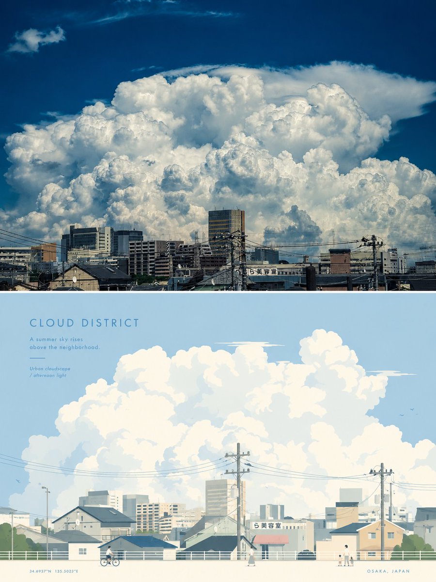
请将我上传的每一张照片分别制作成一张独立的高级设计海报,不多图拼接,每张照片单独输出。整体采用3:4竖版构图,上下两个区域高度严格1:1,各占画面50%。

上半部分保留原始照片,保持主体结构、真实质感、自然光影和原有色彩氛围,仅进行轻微高级摄影调色,使其具有艺术杂志、独立出版物和展览摄影质感。为适配画幅,可自然扩展天空、地面或环境背景,但不得拉伸、扭曲或改变主体。

下半部分提取照片中最具识别性的主体、轮廓、姿态与叙事关系,重构为精致的 miniature 3D paper-craft 微缩纸艺场景。不要机械复刻照片,而是将主体及最能强化其身份与环境气质的少量元素,转化为由纸张、卡纸、软陶、木片等材料手工制作的微型模型,自然组织在一条狭长、轻盈的悬浮景观基座上。主体保持一眼可辨,其余元素只作为叙事陪衬,可根据原图加入植物、道路、水面、灯具、交通工具、人物、飞鸟、云朵或其他具有代表性的生活细节,但必须与原始主题真实相关,避免无意义堆砌。

构图以一个核心主体 + 一条横向微缩景观带 + 大面积留白为基础,根据主体的体量、方向与空间关系调整高低、前后、疏密和左右重心,使场景像一件被精心陈列的微型艺术装置。通过尺度变化、层叠遮挡、小型前景与背景元素建立纵深,主体承担主要视觉重量,辅助模型保持更小尺度和更低视觉权重,整体居中但不过度对称,保持轻盈、精致和安静的视觉节奏。

整体继续采用柔和、通透、略微去饱和的高级配色:以浅粉蓝、雾蓝、天空蓝和空气感冷调蓝建立主要氛围,以象牙白、奶油白、浅米色、柔和灰绿、鼠尾草绿和建筑中性色保持平衡,仅使用少量 dusty rose 或 muted blush 作为细节点缀。颜色柔和但干净,避免灰脏、过度泛黄或糖果色,让不同纸层通过轻微色差自然形成空间关系。

材质强调真实手工触感,可见纸纤维、折边、切口、层叠厚度、轻微毛边和细小制作误差;使用柔和自然漫射光与细腻阴影表现微缩模型的真实体积和层次,具有 macro photography 般的近距离质感。背景保持柔和白色或极浅色纸面,大面积干净留白,使整个下半部分像一张被精心拍摄的高级手工旅行明信片。

文字同样融入微缩纸艺语言。从照片的地点、主体身份、主题或情绪中提炼一个简短英文标题,不限定必须是城市名称。标题采用小型、精致、略带手写感的字形,优先放置在景观带下方的留白区域,也可根据主体关系轻微弯曲、沿基座排列或与微缩场景形成空间呼应;保持极少、优雅、克制,不加入大段说明,让文字像作品签名而不是商业标题。

整体呈现 miniature diorama、handcrafted paper art、whimsical 3D illustration、premium travel postcard 的高级视觉气质:轻盈、温柔、精致、可触摸、有生活感,同时保持清晰的设计秩序与大量呼吸空间。无论原图是人物、动物、植物、建筑、器物、交通工具或自然景观,都应保持真实摄影与微缩手工世界之间清晰而巧妙的视觉对应,避免塑料3D、玩具感、儿童手工感、复杂堆积、过度可爱和电商展示感。
😆😆😆😆
```

english

prompt version :

```
😍😍😍
Please transform each photo I upload into a separate, standalone premium-designed poster. Do not create multi-image collages or combine multiple photos into one composition. Each photo must be output individually. Use an overall 3:4 vertical format, divided into two sections with a strict 1:1 height ratio, with the upper and lower sections each occupying exactly 50% of the canvas.

The upper half should retain the original photograph. Preserve the subject’s structure, realistic texture, natural lighting and shadows, and the original color atmosphere. Apply only subtle, sophisticated photographic color grading to give the image the refined visual quality of an art magazine, independent publication, or exhibition photography. To adapt the photograph to the required aspect ratio, you may naturally extend the sky, ground, or surrounding environment, but do not stretch, distort, reshape, or alter the main subject.

In the lower half, extract the most recognizable subject, silhouette, pose, and narrative relationship from the photograph, and reinterpret them as a refined miniature 3D paper-craft diorama. Do not mechanically reproduce the photograph. Instead, transform the main subject and a limited number of elements that best reinforce its identity and environmental character into miniature handcrafted models made from materials such as paper, cardstock, soft clay, thin wood pieces, or similar tactile craft materials. Arrange them naturally on a narrow, lightweight, floating landscape base.

The main subject must remain instantly recognizable at a glance. All other elements should function only as narrative support. Depending on the original photograph, you may incorporate plants, roads, water, lamps, vehicles, people, birds, clouds, or other representative details of everyday life, but every added element must be genuinely relevant to the original theme. Avoid decorative clutter or meaningless accumulation of objects.

Base the composition on one core subject + one horizontal miniature landscape strip + generous negative space. Adjust vertical levels, foreground/background relationships, visual density, and left-right balance according to the subject’s scale, direction, and spatial relationships, so that the scene feels like a carefully curated miniature art installation.

Create depth through variations in scale, layered overlaps, and small foreground and background elements. The primary subject should carry the greatest visual weight, while supporting models remain smaller and visually quieter. Keep the overall composition centered without making it excessively symmetrical, maintaining a light, refined, calm, and elegant visual rhythm.

Continue using a soft, airy, slightly desaturated premium color palette. Establish the main atmosphere with pale powder blue, mist blue, sky blue, and cool airy blues. Balance these with ivory white, creamy white, light beige, soft gray-green, sage green, and neutral architectural tones. Use only small accents of dusty rose or muted blush for subtle detail.

The colors should feel soft yet clean. Avoid muddy gray tones, excessive yellow casts, or candy-like colors. Allow different paper layers to create natural spatial separation through subtle variations in tone and color.

Emphasize the authenticity of handcrafted materials. Make paper fibers, folded edges, cut edges, layered thickness, slight fraying, and tiny handmade imperfections visible. Use soft natural diffused lighting and delicate shadows to reveal the real volume, depth, and layering of the miniature models, with the intimate tactile quality of macro photography.

Keep the background soft white or an extremely pale paper tone, with extensive clean negative space, so that the entire lower half feels like a meticulously photographed premium handcrafted travel postcard.

Typography should also be integrated into the visual language of the miniature paper-craft world. Derive a short English title from the location, identity of the subject, theme, or emotional atmosphere of the photograph. The title does not have to be a city name.

Use a small, refined typeface with a subtle handwritten character. Preferably place the title within the negative space below the miniature landscape strip. Depending on the relationship with the subject, the text may also follow a slight curve, align gently along the base, or interact spatially with the miniature scene. Keep the typography minimal, elegant, and restrained. Do not add long descriptive copy. The text should feel more like an artist’s signature than a commercial headline.

The overall visual direction should combine the premium qualities of miniature diorama, handcrafted paper art, whimsical 3D illustration, and a premium travel postcard. The result should feel light, gentle, refined, tactile, and full of lived-in character, while maintaining strong design discipline and abundant breathing room.

Whether the original photograph features a person, animal, plant, architecture, object, vehicle, or natural landscape, maintain a clear yet clever visual correspondence between the real photographic world in the upper half and the miniature handcrafted world in the lower half.

Avoid plastic-looking 3D rendering, toy-like aesthetics, childish craft styles, overly complicated compositions, excessive cuteness, visual clutter, or an e-commerce product-display appearance.
😍😍😍
```