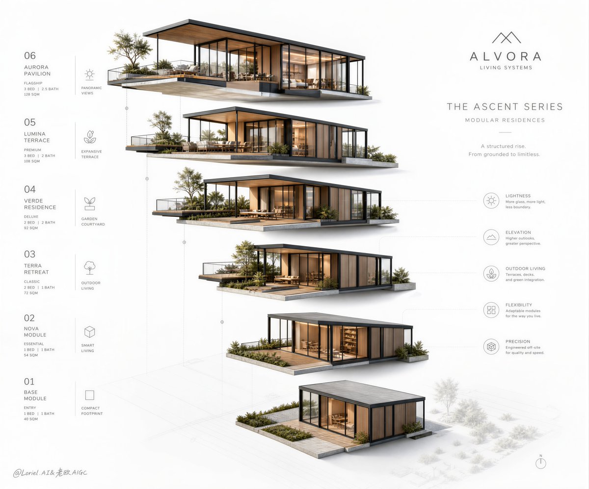
Create an ultra-premium vertical architectural sales poster for a fictional luxury real estate developer, presenting a modular residential product family through a highly refined exploded-axonometric composition with a clear upward serialized progression. Preserve the original visual logic of a clean white presentation background, large negative space, precise technical linework, minimal English annotations, and a world-class premium brand-board aesthetic. The entire image must immediately communicate one core idea: the product system rises upward in a structured series, from grounded entry model to lighter, more open, more elevated flagship modules.

Main composition: arrange five to six modular residential units in a strong rising diagonal sequence from lower right to upper left, with each successive module slightly lifted, lighter, more transparent, and more architecturally advanced than the one below. The sequence must feel like a product line ascending in value, openness, and sophistication. The lowest unit should read as the most compact and grounded version; the middle units should progressively open with more glass, deck extensions, and planted zones; the uppermost unit should feel like the most refined, airy, premium culmination of the series. The entire composition must create an unmistakable "upward product family" momentum at first glance.

Architecture style: contemporary minimalist modular residences with slender dark metal frames, floor-to-ceiling low-iron glass, warm timber cladding, pale concrete bases, clean roof planes, integrated terraces, and subtle landscape pockets. Every module must remain fully believable and buildable. Maintain a unified family DNA across all units so they read as one branded system, but clearly differentiate their degree of openness, landscaping, enclosure, and luxury level to reinforce the serialized hierarchy.

Push the Transit direction strongly: reduce all unnecessary graphic density, increase negative space, refine alignment, lighten annotation noise, and make the whole board feel more international, more editorial, more luxurious, and more controlled. Push the Port direction strongly: compress the page memory into three dominant super symbols only, the rising diagonal module series, the surrounding ultra-light technical callout system, and the minimal brand/title zone. Everything else must remain subordinate.

Surround the module sequence with elegant thin English callout lines, tiny icon markers, subtle drafting grids, and sparse premium technical labels placed mainly on the left and right sides. Add a small minimalist fictional developer logo and one refined English project title near the upper area, using original invented naming only. Typography should be architectural, understated, and secondary to the product system.

Lighting and rendering: soft pale daylight or overcast studio-environment daylight with extremely controlled shadows. Each module should cast a delicate floating shadow onto the white ground plane to emphasize separation and hierarchy. Interior lighting should glow softly in selected units, revealing warm domestic atmosphere, timber ceilings, shelving, seating, and pendant lights without clutter. Exterior materials must feel precise and tactile: matte dark metal, clear glass, warm oak or cedar, pale concrete, fine paving, and realistic controlled vegetation.

Landscape integration: each unit should include subtle premium micro-landscape conditions such as low shrubs, small trees, planted decks, gravel strips, and pale paving grids. Vegetation should feel increasingly curated and elevated as the series moves upward, reinforcing the sense of product evolution rather than random decoration. The white background must remain dominant, with only faint gray grid traces, site hints, and drawing overlays.

Graphic style: world-class real estate developer product launch board, elite modular housing campaign, museum-clean architectural presentation, collectible editorial layout, axonometric precision, calm but powerful branding. The modules should feel simultaneously like real residences and like beautifully organized product data. The page must feel pristine, aspirational, and immediately legible as a premium serialized housing system.

Color system: white and warm gray base, charcoal-dark frames, honey timber, pale concrete, muted green and ochre vegetation, soft warm interior amber, and subtle gray drafting overlays. Keep saturation restrained, premium, and globally architectural. Strengthen depth with clean shadow hierarchy and slightly warmer interior glow, but keep the page airy and minimal.

No copied project names, no real company names, no Chinese headline, no cluttered annotations, no fantasy impossible structure, no distorted axonometric perspective, no muddy shadows, no black blotches, no excessive furniture, no messy landscape, no random people, no watermark, no existing brand logos.