
GPT-image2
进阶
视觉聚核:四种向心构图的海报设计框架
4:5,Pro-Mist柔雾人像,韩系打烊理发店女友写真,新鲜心动,粉灰与暖白。 成年年轻韩系女性,小巧鹅蛋脸,桃粉甜美妆,奶油半哑光真实皮肤,刚吹松的黑茶色层次锁骨发,发顶蓬松,发尾轻微外翘。…
#编辑设计#海报#GPT-Image2
尘林 Spark
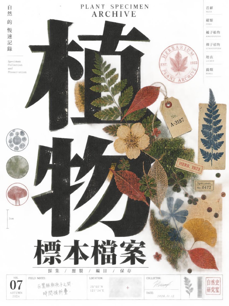
4:5,Pro-Mist柔雾人像,韩系打烊理发店女友写真,新鲜心动,粉灰与暖白。 成年年轻韩系女性,小巧鹅蛋脸,桃粉甜美妆,奶油半哑光真实皮肤,刚吹松的黑茶色层次锁骨发,发顶蓬松,发尾轻微外翘。…
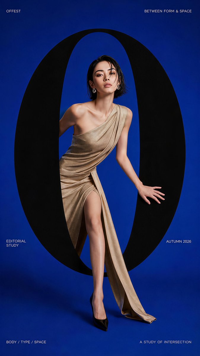
Theme: [TITLE] Type element: [LETTER / WORD] Type behavior: [PORTAL / LAYER / FRAME / MOTION] …
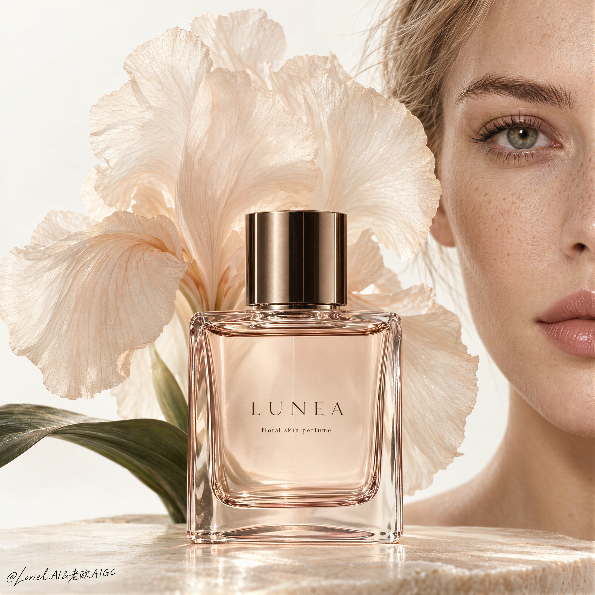
The face adds intimacy without becoming a portrait. Your eye feels the human connection, then returns to the perfume. …
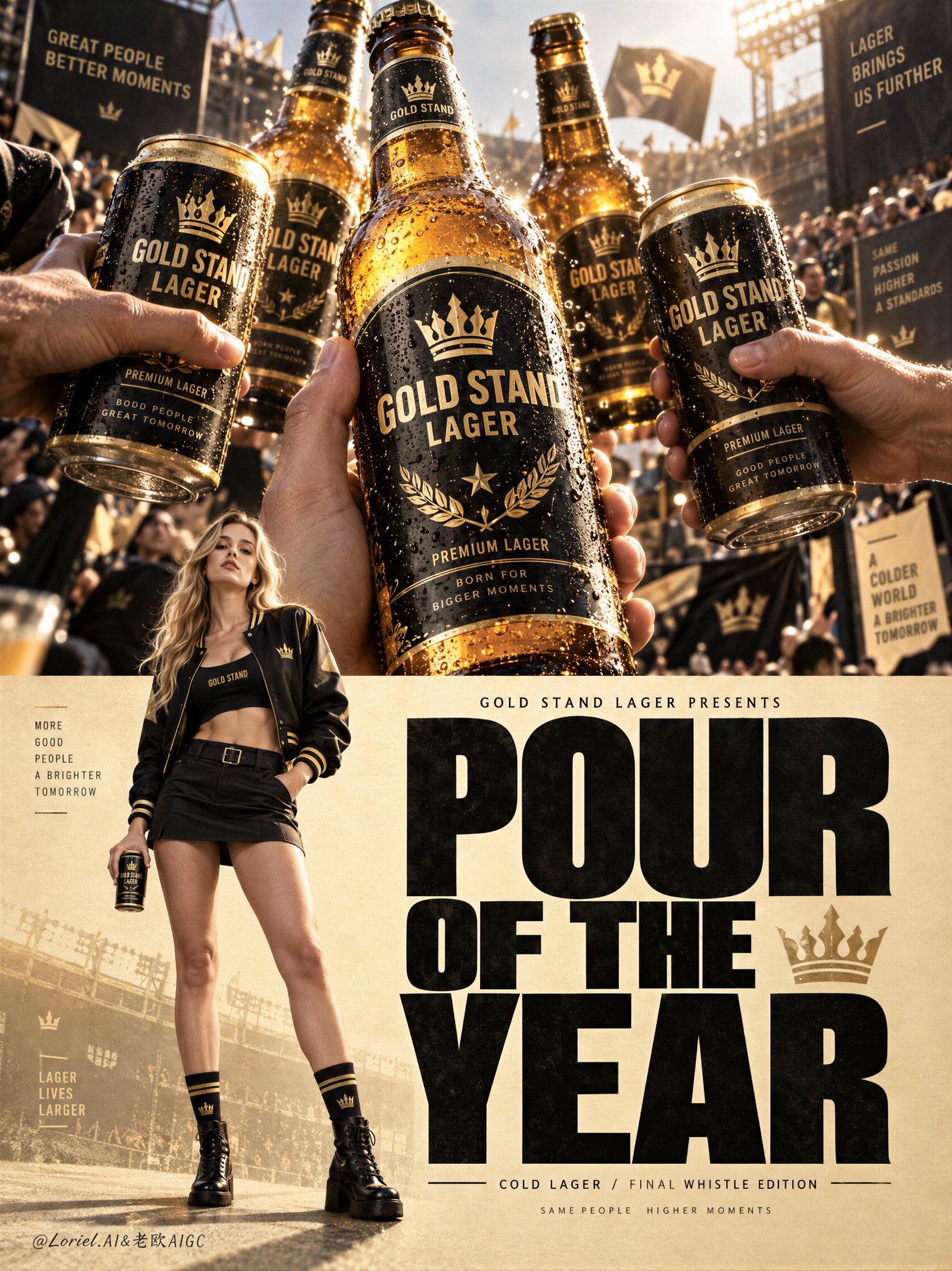
A Cannes-level beer campaign poster for fictional premium lager brand GOLD STAND LAGER, merging emotional celebration,…
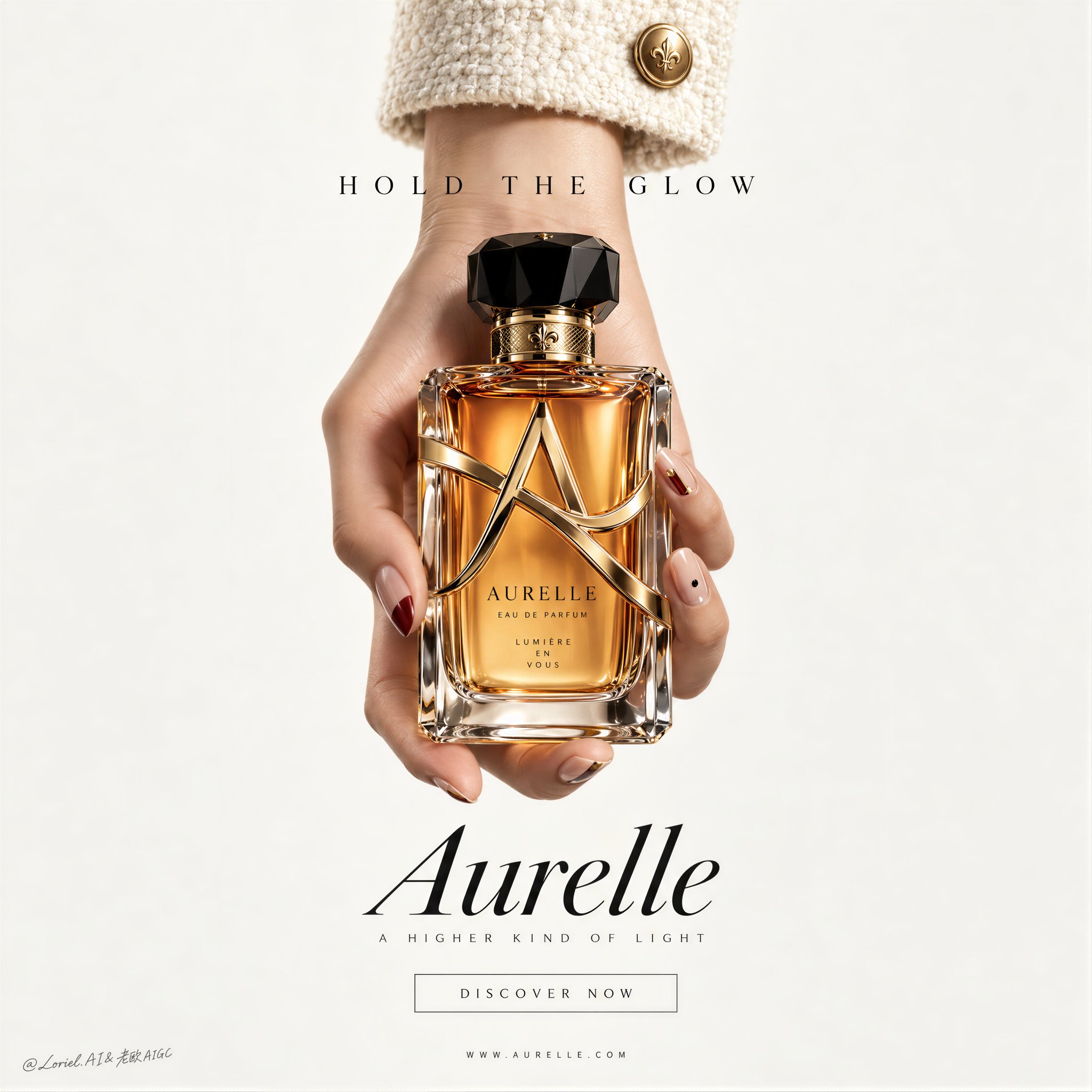
A Cannes-level luxury fragrance poster for a fictional perfume house called AURELLE, merging emotional aura, jewel-like…
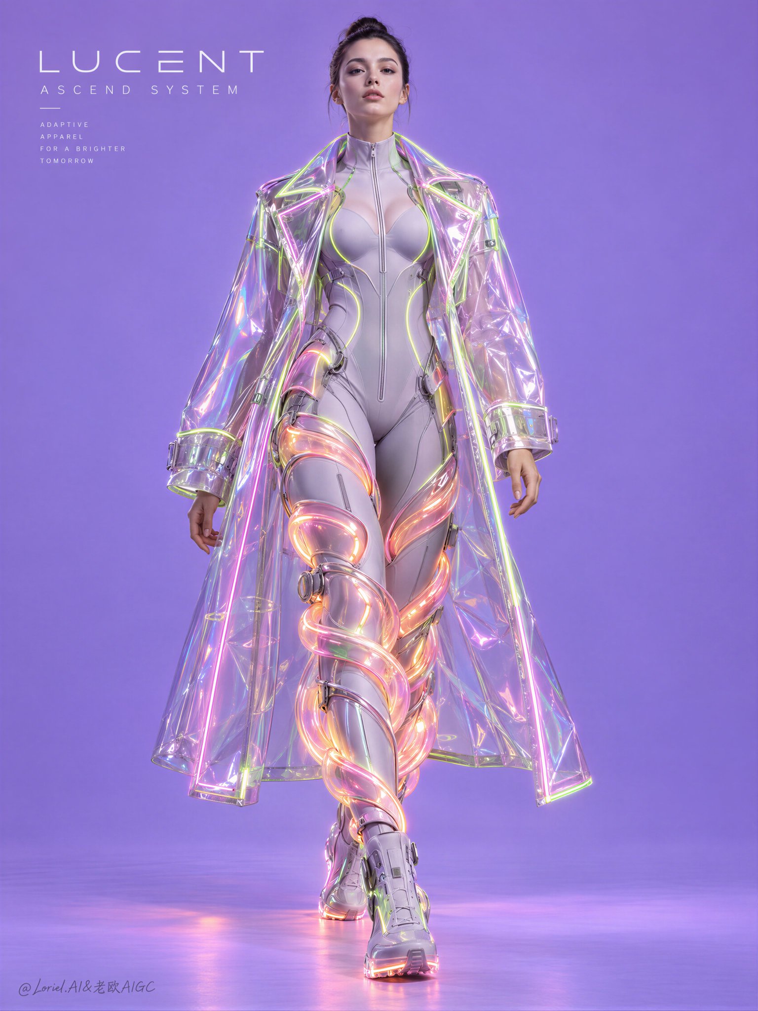
Create the definitive Orbit + Transit + Port final poster for the fictional international neo-couture label LUCENT…
下载精美的 Prompt 分享卡片,分享到社交媒体
小小东 GPT2 x 复古 x 印刷 x 刊物 x 美学提示词 x 海报 今天一整体,都是印刷、噪点 GPT-image2 这两个词真慎用 不过出来的画面,确实复古,也不少耐看 比如这组 提示词 ⬇️ 小小东 14h GPT2 x 工业风 x 遗迹 x 墨痕 x 美学提示词 GPT-imag...