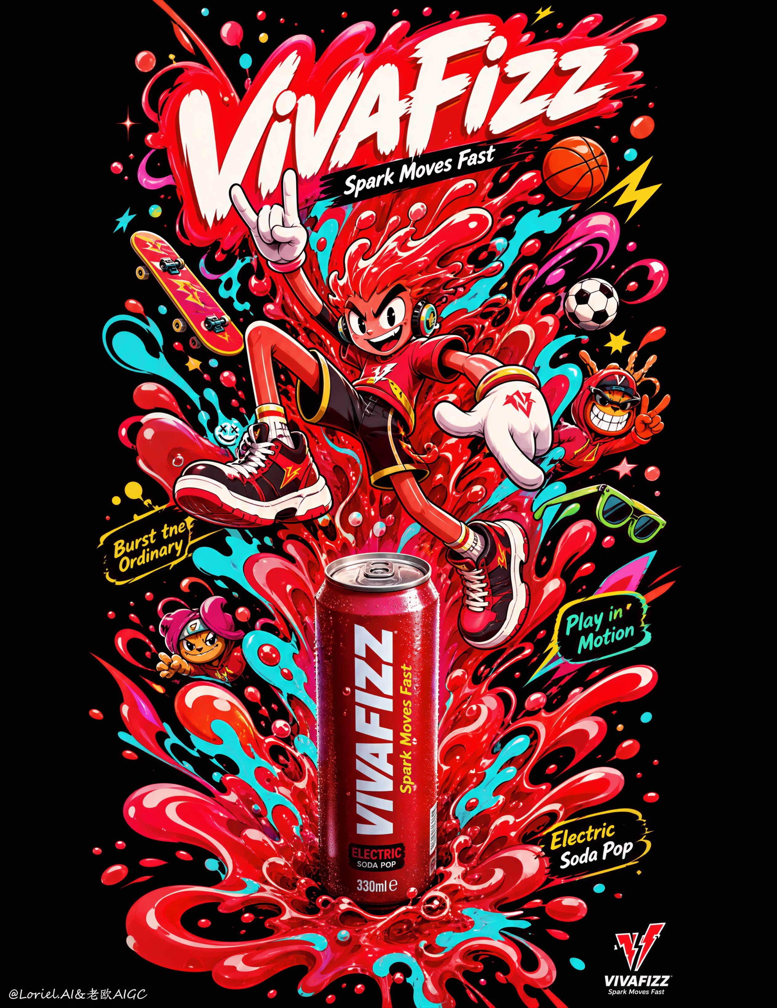
Create an ultra-premium pop-surreal beverage poster for a fictional soda brand called “VIVAFIZZ”, designed as a Cannes-level commercial ad with a single explosive vertical composition on a deep black background. The image must preserve the same totem-like upward structure, with one central dynamic cartoon-athletic figure built out of swirling liquid forms, playful motion symbols, and bright sports-energy fragments, while integrating one real hyper-stylized soda product as the key branded anchor. The final artwork must feel electric, joyful, rebellious, youth-driven, collectible, and highly systemized, while staying compositionally clean and visually dominant.

Core composition:
Use a tall vertical poster with one rising central column of motion, built like a liquid flame, splash tower, or energy totem. Enlarge the central red liquid mass so it feels more forceful and iconic, almost like a fiery core exploding upward through the frame. In the middle of this vertical burst, place one exaggerated cartoon-style action character in mid-air, with bent limbs, oversized sneakers, dynamic gloves, and a wild expressive face, as if being propelled by the soda energy itself. The lower part of the composition should form a bold splash base, while the upper part blooms outward with liquid ribbons, bubbles, and vivid symbols. The entire poster must read as one single central energy monument.

Brand creation:
Brand name: “VIVAFIZZ”
Main title / logo text: “VIVAFIZZ”
Support line: “Spark Moves Fast”
Optional micro copy:
“Burst the Ordinary”
“Play in Motion”
“Electric Soda Pop”
All text must be original, custom, and beautifully art-directed. Do not copy any real brand or wording from the sample. Keep text minimal and elegant, with one small official brand mark near the lower area only.

Product integration:
Integrate one realistic premium soda product into the poster, either as a slim can or contour bottle, embedded subtly but clearly into the lower-middle or central splash structure. The product should be hyper-realistic, with crisp print fidelity, glossy highlights, clean condensation, believable reflections, and clear color branding. It must feel like a real hero product inside an illustrated universe, not like a pasted photo.

Orbit-style impact:
Increase first-glance power by making the central red liquid form larger, the character silhouette more immediate, and the lower splash base more aggressive and visible. The viewer should first read the explosive central shape, then the character, then the product anchor. The poster should hit instantly from a distance like an iconic street-pop energy symbol.

Transit-style system discipline:
Keep the whole image standardized under one mature global visual system. All supporting sports-energy symbols, side characters, gloves, shoes, splash droplets, stars, bubbles, boards, balls, and graphic fragments must follow one coherent outline thickness, one controlled saturation logic, and one repeatable visual rhythm. The poster should feel like part of a polished international campaign system rather than a random cartoon explosion.

Illustration world:
Build a dense but highly controlled pop-doodle action universe using:
- liquid splash ribbons in red, aqua, teal, and hot pink
- floating sports-energy symbols such as balls, boards, glasses, stars, and speed marks
- one or two small supporting cartoon side-characters
- playful bubbles, burst droplets, and elastic motion streaks
- oversized gloves, sneakers, and exaggerated action anatomy
The illustration style must feel bold, polished, mischievous, and collectible, not chaotic or childish-cheap.

Character design:
The central character should feel like a mascot-athlete hybrid, with long expressive limbs, oversized shoes, dynamic hand gestures, and a face full of playful intensity. It should embody fizzy motion and youth energy rather than feel generic. The silhouette must read instantly and powerfully from afar.

Color direction:
Use a high-impact premium palette against a deep black background:
- explosive red as the main liquid body
- bright aqua and cyan splash accents
- hot pink details
- vivid yellow and lime highlights
- clean white glove or shoe accents
Keep all colors loud and electrified, but highly controlled and graphically disciplined.

Lighting and finish:
Keep the illustrated world mostly graphic and saturated, but render the real soda product with premium dimensional lighting. The can or bottle should receive soft glossy highlights and subtle condensation realism. The black background should remain rich and velvety, giving the central explosion maximum contrast and presence.

Graphic discipline:
The whole poster must read as one iconic central visual symbol. Avoid unnecessary clutter. Every side-character, sports icon, liquid trail, and burst fragment must reinforce the vertical rhythm and central explosion. The final image should feel collectible, bold, and internationally campaign-ready.

Mood and quality:
premium soda campaign, explosive central energy totem, pop-surreal street poster, hyper-real beverage integration, youth-culture branding, collectible illustration, black-background impact, highly systemized visual identity, polished commercial art direction, 8k, world-class advertising image quality

Negative

prompt:
real Coca-Cola text, copied logo, weak central structure, cluttered composition, muddy colors, cheap cartoon style, random sports icons, unreadable branding, low-detail product, fake glass or can, harsh noise, low resolution, flat image, weak contrast
6:14 AM · Aug 9, 2026
356
Views
1
6
4

===ARTICLE 1===
Shara I Ai Video Creator
@itsshara_ai
2h
The rising energy totem concept ties everything together well.
3