[DESTINATION] = [CITY NAME]

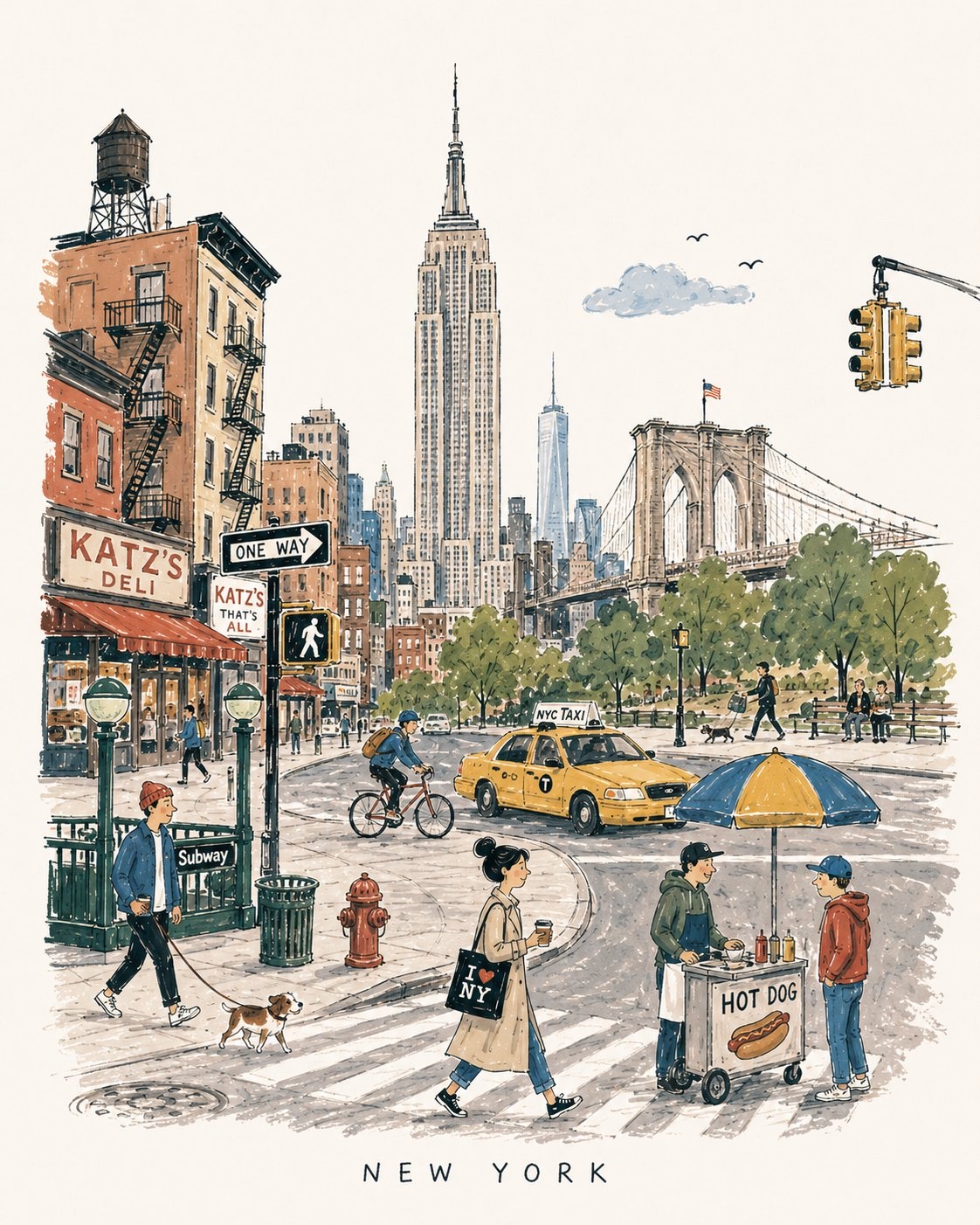
Create a charming vertical 4:5 mid-century travel picture-book illustration of [DESTINATION], inspired by playful 1950s–60s European city books.

Depict the city as an affectionate, imperfect travel memory—not a map, postcard, architectural rendering, landmark collage, or cinematic panorama.

Include:
  • 1 distinctive primary landmark
  • 1 smaller secondary landmark
  • 1 distant/partially hidden local feature
  • 1 recognizable local vehicle
  • 3–5 subtle everyday city details
  • 5–6 ordinary people doing simple local activities

Compress these naturally into one imaginary street, plaza, park, or waterfront. Keep the primary landmark slightly off-center, with open foreground, shallow theatrical depth, gentle curves, and generous museum-white negative space. The city should be recognizable without feeling geographically accurate.

STYLE:
Hand-drawn picture-book illustration with loose charcoal/navy ink, trembling contours, crooked architecture, uneven proportions, sparse windows, simplified silhouettes, occasional double strokes, and minimal detail. Use the fewest lines necessary. Slightly awkward, intelligent, warm, humorous, and handmade.

PEOPLE:
Simple expressive figures with oversized heads, thin legs, narrow bodies, tiny faces, tilted accessories, and awkward but readable gestures. Show ordinary local life, not celebrities, models, stereotypes, or tourist clichés.

COLOR:
Use a restrained 6–7 color destination-specific palette with flat matte gouache shapes, uneven brush edges, white gaps, slight misregistration, and occasional color spilling beyond ink. Mostly unpainted sky/paper. No gradients or realistic shading.

MEMORY DISTORTION:
Gently compress geography and distort scale: distant landmarks may appear nearby, roads may curve strangely, buildings may overlap, and people/vehicles may be slightly oversized or undersized. Keep it balanced, affectionate, and culturally respectful.

OPTIONAL TEXT:
“[DESTINATION]” in small uneven hand-drawn capitals near the bottom. No slogans, dates, labels, logos, or promotional text.

AVOID:
Photorealism, map-like accuracy, landmark checklists, aerial views, cinematic lighting, technical perspective, dense crowds, detailed ornament, polished vector art, CGI, 3D rendering, gradients, sepia/beige paper, artificial aging, distressed textures, and hyper-detailed watercolor.

Overall feeling: [DESTINATION] remembered lovingly-recognizable, spacious, human, humorous, slightly improbable, and beautifully imperfect.
Premium level editorial travel illustration

GPT Image 2

Prompt:
Create a premium editorial travel illustration of [DESTINATION], [COUNTRY/REGION] using a minimal layered cutout illustration style. IMPORTANT: This must NOT look like a busy handmade paper craft artwork. Instead, it should feel like a premium Scandinavian editorial poster, a modern travel magazine cover, a sophisticated museum-shop print, and an elegant minimalist paper collage design.

STYLE: minimal layered cutout illustration, large clean paper shapes, editorial paper collage aesthetic, bold geometric masses, simplified layered depth, soft subtle shadows, clean cut edges with slightly rounded corners, ultra simplified shape language, no photorealism, no handcrafted DIY feeling, no excessive texture, no visual clutter.

TEXTURE: extremely subtle paper grain only, smooth premium paper surface, almost invisible texture, no embossed texture, no heavy paper fibers.

COMPOSITION: vertical 9:16 poster layout, strong foreground/midground/background separation, large open breathing space, refined negative space, balanced premium editorial composition, minimal object density, avoid overcrowding.

FOREGROUND: minimal landscape forms only, clean abstract terrain representing [DESTINATION'S NATURAL FEATURE / WATERFRONT / LANDSCAPE], minimal environmental details, avoid dense plants and excessive flowers.

MIDGROUND: [ICONIC LANDMARK / ARCHITECTURAL ANCHOR], simplified architectural masses of nearby buildings or structures, strong recognizable silhouettes, minimal window detail.

BACKGROUND: [DISTANT NATURAL FEATURE / MOUNTAIN / SKYLINE / LANDSCAPE ELEMENT] in the far distance, large clean sun, simple rounded clouds, spacious atmosphere.

ARCHITECTURE: simplified isometric-inspired forms, geometric buildings, minimal window patterns, reduced micro-detail.

COLOR & LIGHTING: limited color palette (4–6 colors) featuring [PRIMARY COLOR], [SECONDARY COLOR], crisp white, soft slate blue, and pale grey, vibrant but restrained tones, clean white balance, bright neutral daylight, slightly cool-neutral lighting, fresh crisp whites, no yellow tint, no warm sepia tone, soft directional shadows only, flat but elegant dimensional feeling.

MOOD: calm, modern, refined, premium, slightly whimsical, mature high-end travel branding aesthetic.

TYPOGRAPHY: minimal elegant sans-serif typography with the text "[DESTINATION]", clean spacing and alignment, suitable size.

QUALITY: ultra clean edges, high resolution, print-ready, no blur, no noise, visually organized, premium design-forward aesthetic.

COMPOSITION:
ASPECT RATIO: 4:5 vertical poster format.